


![]()
The platform Air has unveiled a refreshed logo and a completely new style created by FOOD, a New York-based design studio known for unconventional visual solutions for digital brands and startups. Air positions itself as a comfortable space for creative teams working with digital assets, guiding the entire process from idea generation to publication. Unlike traditional systems, Air emphasizes ease of interaction and visual clarity, minimizing bureaucracy and complexity common to similar services.
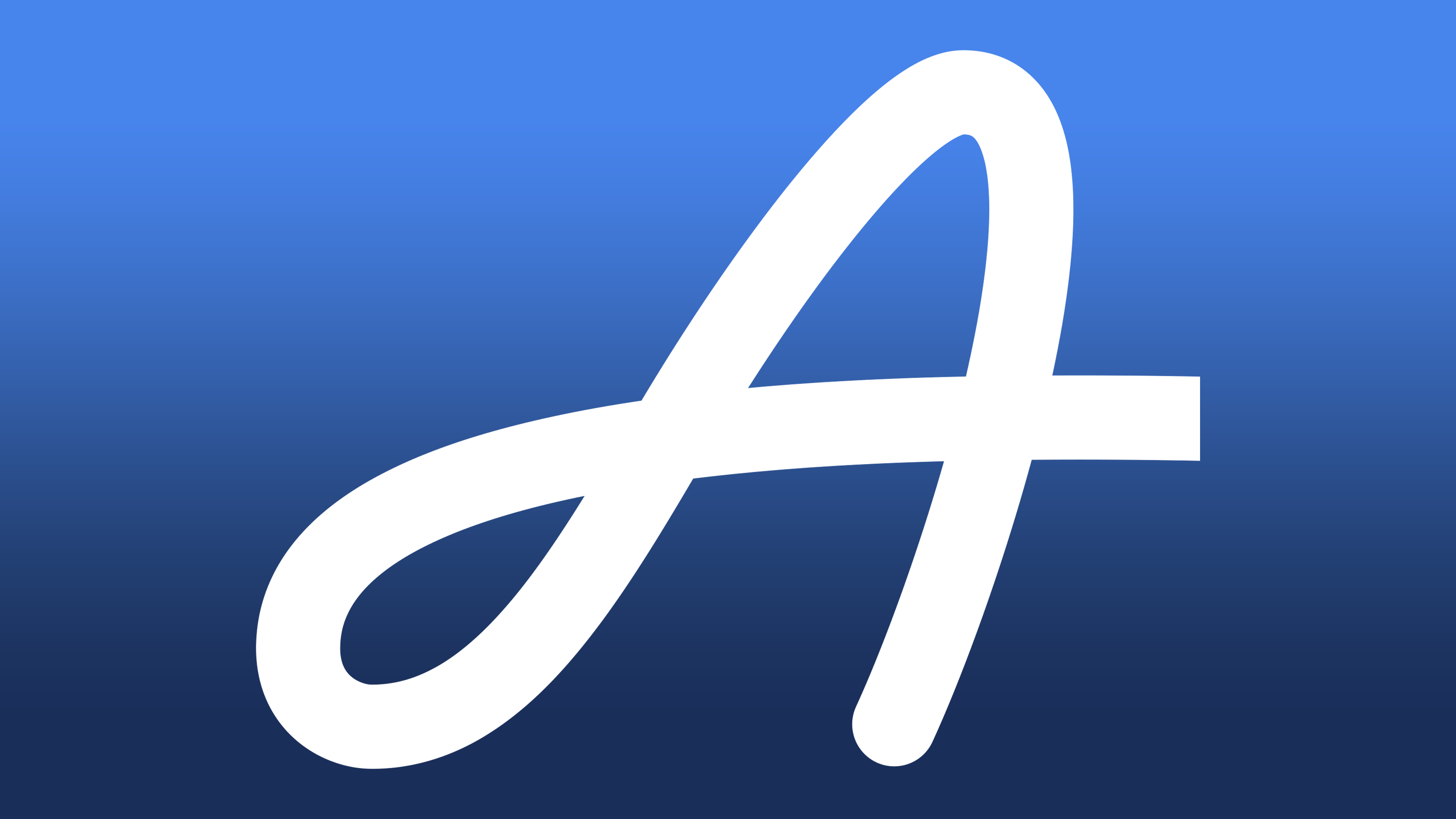
The origin story of Air’s logo is intriguing, tied to flight and air, not only figuratively but literally. Designer Richard created it quite by chance while flying over the Atlantic. The sketch appeared spontaneously on the back of a boarding pass, inspired mid-flight. Eventually, this idea evolved into the official emblem of the platform, symbolizing openness and ease.
![]()
Although the previous Air logo conveyed airiness through flowing lines, it encountered an unusual problem: the initial letter “A” was so ornate and curled that it resembled a capital “S.” This led to ambiguity, causing some people to misread the brand’s name as “Sir.” The new emblem resolves this confusion. The letter “A” is now clear, precise, and easily recognizable at a glance. The symbol acquired confident geometry and solidity, while retaining the necessary softness and association with air that define the brand.
A distinctive feature of the new symbol is its versatility. Designers were not limited to a simple flat shape but also presented the logo as a three-dimensional object. Its visualization resembles transparent glass refracting light, emphasizing the airy nature of the brand. By complementing the visual identity with dynamic animations, Air achieved the effect of a living, constantly changing emblem adaptable to various formats and contexts.
The corporate identity has also changed. The design now employs the Control typeface collection by Commercial Type, one of the most diverse and expressive on the market. Bold and expressive letterforms create contrast with the transparency and dimensionality of the graphics. This results in a unique balance: typography is deliberately solid, whereas the symbol’s visualization is light. Additionally, the team allowed itself to incorporate humor and a bit of irony into brand communication, which is unusual for the software segment but precisely matches the company’s spirit.
The refreshed style is primarily aimed at a creative audience: designers, photographers, videographers, and anyone involved with visual content. The service deliberately moved away from the formality typical of similar platforms, emphasizing emotional connection with users. This step refreshed Air’s image among competitors, enabling the platform to openly appeal to creative individuals who prioritize freedom and ease.
![]()