The logo of AirAsia X, a subsidiary of the Malaysian low-cost airline AirAsia specializing in long-haul budget flights, represents the company’s goal to make long-distance travel affordable for a wide range of passengers. It signifies AirAsia X’s focus on providing cost-effective long-distance air travel, creating new opportunities for travelers from Southeast Asia and beyond.
AirAsia X: Brand overview
AirAsia X, a well-known Malaysian low-cost airline AirAsia Group division, was established in 2007. Tony Fernandes, the founder of AirAsia, had the brilliant idea to launch this brand to apply the low-cost carrier model to long-haul routes. This was a novel strategy because the low-cost model had previously only been used for short—and medium-distance travel.
The company conducted its inaugural commercial flight from Kuala Lumpur to Gold Coast, Australia, on November 5, 2007. This route was purposefully chosen to show off the possibilities of low-cost, long-haul travel while connecting Malaysia with a well-liked tourist attraction.
2008 saw the fast expansion of the route network with the introduction of flights to Hangzhou, China, and Perth, Australia. The airline started flying long-haul routes using wide-body Airbus A330-300 aircraft, which increased passenger capacity and efficiency.
A major milestone was reached on March 11, 2009, when the company began service on the Kuala Lumpur to London (Stansted) route, marking the airline’s first trip to Europe. This was the longest low-cost carrier flight in the world at the time.
As it grew, 2010 saw the firm add new Airbus A330 aircraft to its fleet. Opening new routes, such as those to Tokyo, Japan, and Taipei, Taiwan, strengthened the airline’s standing in the Asian market.
In 2011, the airline took an important step in growing its footprint in East Asia by operating flights to Seoul and entering the South Korean market.
Amidst the Eurozone’s economic crisis and rising fuel prices, the company discontinued its flights to Europe in 2012. This was done as part of a plan to optimize its route network and focus on more profitable routes in Asia and Australia.
The business raised extra money for development in 2013 by holding an initial public offering (IPO) on the Malaysian Stock Exchange. To increase the size of its fleet, the company made a sizable order for brand-new Airbus A330-300 aircraft that same year.
By forming subsidiaries Thai AirAsia X and Indonesia AirAsia X in 2014, the company increased its footprint in Southeast Asia and added new hubs for long-haul flights.
The airline experienced financial challenges in 2015–2016 due to fierce competition and currency fluctuations. As a result, the company reorganized, streamlining its route system and cutting expenses.
Following the restructuring, the airline returned to the North American market in 2017 and began expanding again by launching new routes, one of which was to Hawaii (USA).
By expanding service on its current routes and adding new destinations, the airline concentrated on bolstering its position in the Asia-Pacific area in 2018–2019.
The company was obliged to drastically reduce its operations and start a restructuring process in 2020 due to extraordinary obstacles that required the airline to adjust to the changing realities of the market.
Meaning and History
The logos of AirAsia X have evolved over time but always kept recognizable elements that link back to the parent brand, AirAsia. The red color and distinctive font connect with AirAsia’s identity, symbolizing dynamism, energy, and an innovative approach that defines the entire group. Meanwhile, the AirAsia X logos carry a special meaning that highlights the company’s focus on long-haul flights. Through its logos, AirAsia X aims to convey the concept of making long-distance travel accessible to a broad audience.
What is AirAsia X?
It is part of the Malaysian budget airline AirAsia, specializing in affordable long-haul flights. It strives to make faraway places accessible to all kinds of travelers through low-cost tickets and efficient service. With Kuala Lumpur and Bangkok hubs, AirAsia X flies to destinations in Asia, the Middle East, and Europe using its up-to-date Airbus A330 planes.
2007
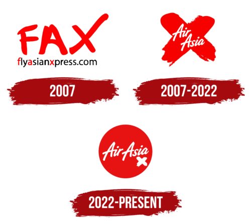
In 2007, AirAsia X, first called FlyAsianXpress or FAX, introduced a logo that spoke to its mission and approach. The red letters in its name boldly stated the airline’s focus on being fast and affordable. As part of AirAsia, AirAsia X followed the same core idea of providing low-cost flights without cutting down on comfort, aiming to make flying available to more people. The logo was a clear sign of this goal.
Choosing red for the logo was thoughtful, symbolizing the airline’s energetic and passionate approach to the industry. AirAsia X set out to change our thoughts about long-haul flights by offering budget-friendly options without lowering service quality.
The design, especially the extended “X,” was creative and meaningful. It subtly suggested the airline’s specialty in long-distance flights, pointing to its goal of connecting places like Malaysia and Australia. This design spoke of the distances AirAsia X covers and its ambition to connect different parts of the world.
The stretched “X” helped set AirAsia X apart from AirAsia and other airlines. It highlighted its unique offer: long journeys to distant places at competitive prices, challenging the usual costs of long-haul travel.
2007 – 2022
Choosing a name for AirAsia X was initially tricky. The first name, FlyAsianXpress, or FAX, didn’t quite click with people because it was too long and complicated. Tony Fernandes, an entrepreneur with big ideas, saw the need for a name that was easy to remember and stood out. He built on AirAsia’s already successful image by adding ‘X’ to signal the new focus on long-haul flights.
When it came to rebranding, they faced more hurdles. The logo, with “AirAsia” inside a big red St. Andrew’s cross, was meant to be bold and set the airline apart. However, it reminded people of medical services rather than suggesting speed and global travel. This mix-up showed how crucial design is in ensuring people see your brand how you want them to.
The ‘X’ in AirAsia X was supposed to mean more than just longer flights; it was also a nod to planes taking off, symbolizing growth and ambition. But this idea wasn’t straightforward for everyone, highlighting the tricky balance in branding between being creative and being easily understood.
2022 – today
In 2022, AirAsia X rolled out a new logo that reflected its expansion to new places like China and Europe. This logo featured a red circle that looked like a globe, fitting AirAsia X’s image as a forward-thinking airline expanding the possibilities of affordable long-haul flights. This globe symbolized the airline’s goal to connect different parts of the world.
The logo used soft white letters similar to AirAsia, ensuring the brand was easily recognized. The layout mirrored a plane’s takeoff, with words rising from bottom to top, representing growth. A bold ‘X,’ doubling as an airplane, added energy to the design, implying speed.
Yet, the logo received mixed reactions, showing how tricky it can be to convey the right message. Some people thought the globe looked like a cross-eyed smiley face from horror movies, a connection the airline didn’t intend. This unexpected interpretation highlighted the challenge of logo design: making something memorable but also clear and positive.
The logo’s mixed reception shows how personal tastes and cultural backgrounds can influence how we see visual symbols. While it aimed to showcase AirAsia X’s bold vision and wide reach, the unintended horror film association points to the complexities of visual branding. This case underlines the ongoing challenge for brands to balance being innovative with being understood, especially in a global context.
FAQ
What is the meaning of the AirAsia logo?
AirAsia’s logo has a circle that means a lot, tapping into Asian culture and ideas. Here’s what the circle stands for:
- The Sun: In many Asian places, the sun is a big deal, standing for life and new beginnings. The circle looks like the sun, showing that the airline wants to bring new opportunities and fun to people who fly with them.
- Enlightenment: In Buddhism, enlightenment means finding wisdom and peace. The circle in the logo can be seen as this enlightenment, hinting that the airline wants to open up the world to its passengers through travel.
- The World and Sky: The circle reminds people of the Earth, the sky, and the universe, connecting to the airline’s job of linking different places and making flying available to more people.
- Forever and Always: Circles never end, often meaning forever or endless possibilities. For the company, this could mean they’re always there to help you explore and find new places without end.
The circle in the logo embodies much of the airline’s mission: sticking to its Asian roots, making flying affordable, and offering endless adventures.
Who owns AirAsia X?
As of February 2022, Tune Group, controlled by Tony Fernandes and Kamarudin Meranun, who also started AirAsia, owned 17.8% of this aviation enterprise, showing that they’re still deeply involved with this airline that flies long distances at low prices. This aviation branch focuses on flying far without costing a lot. Tune Group invests in entertainment, sports, and tech, supporting the company with ideas and business know-how. Fernandes and Meranun have used their experience to grow the airline, making cheap long flights a reality for more people.
What is the strategy of AirAsia X?
This aviation operator offers long flights at low costs within the AirAsia Group and has a smart plan for growing and starting flights to new places. Here’s how they pick where to fly:
- Looking at the Market Size: They check how many people might want to fly from certain places, focusing on areas with many potential travelers and room for more people to start flying.
- Checking If People Are Already Flying There: The airline looks at the number of flights to these places and whether more people are starting to fly there to determine whether a new route would be popular.
- Wanting Different Types of Travelers: They aim for places where different kinds of travelers would go, like those traveling for fun, work, or to see family. This way, flights are likely to be full all year round.
- Seeing Who Else Is Flying There: The aviation enterprise looks at the competition, such as other airlines and their offerings, to find spots where it can be the go-to choice without cutting prices too much.
The company picks new places to fly that will likely do well and make money by following these steps.
What’s the difference between AirAsia and AirAsia X?
AirAsia and this branch are like two branches of the same tree, the AirAsia Group. They both offer cheap flights but aim at different types of trips.
AirAsia is the main part of the group, focusing on short trips. It flies within Asia, connecting lots of places with quick flights. The airline uses smaller planes, like the Airbus A320, which are perfect for these shorter hops and help keep flights cheap for everyone.
The branch stretches things further, dealing with longer flights. It was started to bring cheap tickets to faraway places. AirAsia sticks to quick, local trips with smaller planes, while this branch takes you further away with bigger planes. Both are about making flying affordable for different lengths of trips, helping the AirAsia Group meet all kinds of travel needs.


