


![]() Airbnb Logo PNG
Airbnb Logo PNG
The Airbnb logo promotes accommodation and housing products worldwide. The emblem embodies the “Belong Together” symbol, which consists of four themes: people, places, love, and the company itself.
Airbnb started in 2007 in San Francisco when Brian Chesky and Joe Gebbia rented out air mattresses in their apartment during a sold-out design conference. In 2008, Nathan Blecharczyk joined, and the service launched as AirBed & Breakfast, focusing on short stays during large events, including the Democratic National Convention in Denver.
Early growth came with difficulty. To raise funds, the founders sold limited-edition cereal tied to the 2008 election, earning about $30,000. In 2009, Y Combinator provided initial investment, and the platform dropped the air mattress concept and rebranded as Airbnb.
By 2010, the company launched a mobile app, secured $7.2 million in funding, and opened its first European office in Hamburg. In 2011, it reached 1 million bookings but faced a trust crisis after a host’s home was damaged, prompting the launch of a $50,000 host guarantee.
Expansion accelerated in 2012 with offices in São Paulo, Barcelona, Paris, London, and Milan, alongside the introduction of Instant Book. In 2013, the “Bélo” logo appeared, marking a shift in brand identity.
From 2014 to 2017, Airbnb added Experiences, business travel tools, and premium listings through Luxury Retreats and Airbnb Plus. In 2019, it acquired HotelTonight and prepared for a public listing.
Despite the 2020 disruption, the company completed its IPO in December. From 2021 onward, it focused on long-term stays and remote work through programs like Live Anywhere, adapting its model to new travel patterns.
Meaning and History
![]()
When Airbnb first started, it was a small startup offering a place to stay with strangers. Over time, the company expanded and evolved into a global platform for booking accommodations worldwide. The logo needed to reflect this growth and the company’s new values. It is not just a housing rental service; it is a community of people who trust one another and create unique travel experiences.
What is Airbnb?
Airbnb is an American corporation that provides housing for tourists in private homes. This unique type of accommodation led to a revolution in the tourism industry, as travelers previously stayed only in hotels or hostels. The company operates through its eponymous website, where users can book accommodation. The company was founded in 2008 by Brian Chesky and Joe Gebbia.
2007 – 2008
![]()
Once known as AirBed & Breakfast, this reflected the business concept of three friends from San Francisco who, in 2007, decided to rent out an inflatable mattress in their living room and, coincidentally, serve breakfast to travelers. Thus, the name represented the full range of services. The short yet meaningful phrase served as the basis for a three-level logo. The first line was occupied by the blue word “AirBed&,” the second by the purple “Breakfast,” and the third by the blue phrase “idsa connecting ’07”. All were aligned to the left edge. The upper lines used a bold, Comic Sans-style bubble font, while the lower ones used a thin, low-contrast sans-serif font.
2008 – 2009
![]()
In 2008, the wordmark underwent a redesign. The designers placed the company name on one line and the long inscription on a white base with a light gray shadow, which spread as a gradient around the entire outline. This shadow replicated the letter outlines, making the logo look like a sticker. Thanks to the brighter, more saturated colors, the phrase “AirBed & Breakfast” stood out against the background. Below was the slogan “Forget about hotels” with a period at the end. It was right-aligned and consisted of dark gray sans-serif letters. The font roughly resembled Proxima Nova Condensed Medium by Mark Simonson Studio.
2009 – 2010
![]()
In 2009, the founders of AirBed and Breakfast underwent training at the Y Combinator venture fund and, as part of the collaboration, received funding to develop the company. Some of the money went into rebranding, as the platform expanded its service offerings that same year, changed its name to Airbnb, and updated its logo. Thus, a wordmark appeared with a shortened inscription, with only the letters “Air” from the first (blue) half and “BnB” from the second (hot pink) half. A common white contour still outlined them, but the designers reduced the blurring of the gray shadow along the edges.
2010 – 2013
![]()
The creators of the new logo decided to unify the font and color, so the inscription became blue and was set in lowercase. The company used a custom set of glyphs to mimic handwritten text. The letters were characterized by thickening and smooth, rounded lines. Notably, the letter “r” was not connected to the following “b” but was separated from it by a thin white contour. The style of the Airbnb logo remained unchanged: it still resembled a sticker, with blurred gray shadows appearing in the distance behind the word. At the same time, it developed a linear gradient: the bright blue at the top faded to a pale shade.
2013 – 2014
![]()
The original version of the logo featured “inflated” letters, as if filled with air. This was done intentionally, as such a design is associated with the soft, inflatable mattress mentioned in the name. The lowercase letters were outlined in blue and visually resembled handwritten inscriptions. The lines were wide and sweeping.
2014 – 2020
![]()
In 2014, the project updated its logo, modernizing it, making it original, and incorporating meaningful symbols. In this version, both graphical and textual elements are equally utilized. The icon is on the left, and the name is on the right. The elements are simple, and the background is white.
2020 – 2025
![]()
The Airbnb logo, which has become a symbol of hospitality and openness, has undergone some changes but has retained its recognizability and the key elements established from the outset.
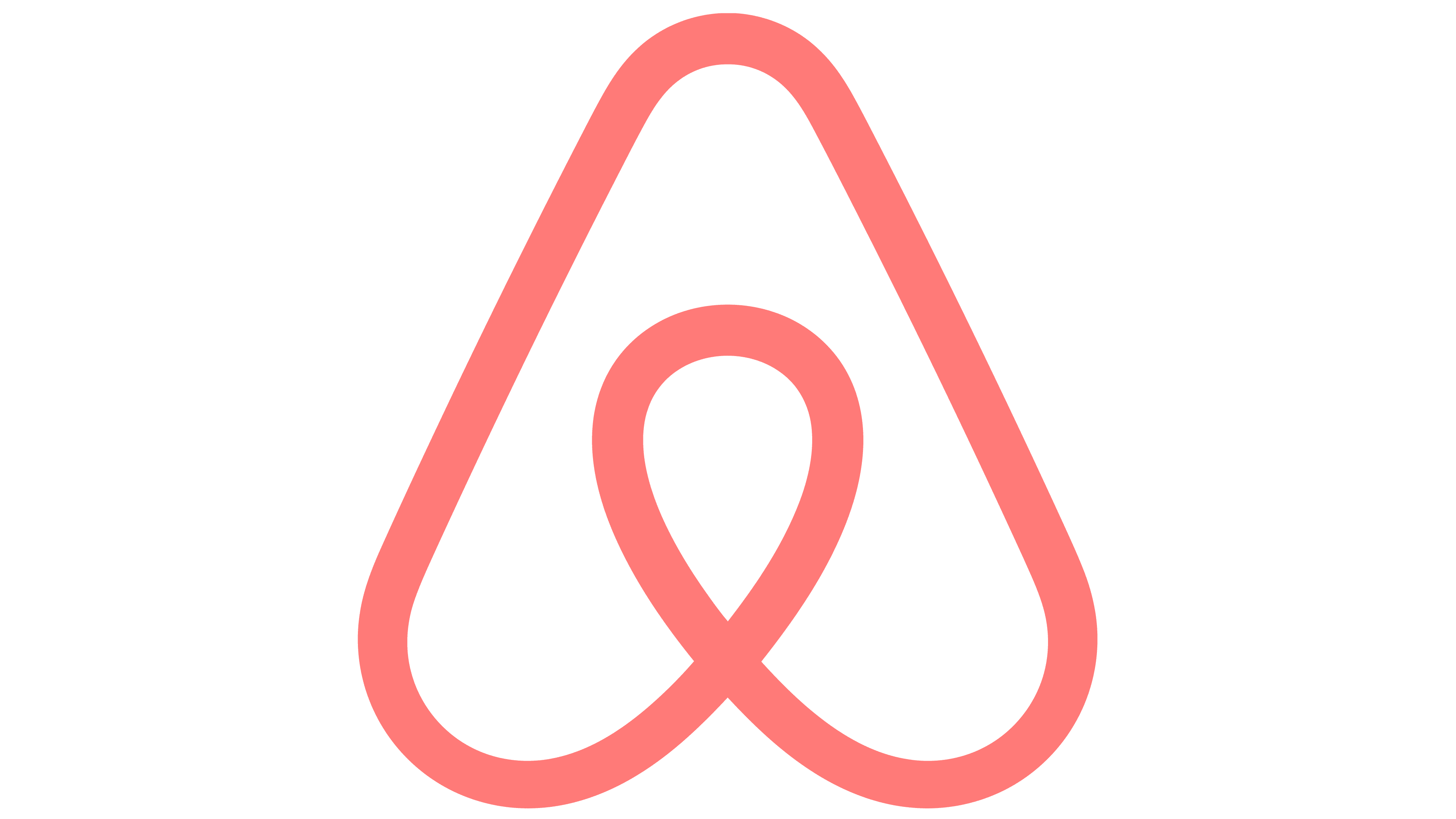
The primary element of the logo is an abstract symbol that conveys multiple meanings. This shape, reminiscent of a drop, a heart, and an inverted letter “A,” remains unchanged. This symbol continues to represent the connection between people and the platform’s universality.
The font has also remained the same. It is still rendered in a soft, rounded style, which adds a sense of friendliness and accessibility. The smooth lines and absence of sharp angles emphasize the company’s desire to create a cozy and comfortable space for everyone.
The primary change involves the color. The rich pink shade has been slightly altered. Previously, the color was somewhat brighter; now, it has become slightly warmer and deeper. This subtle change is intended to give the emblem a modern look while maintaining its brightness and memorability.
2025 – today
Font and Colors
The updated design was developed by DesignStudio from London (UK). This version represents a stylized letter “A,” comprising four elements, each with a distinct meaning. Specifically, these are people, places, love, and Airbnb itself, uniting them. Together, they form a simple yet unique figure, commonly referred to as “Belong Together.”
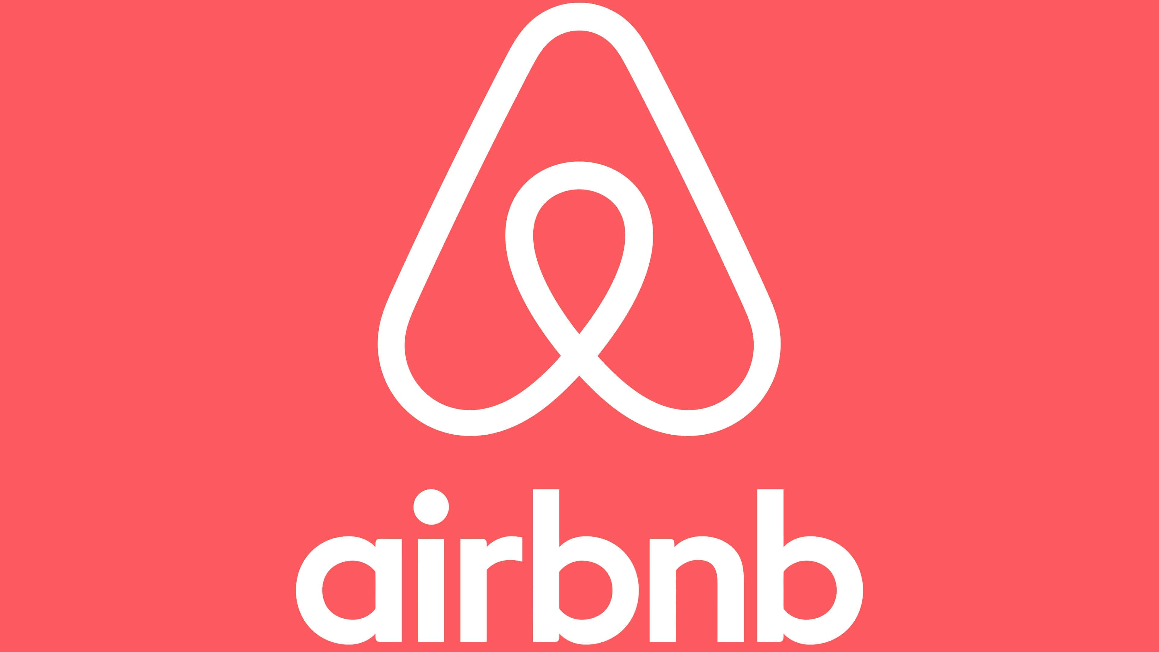
The original Airbnb font is airy and italic, while the modern one is strict and classic. The letters on the emblem are streamlined, minimalist, sans-serif. The color palette remained the same to avoid cluttering the service’s visual perception. The debut version features a combination of white and light blue, while the current one features rich red.