The Airlink logo works as a silent yet effective communicator, conveying a sense of speed, reliability, and thoroughness. The airline’s design reaffirms its commitment to providing an exceptional flying experience crafted with quality and punctuality in mind.
Airlink: Brand overview
Founded in 1992 in Johannesburg, South Africa, Airlink is a regional airline that caters to small towns and isolated places not serviced by major national carriers. This reflects Africa’s changing political and economic climate as it opened up to the outside world after the end of apartheid.
The airline and South African Airways (SAA), the country’s carrier, established an alliance in 1995. This collaboration allowed the company to provide passengers with additional connecting flight alternatives and grow its route network. Code-sharing arrangements were a feature of the relationship, raising the company’s profile in the industry.
1997, the company started a major fleet expansion by purchasing several brand-new Jetstream 41 turboprop aircraft. This acquisition enabled the launch of new routes and increased flying frequency in the area.
Around the turn of the century, the airline began its global expansion by operating flights to nearby nations, including Namibia, Botswana, and Mozambique. This growth reflected South Africa’s expanding influence in the regional economy and the developing trade and tourism ties among the member nations.
2006, the company debuted the Embraer ERJ 135 as its first jet aircraft. This allowed for more effective servicing of longer routes and provided customers with greater comfort.
2009, the company changed its name and unveiled a new logo and aircraft livery. The new design reflected the company’s modern and dynamic spirit and dedication to innovation in regional air transport.
The airline celebrated its 20th anniversary in 2012 as the biggest independent regional airline in South Africa, continuing to serve over 35 destinations.
In 2014, the company added the bigger ERJ 140 and ERJ 170 aircraft to its Embraer fleet, greatly increasing its size. This allowed for the addition of new destinations and an increase in passenger capacity on well-traveled routes.
In 2017, the airline and South African Airways (SAA) terminated their long-term franchise arrangement. This decision was made due to SAA’s financial struggles and the airline’s wish for more market freedom.
In 2018, the company continued its global expansion by opening new routes to Madagascar and Zimbabwe and bolstering its presence on already-established foreign routes.
At the beginning of 2020, the airline underwent a significant rebranding, adopting a new aircraft livery and renaming itself. Along with starting up entirely autonomously, the business stopped using South African Airways’ “SA” code.
Meaning and History
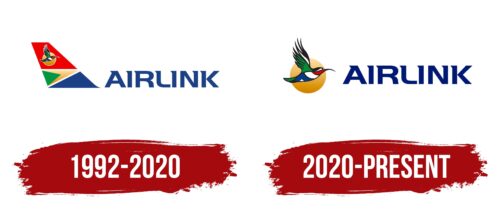
Airlink’s logo changes reflect the airline’s growth and commitment to providing easy and dependable services for regional travel. The logos have consistently included symbols of connectivity, dependability, and progress, which are attributes Airlink aims to represent. A common element across many of Airlink’s logos is the stylized depiction of a bird or airplane, emphasizing the airline’s dedication to air transportation and its role in linking different areas in South Africa and nearby nations. This imagery has become central to Airlink’s brand identity, underlining its standing as a reliable, flexible, and liberating choice for travelers.
What is Airlink?
Airlink, also known as South African Airlink, is a well-respected airline headquartered in Johannesburg, South Africa. Starting in the 1990s, Airlink committed to delivering air transport services. Through hard work and dedication, it has expanded to become a major airline in South Africa. Airlink offers passenger and cargo flights covering a wide range of African destinations.
1992 – 2020
From 1992 to 2020, Airlink’s logo showcased South Africa’s rich natural beauty and cultural diversity, aligning with the vibrant colors of the national flag. The logo’s design, combining blue, red, green, white, and yellow, represents South Africa’s diverse communities and natural resources, aiming for peace and prosperity.
The logo cleverly uses two triangles and a square to symbolize water, earth, and sky—essential elements for life. Blue stands for water, essential for life; yellow for sand; and green for plant life, depicting ecological balance. Alternatively, blue represents the sky, yellow represents the sun, and green signifies growth under the sun, reflecting the country’s prosperity.
Red, covering a large area, symbolizes energy, speed, and aviation as the fastest mode of travel, indicating Airlink’s dynamic operations. A bird, mirroring the colors of the national flag, highlights Airlink’s commitment to South African values and service. This bird, a nectarine with colorful feathers, embodies South Africa’s fauna’s beauty, grace, and speed, resonating with Airlink’s image.
The logo’s unique font, with each letter marked by a triangle resembling an airplane’s tail, adds aviation flair and elegance. This design choice underscores Airlink’s deep connection to South African heritage and commitment to efficient, graceful service.
2020 – today
The logo features a striking Sunbird, symbolizing the airline’s expansive network across the bird’s natural living areas. The Sunbird, celebrated for its bright plumage and nectar-seeking behavior, parallels the airline’s practice of gathering travelers from different spots, similar to how the bird collects nectar. This resemblance inspired the decision to adopt the Sunbird as the airline’s emblem, capturing the essence of its operations’ efficiency, focus, and intent. The depiction of the bird’s flight, direct and purpose-driven, aligns with the airline’s aim to offer straightforward and meaningful services to its customers.
The emblem illustrates the Sunbird using a vibrant mix of red, green, black, blue, and white hues, set against a sun-representing yellow circle. This vivid portrayal draws attention and highlights the airline’s lively and dynamic character. The bird points towards “Airlink,” presented in a bold typeface with distinctive one-sided serifs that lend a unique flair to the wording, boosting the logo’s visual attraction.
Featuring the Sunbird against the Sun signifies the areas serviced by the airline. It conveys the sun’s warmth, vitality, and nurturing aspect, mirroring the airline’s aim to invigorate and enrich its service offerings. The chosen colors for the bird and the sun pay tribute to the natural hues observed in the Sunbird’s surroundings while also representing the airline’s identity—varied, full of energy, and comprehensive.
This emblem, rich in symbolism and vibrant hues, effectively conveys Airlink’s principles and approach to service. It symbolizes the airline’s commitment to direct, streamlined, and lively travel experiences, akin to the Sunbird’s enthusiastic quest for nectar. Thus, Airlink symbolizes connection and vigor in the aviation sector.
FAQ
What is the bird on the Airlink logo?
Airlink picked the Sunbird for its logo to stand out in the busy airline world. The Sunbird, known for its bright colors and lively nature, shows what Airlink aims for: quick, smooth flights and connecting places with ease and style.
Choosing the Sunbird, which lives in areas Airlink flies to, shows the airline’s care for the places and people it serves. In February 2008, Airlink passed a big safety check called the IATA Operational Safety Audit (IOSA), proving it meets top safety standards. Getting the “4Z” code from IATA was a big thumbs-up for following global best safety practices.
What is the Airlink motto?
Airlink’s motto is about being the best rather than the biggest. It’s their way of saying that quality matters more to them than just how large their operations are. This motto shows that Airlink cares deeply about offering top-notch services to everyone who flies with them. They focus on ensuring the flying experience, from safety and reliability to customer service.
This motto guides everything Airlink does. Whether choosing their planes, planning flights, or how they treat customers, it’s all about ensuring they deliver the best service possible.
Who owns Airlink?
Airlink operates independently, not relying on government funds to stay afloat. This independence allows Airlink to meet traveler demands, making it stand out swiftly. A significant source of its strength is its connection to the community. Families from Sishen, Sishen South, and Thabazimbi, totaling 350,000, own shares in the airline. These families have encountered hardships, and owning a part of Airlink helps improve their situation. Through this shared ownership, Airlink contributes to positive development and growth in South Africa.
What are the core values of Airlink?
Airlink believes in doing well by doing good. It’s all about making money in a way that helps people, the economy, and the planet. They think long-term, ensuring their business helps everyone involved—passengers, employees, and the places they fly to. They’re big on being open and honest, making sure they’re a company you can trust. Working hard and doing your best is important at Airlink, as is working together and treating everyone fairly and respectfully.
They mix hard work, honesty, and teamwork with caring about the environment and society. This mix is their secret sauce, making them more than an airline. They aim to lead by example, showing how a business can be successful and still do good in the world.


