 South African Airways Logo PNG
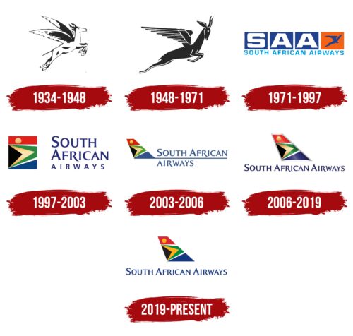
The South African Airways logo, resembling a colorful depiction of Africa, highlights the uniqueness and impressive diversity of the nation’s people. The emblem displays a sense of national pride and respect for all the brand’s passengers.
South African Airways: Brand overview
South African Airways (SAA) took flight on February 1, 1934, after the South African government purchased the assets of Union Airways. This move aimed to establish a dependable national carrier linking the country internally and internationally. The airline started with a modest fleet of Junkers F13 and F14 aircraft.
The airline continued its domestic operations throughout World War II, ensuring vital connectivity nationwide. In the post-war era, the company expanded its reach significantly. In 1945, the airline launched its first intercontinental flight to London using Avro York aircraft, marking a significant milestone in its international endeavors.
The 1950s marked the company’s entry into the jet age. 1953, the airline acquired its first De Havilland Comet jets, becoming the first non-British airline to operate these advanced aircraft. This acquisition drastically reduced international travel times and enhanced passenger comfort.
During the 1960s, the airline expanded its international network, adding routes to Europe and Australia. However, the company faced political challenges due to South Africa’s apartheid policies, which led to airspace bans by numerous countries, necessitating longer detour routes.
In the 1970s, the airline continued to innovate technologically despite international isolation. In 1976, it became the first to operate the Boeing 747SP, which enabled ultra-long-haul nonstop flights, particularly between Johannesburg and New York.
In the 1980s, intensified international sanctions against the apartheid regime complicated the airline’s operations. The company had to halt flights to the US and several other countries, yet it persisted in modernizing its fleet and improving services on the remaining routes.
With the end of apartheid in the early 1990s, the company began a period of transformation. The lifting of sanctions allowed the airline to restore many previously suspended routes. The company aimed to become more inclusive and representative of the new South Africa.
In the 2000s, the airline joined the Star Alliance in 2006, enhancing its collaboration with other airlines. However, this period was marked by financial difficulties, requiring government support and restructuring efforts.
The last decade has proved particularly challenging for the company, with persistent financial struggles leading to repeated government bailouts. Despite efforts to restructure and optimize operations, sustained profitability remained out of reach.
In December 2019, the airline entered business rescue to undergo extensive restructuring. This process continued into 2020, involving temporary flight suspensions and the development of revival plans to secure the airline’s future.
Meaning and History
What is South African Airways?
This is the national carrier of South Africa, based in Johannesburg. It is known for its role as a key connector between Africa and the rest of the world. The airline operates a wide-body Airbus A330 and A350 aircraft, serving routes on six continents. The uniqueness of the airline lies in its Voyager program, one of the first loyalty programs in Africa. It allows members to earn miles for flights and purchases with partners.
1934 – 1948
Founded in 1934, South African Airways chose a unique and significant symbol for its first logo. The figure of Pegasus inspired the image, but instead of a mythical winged horse, the logo featured the Springbok antelope (Antidorcas marsupialis), the national symbol of the Republic of South Africa. This antelope is known for its ability to make high vertical jumps over several meters and speed, making it a perfect representation of lightness and speed.
The logo combined the idea of flight with distinctive features of South Africa, allowing the airline to express its innovation and emphasize its deep connection with the country’s culture and heritage. The black and white color of the emblem had additional significance, symbolizing the country’s African heritage, which added even greater significance and depth to the logo.
1948 – 1971
In 1948, the airline’s logo, which featured an antelope, underwent significant changes to become more expressive and detailed. The antelope was depicted in solid black with a white outline, providing a special contrast and visual impact. The refinement in detail made the image more lifelike and dynamic.
A particularly memorable element was the antelope’s swift leap and the sweep of its wings, symbolizing the ability to traverse long distances. This image reflected the unique operational conditions of the airline during those years. During apartheid, due to policies not supported by many countries, the airline was forced to perform only long-haul flights. It lost the ability to use many intermediate airports for landing, making its operations more complex and risky.
The antelope’s forward-pointing horns became another powerful symbol. They portrayed the animal’s readiness to defend itself and face any challenges, including competition in the aviation industry.
1971 – 1997
South Africa’s departure from the Commonwealth marked a pivotal moment in its history, representing a turning point in its development. This event symbolized a new era in which the country and its major companies began redefining their strategies and goals.
Against this backdrop, the rebranded South African Airways expressed the airline’s aspirations and ambitions. The visual embodiment of this idea was reflected in their new logo, which featured large white letters of the abbreviation SAA set against blue squares. These elements, reminiscent of giant clouds filling the sky, emphasized the broad possibilities and scope of the company’s operations.
Each letter in the abbreviation stands for South African Airways, which is clarified below in smaller blue font that spells out the company’s full name. This was the first instance of using the full name in the company’s logo, highlighting their readiness for open and transparent dialogue with customers and partners.
The design was executed on such a scale that it accentuated the carrier’s grandeur, reach, and power. Additionally, in an orange rectangle was a blue silhouette of an antelope looking out from its flight height. With wings spread, the animal seemed to soar in the air, symbolizing the freedom it finally felt thanks to a powerful gust of wind. This element emphasized the company’s striving for new heights under newfound freedom.
1997 – 2003
The 1997 logo of South African Airways is closely tied to the redesigned flag of the Republic of South Africa, symbolizing a new era post-apartheid. The flag, with its red and blue design recalling the era under British rule, serves as the backdrop for a more intricate and significant image. Across the flag, there is a composition in the form of a tandem of fork-shaped elements colored white, green, yellow, and black, each representing one of the main racial groups of the country, unified in a multiracial society.
The company transformed this symbolic image by adapting it to its context and emphasizing the aviation theme. On the red segment of the flag, the hot sun of Africa is depicted, symbolizing the heat and energy of the continent. The airline’s planes appear to soar in this warm atmosphere, using the warm air currents for their flights.
The central part of the flag, with colorful, sharp elements, focuses attention on the comprehensive service provided by South African Airways to all customers, regardless of their ethnic background. These pointers symbolically guide the view towards the company’s global service and inclusivity. Below these elements is a blue stripe representing the oceans the company’s airliners crossed, connecting continents and cultures.
To the right of the flag, against a blue background, there is a large inscription of the company name, “South African Airways,” arranged in three levels to enhance visual impact and brand recognition.
2003 – 2006
South African Airways proudly ranks among the top ten airlines worldwide, a status highlighted by introducing a new logo. This symbol, crafted as an airplane, marks the company’s high achievements in the aviation industry. The main concept of the logo design combines national symbols and corporate identity, seamlessly integrating historical roots with modern aspects of operations.
The new emblem’s tail is painted in the colors of the national flag of the Republic of South Africa and extends into the airplane’s fuselage line. This design choice is visually appealing and carries deep symbolic meaning, emphasizing the airline’s commitment to its heritage and its aspiration to be recognized as a symbol on the international stage.
The sides of the airplane are formed from light blue letters spelling out the company’s name. The color of the letters adds elegance and a sense of airiness to the image, making it easily recognizable and memorable. The visual simplicity and clarity of lines highlight the company’s dynamism and innovative approach to the aviation industry.
The logo of South African Airways is a branding element and a reflection of the company’s strategy. It blends national identity and industry specificity, underlining its status as one of the leading global airlines.
2006 – 2019
South African Airways gained new recognition and prestige by joining Star Alliance, one of the world’s largest aviation alliances. This membership significantly influenced the airline’s corporate image and branding, as reflected in the design of its emblem.
The emblem of South African Airways was enhanced with a silver outline around the airplane’s tail, painted in the national colors of the Republic of South Africa. This outline decorated the logo and symbolized the company’s high status in the international aviation industry. It underscores the airline’s commitment to providing premium services to its passengers, reflecting its dedication to exceptional quality and customer focus.
Additionally, using dark blue for the company name enhances the impression of professionalism and reliability. This color choice is deliberate: dark blue is associated with expertise, stability, and trust, which are crucial for an airline striving to highlight its experience and skill in serving customers globally.
2019 – today
In 2019, facing financial difficulties, South African Airways turned to specialists to save the company from bankruptcy. This effort led to a significant brand transformation, including a change in its visual representation. This change symbolized the start of a new phase in the company’s life and its commitment to recovery and renewal.
As part of this brand reboot, while the main symbol—the image of the country’s flag—was retained, significant changes were made to the design. The previously used silver metallic outline was removed. This elimination added simplicity to the logo and reduced its visual complexity, reflecting the company’s new strategic focus on cutting costs and simplifying operations. As a result, the logo now appears less bright and conspicuous, symbolizing a shift away from former luxury towards a more pragmatic and functional approach.
The inscription of the company’s name was changed to a lighter shade. This color change emphasizes South African Airways’ aim to become more accessible and focused on a broader consumer base. It reflects the company’s desire to be more open and customer-oriented.
