“With us, you will hear the caller perfectly,” the Airtel logo promises. The company is constantly improving its technologies and equipment, which allows it to occupy a leading position in the market.
Airtel: Brand overview
| Founded: | 7 July 1995 |
| Founder: | Sunil Bharti Mittal |
| Headquarters: | New Delhi, India |
| Website: | airtel.com |
Meaning and History
Having received a telecommunications service’s official status, the company immediately thought about developing a simple but bright logo. She stopped her choice on the name, which she decided to play uniquely.
What is Airtel?
It is an international telecommunications operator from India. He works on the territory of his country, as well as in 18 countries of the world. He specializes in mobile networks, fixed broadband, and a variety of voice services.
1995 – 2010
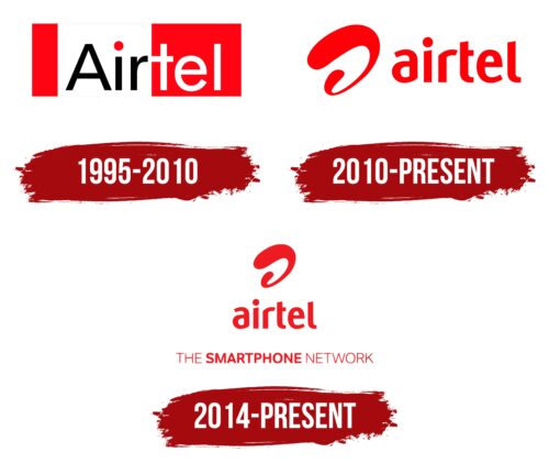
The original version shows a two-color rectangle with one white stripe and two red ones. On a light background is the first part of the operator’s name – the word “Air” with a red dot above the black letters. On the red half is the second segment of the name – “tel.” The inscription is made in an unremarkable sans-serif font – strict and too straight. The only highlight is the junction of the letters “r” and “t” at the level of a single line that runs between the cap and the crossbar.
2010 – today
Further expansion of the business led to a renewal of the global telecommunications network strategy and required a rebranding. The implementation of the strategically important idea began in 2010 when a new identification mark was adopted, proposed by the London agency Brand Union. According to the author’s idea, it appeared as a result of a six-month online competition and reflects the limitlessness of telephone communication.
The emblem is based on the stylized letter “a” or, as the company claims, “Airtel wave.” The semi-swirled symbol is in front of the service name and is incorporate red. It consists of a single line, which is thinner in distant places and wider in closer ones according to the spatial perspective.
2014 – today
In 2014, a telecommunications company started using another logo in addition to the one created in 2010. This version is more structured because it contains the phrase “THE SMARTPHONE NETWORK,” where the second word is emphasized in bold. All other letters are thin. The motto is written in grotesque and is located at the very bottom, centered. Above it is the name Airtel, rendered in the traditional style of custom lowercase glyphs. And even higher is the brand’s iconic symbol in the form of a wide deformed spiral. It looked plastic due to its smooth curves and rounded ends. It contains the letter “a.” This emblem is red, like the previous one, but its color has a tint similar to a light marsala.
Airtel: Interesting Facts
Airtel, or Bharti Airtel Limited, is a big name in global telecommunications, offering services in several countries.
- Start and Growth: Sunil Bharti Mittal founded Airtel in 1995. It began with mobile services in Delhi, India, and has grown into one of the world’s largest telecom operators.
- Worldwide Operations: Airtel works in 18 countries across South Asia and Africa, making it the world’s second-largest mobile network operator by subscribers.
- Tech Innovations: Airtel was one of the first in India to offer 4G services. It’s known for embracing new technologies to improve connectivity and services.
- Financial Services: In 2016, Airtel started India’s first payments bank, Airtel Payments Bank. This move aimed to provide banking services to the unbanked population through Airtel’s network.
- Digital Services: Airtel leads digital transformation, offering digital platforms like Airtel Xstream, Wynk Music, and Airtel Thanks for digital entertainment and rewards.
- Partnerships: Airtel has partnered with global tech companies like Google, Amazon, and Cisco to boost its services with the latest technologies.
- Market Position: Airtel is a top telecom operator in many markets, thanks to its broad services and focus on customer satisfaction.
- Educational Efforts: Airtel supports education for underprivileged children in rural India through the Bharti Foundation, with the Satya Bharti School Program being a key initiative.
- Services in India: Airtel offers a wide range of services in India, including mobile, fixed line, broadband, IPTV, and DTH, serving a huge customer base.
Airtel’s growth from a startup to a major global telecom player shows its innovative approach, dedication to customers, and ability to keep up with industry changes.
Font and Colors
Even though the updated logo is much more progressive than the previous version, some experts criticized it for its lack of personality. They see it as similar to the graphic designations of Videocon, Vodafone, and Air Arabia. Such a roll call in design is because the same British studio Brand Union developed the Vodafone emblem. Critics have also noted the icon’s similarity to an uppercase “D” rather than a lowercase “a.” This forces the telecommunications operator to place the explanatory word “airtel” next to the letter.
The logo uses one of the typefaces of the Ubuntu family – from the Medium category. She has lines of medium width, free intersymbol space, slightly cut strokes. The lower right corner of the letter “a” is absent, as well as the lengthening of the “l” and “t,” so the inscription looks light and airy. Visually, it is in harmony with the graphic sign in the form of a wave, balanced by the unfinished strip.
The telecommunications company chose the red shade Hex: # FF0000 as their corporate color. It conveys dynamism, energy, intensity well. The early version was combined with white and black, which made the palette difficult to visualize. Now bright red is more memorable: it is on a white background and is not shaded by any other color.
FAQ
What does the Airtel symbol mean?
The Airtel logo features a stylized “a” called the Airtel wave. This design is central to the brand’s identity. The name “wave” was chosen through a six-month online contest. The wave symbolizes “no boundaries,” reflecting the brand’s seamless and limitless communication mission.
The dynamic shape of the wave suggests movement and connectivity, showing the company’s commitment to innovation and connecting people across different regions and cultures. The design conveys freedom and endless possibilities, aligning with the brand’s vision of breaking down communication barriers.
The symbol communicates the company’s goal of being a telecommunications leader and providing reliable and expansive customer services.
Who created the Airtel logo?
The London-based brand agency Superunion created the logo. It features a lowercase “a” with “airtel” written beneath it. The logo was introduced on November 23, 2010, when the brand rebranded its Africa operations to “airtel.”
Superunion designed a modern, dynamic logo reflecting the brand’s mission of seamless communication. The lowercase “a” symbolizes approachability and simplicity, while the wave-like design suggests movement and connectivity. The new logo captures Airtel’s vision of breaking down communication barriers and connecting people across different regions.
What is the Airtel slogan?
The brand slogan, “Reason to Imagine,” highlights the brand’s role in empowering young people’s dreams and ambitions. This campaign shows Airtel’s commitment to providing the tools and connectivity needed to pursue any aspiration.
“Reason to Imagine” reflects the brand’s mission to inspire and support creativity, innovation, and personal growth. It reinforces the brand’s image as a modern and supportive force in the lives of young people, encouraging them to imagine and achieve their goals.
What is the Airtel network?
Airtel, known as Airtel India, is the second-largest provider of mobile telephony and the third-largest provider of fixed telephony in India. It offers broadband and subscription television services.
The mobile network covers urban and rural areas, delivering voice and data services to millions. Its broadband services provide high-speed internet, meeting the demand for reliable and fast connectivity for homes and businesses. The subscription television service offers a variety of channels and entertainment options, enhancing the viewing experience for customers.
What does the Airtel logo mean?
The logo symbolizes the dynamic energy that connects the company with its customers. It features the first letter of the brand name, “a,” in a stylized graphic icon. The wavy shape and curved lines represent movement and seamless communication.
The soft highlights make the logo warm, lively, and inviting, reflecting the brand’s approachable and customer-friendly nature.
The logo communicates energy, connectivity, and warmth values, making it a recognizable and appealing symbol for customers.
What is the font of the Airtel logo?
The logo uses a strict geometric font with a slightly rounded shape, giving it a modern and approachable look. The ends of some letters are cut off, adding a unique touch to the design.
The geometric font conveys precision and stability, aligning with the brand’s image as a reliable and innovative telecommunications provider. The rounded shapes make the logo friendly and inviting, reflecting the brand’s focus on customer satisfaction and accessibility.
Why did Airtel change its logo?
The brand changed its logo after acquiring the African operator Zain Telecom. Zain’s logo had a light wave design. To retain Zain’s customers and maintain brand recognition, the brand adapted its logo to include elements of Zain’s design.
The new logo kept the light wave concept but added a name, with a stylized “a” at the center. This “curl” shape helped merge the identities of both companies, creating a unified brand that resonated with existing customers and attracted new ones. By adopting elements from Zain’s logo, the company ensured a smooth transition and maintained customer loyalty.
