AIS: Brand overview
In 1985, AIS emerged in Thailand as the cellular services arm of the Charoen Pokphand Group. Established under Thaksin Shinawatra, the company received one of Thailand’s first mobile operator licenses. By the following September, AIS had commercially launched analog mobile communications based on the NMT-450 standard, pioneering mobile communications in Thailand.
A significant technological transition occurred in the early 1990s when AIS moved to the GSM standard. In 1991, the company opened Thailand’s first GSM network. During the decade, the company aggressively expanded its footprint throughout Thailand, introducing many new features such as text messaging, global roaming, and prepaid subscription options.
The ownership dynamics of the company changed in 1997 when the Shinawatra family took a controlling stake, and the Charoen Pokphand Group reduced its stake. For a long time, AIS remained the only cell phone operator in Thailand. This monopoly was maintained until the early 2000s when other players such as DTAC and TrueMove emerged.
A major event for AIS was in 2003 when the company went public by listing its shares on the Thai Stock Exchange. This came at an era of dramatic subscriber growth. The company now dominates the Thai telecommunications market with around 45 million users on 2G, 3G, and 4G/LTE platforms.
Looking to the future, AIS is betting on new technologies such as 5G and the expansion of digital services beyond traditional mobile communications. Now largely owned by Intouch Holdings, AIS employs over 4,000 people and continues to be a major player in the Thai business landscape after more than three and a half decades of operation.
Meaning and History
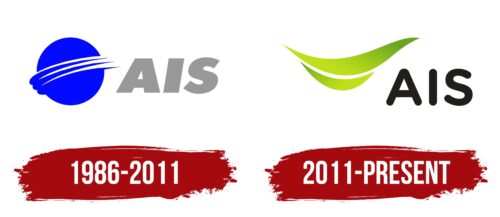
1986 – 2011
2011 – today
The Thai cell phone operator wants to make a friendly impression on its customers, so it chose a logo with a smile. The smile is clearly visible in two slightly curved, elongated lines. These elements also resemble leaves in color, shape, and pointed tips. There is a small gap between the upper and lower lines, making them resemble the lips of a smiling person. The inscription is an abbreviation formed from the phrase Advanced Info Service. The letters are rounded, which also creates a sense of good-naturedness.
The choice of greenish color for the lines creates a feeling of nature. The space between the lines is optimal, not too big and not too small, so it creates the feeling of a sincere rather than forced smile. The rounded letters in the inscription look casual as if they are part of the whole friendly theme.
AIS color codes
| Bitter Lemon | Hex color: | #bddf19 |
|---|---|---|
| RGB: | 189 223 25 | |
| CMYK: | 15 0 89 13 | |
| Pantone: | PMS 375 C |
| Light Aloe Green | Hex color: | #6ba71f |
|---|---|---|
| RGB: | 107 167 31 | |
| CMYK: | 36 0 81 35 | |
| Pantone: | PMS 361 C |
| Raisin Black | Hex color: | #211e1e |
|---|---|---|
| RGB: | 33 30 30 | |
| CMYK: | 0 9 9 87 | |
| Pantone: | PMS Neutral Black C |


