The Aixam logo symbolizes the maximum features placed in the minimum size. A neat emblem speaks of compactness and elegant appearance. Brand cars immediately attract attention and are remembered against the background of ordinary models.
Aixam: Brand overview
Aixam is a French manufacturer of minicars, electric vans, and SUVs. Polaris Industries, the American giant, has owned it since 2013. The Aixam logo adorns the models: Mega, Minauto, eAixam, Aixam Pro, Emotion.
The production of small cars began based on the bankrupt Arola enterprise in 1983. In 1992, Mega cars were added, and in 2009, NICE. Since 2013, the giant Polaris has taken over the company itself.
Meaning and History
The brand’s logo is designed so that its emblem can be used alone to mark the lineup. The symbol is based on simplicity and conciseness, indicating an ergonomic design.
What is Aixam?
It is a French automaker specializing in producing microcars and lightweight quadricycles. These compact vehicles are designed for use in urban environments, and in some European countries, they can be driven without a full driving license. The lineup includes models such as the Aixam City and Aixam Crossline. The company provides practical and eco-friendly transportation solutions, which makes its vehicles popular.
1983 – 1996
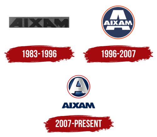
From 1983 to 1996, Aixam was known as a reliable and consistently performing small vehicle manufacturer. The company’s first emblem embodied these qualities, reflecting durability and smooth operation even in compact car models. This reminded users that small size does not limit quality and functionality.
The design of the Aixam logo was particularly notable due to the unique styling of the letter A in the word Aixam, which pointed in different directions. This added a playful and dynamic quality to the brand’s visual identity, making the inscription monumental yet easy to perceive. This design approach symbolized the freedom of movement since Aixam cars could be used without a driver’s license, making them an ideal choice for easy and quick urban travel.
Additionally, the interesting division of the word Aixam into two parts—AIX and AM—held special significance. AIX referred to Aix-les-Bains, the city in France where the company was founded, adding a sense of geographical ties and cultural identity to the brand. The second part, AM, stood for Automobile Manufacture, emphasizing the industrial foundation and specialization of the company.
1996 – 2007
The logo, a striking blue road sign with red-and-white trim, is a recognizable symbol deeply connected to the brand’s history. This design was selected after the company acquired the Mega brand in 1995, marking a significant development. The color palette and emblem shape reflect this connection, highlighting the two brands’ integration and the corporate image’s update.
The choice of a road sign symbol is deliberate: it represents the accessibility and freedom of movement provided by Aixam’s small cars. Their maneuverability, lightness, compactness, and convenience make them ideal for urban environments where every inch of space counts.
The design is dominated by a giant letter A at the center of the sign, symbolizing Aixam as a major player in the microcar market. A creative design move uses the full brand name Aixam in place of the central bar of the letter A, enhancing visual perception. The small letters of this inscription contrast with the huge A, emphasizing that even small cars are a superb alternative to full-sized vehicles.
2007 – today
The emblem consists of a circle with a large three-dimensional letter A inscribed in it, and the name of the brand is made in blue capital letters.
The round shape embodies car wheels, indicating minimalism, harmony, and completeness. The background has a double red and white border, connecting the emblem with permissive and prohibitory road signs.
The red outline resembles a deceleration sign. Most Aixam models cannot go faster than 45 km/h. In many European countries, this allows you to drive a mini-transport without a driver’s license.
The white border is a symbol of ultra-light machines powered by electricity. They have been sold under the Mega brand since 2003. The rim conveys the safety of products for the environment and the absence of harmful emissions.
A large central A is the first letter in the brand name. Its edges blend into the white stroke. It goes beyond and voluminously shows the company’s expansion to the American continent after its purchase by Polaris. Embodies the popularity of small-wheeled vehicles. Every year, up to 16 thousand cars roll off the assembly line.
Font and Colors
The logo’s main colors are red, white, and blue. These are the leading shades of road signs, connecting the emblem with the world of cars and roads.
- Red emphasizes and attracts attention. It is the color of beauty, efficiency, and maneuverability that machines acquire due to their small size. Red is a shade of danger. The brand’s SUVs cope well with driving on uneven terrain and difficult areas.
- White is the main color of the badge. It transfers the metal from which most machines are made. It indicates a lineup update. White is associated with lightness or the low weight of machines.
- Blue is the color of professionalism, a serious approach to work.
The font of the inscription is similar to Rifton Caps but with minor changes. The M glyphs are slanted backward, reminiscent of the structure of the trunk of minicars, which appears to be cut off, reducing the length of the car. The lower parts of the letters merge, making the word continuous. This is another nod to the compact size and close placement of interior elements.
