The Aixam Mega logo is characterized by compactness and minimalism. Technical perfection and metal dominance are at the core of the company’s activity. The emblem shows the brand creates safe, innovative, modern supercars.
Aixam Mega: Brand overview
Founded as Arola in 1983 in Aix-les-Bains, France, the company now known as Aixam-Mega began its journey by producing minimalist microcars with minimal safety requirements. 1992, Mega Group acquired Arola, marking a brand identity and production line change. Subsequently, the company was renamed Aixam-Mega and produced more reliable four-wheeled microcars.
Having successfully produced legal models with a speed limit of 28 miles per hour, Aixam-Mega created vehicles that did not require a full driver’s license. This unique offering contributed to the company’s success in the 1990s and early 21st century, when it expanded its range to include compact city cars in various variants – coupes, sedans, and vans.
In 2013, Aixam-Mega’s situation changed again when the controlling stake was acquired by Polaris Industries, an American powersports company focused on the micro-car segment. Under the new owner, the company continued producing miniature quadricycles focused on European urban transportation needs.
As of 2022, the production volume of Aixam microcars at the company’s French facilities exceeded 380,000 units, demonstrating its strong presence in the urban mobility segment.
Meaning and History
What is Aixam Mega?
It is a French automobile manufacturer specializing in microliters and light commercial vehicles. The brand is known for its compact and lightweight vehicles, which can be driven without a full driving license in some European countries. The company’s product range includes passenger microcars, such as the Aixam City, and useful vehicles under the Mega brand for commercial and industrial use.
1993 – 2007
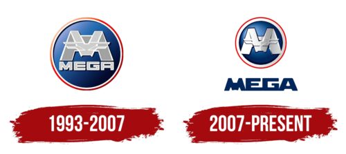
From 1993 to 2007, Aixam Mega actively functioned and developed a distinctive logo that stood out among other brands. The emblem prominently featured the letter M, crafted from elements that visually resembled individual metal sheets fused. This design highlighted the strength and power associated with Mega Group, the primary owner of the brand. The phrase “the company’s cars are mega impressive” was added below the logo, reinforcing the high quality and uniqueness of the offered microcars.
The emblem’s shape, reminiscent of a road sign, combined with a blue background and red-and-white border, created a visual appeal that commanded attention to the company’s exceptional vehicles. This design caught the eye and focused attention on the products, emphasizing their distinctiveness.
Additionally, the logo’s use of red, white, and blue established a connection with the American flag, highlighting the brand’s global and international character.
2007 – today
The French have turned this car company’s logo into a tough symbol. The designers intensified the shadows, added a black frame, used a cool silver color, and enhanced the chrome effect. The gray contour stripe became wider, and the area of dark zones on the blue background increased. In addition, the emblem creators moved the lettering outside the ring. They connected the letters and colored them in a rich blue color. The letter “M” in the name was a block variant inside the circle. All the glyphs are uppercase and solid, which hints at the reliability of the equipment.
The logo has a certain zest, giving the impression that the machines are durable and designed for long-term use. The rich blue color adds a bit of serenity, making you take another look at it. The letter “M” in a circle is like a gem that attracts the eye.


