


![]() Ajinomoto Logo PNG
Ajinomoto Logo PNG
The lightness of the Ajinomoto logo reflects the optimal connection between the company’s specialization and its identity. The strong alliance instills confidence that the branded products are safe, delicious, flawless, and high-quality. The bright color palette is a great eye-catcher for customers.
Ajinomoto’s history began in 1907, when Tokyo Imperial University chemist Kikunae Ikeda studied the deep taste of kombu broth. In 1908, he isolated glutamic acid from the seaweed and named the taste “umami.” The same year, he patented an industrial method for producing monosodium glutamate, or MSG. Saburosuke Suzuki II, whose family business had worked with seaweed iodine since 1890, acquired a share in the patent.
On May 20, 1909, AJI-NO-MOTO, meaning “essence of taste,” entered the market. Japan’s Ministry of Home Affairs confirmed its safety, and the seasoning won a bronze medal at the first Japan Invention Exhibition. Production at the Zushi plant grew from 4.7 tons in 1910 to 23.3 tons in 1913, while sales passed 400,000 yen.
In 1917, S. Suzuki & Co., Ltd. was registered in Tokyo and opened an office in New York. During the interwar years, the company expanded across Asia, including Taiwan, China, Indonesia, and Thailand. World War II stopped MSG production in Japan, but by 1947-1953, AJI-NO-MOTO returned to the U.S. and Europe.
The company later moved into edible oils, lysine in 1956, aspartame with G.D. Searle in 1962, an MSG venture with Orsan in France in 1970, and its first overseas plant in Thailand in 1973. In 1988, it became Ajinomoto Co., Inc. Later research on umami receptors in 2000 and 2006 further strengthened its scientific foundation, while Nestlé and International Flavors & Fragrances remained key competitors.
Meaning and History
![]()
With over 100 years of history behind the Ajinomoto brand, it is not surprising that its visual recognition is high. At the time, the public was presented with seven variants of the logo, one of which was used exclusively in the international market. If most competitors in the market made local logo changes within their frameworks and updated individual details, then, for a Japanese company, each redesign would offer the audience a new and unique option. Because Ajinomoto is a subsidiary of Suzuki, it’s no wonder the logo used elements of the iconic Japanese brand early on.
What is Ajinomoto?
First of all, it is one of the most popular Japanese food brands. The company is gradually expanding in many directions, thereby attracting potential customers’ attention.
1917 – 1946
![]()
The first version of the logo was introduced almost immediately after the company’s founding in 1917. It was an emblem, shaped as an oval of slightly non-standard dimensions, outwardly resembling a medallion. Inside was a Japanese lady holding a jar, most likely with spices. Hieroglyphs were painted on the woman’s apron. The background was composed of black vertical lines. Customers who associated it with Suzuki liked its distinctive logo. At the same time, the dull black-and-white color scheme evoked a certain despondency upon acquaintance.
1946 – 1973
![]()
The brand was named Ajinomoto only in 1946. Together with it, the original logo was also redesigned. This is an interesting red-and-white emblem. The main element of the logo is a red bowl with a lid. It has Japanese hieroglyphs denoting the brand name in white letters. They are in bold type with thick lines. An interesting choice made it possible to associate the Ajinomoto logo with home comfort with the company’s products.
1973 – 1986
![]()
The next redesign took place in 1973. All images were completely removed from it, including the bowl from the previous version. Saul Bass handled the redesign. The logo was a verbal inscription on two levels. At the top was a stylized “a,” which was a reference to the company’s name. Red outlines and white interiors conveyed the company’s potential and ambitions, as well as its desire to develop. At the same time, the buyer could not immediately associate this symbol with the presented letter because it consisted of several curved lines, creating a fancy pattern. Beneath this letter was an inscription in Japanese in bold red type.
1986 – 1999
![]()
A 1986 redesign made the logo more concise, confident, and modern. It was based on the brand name and set in a classic sans-serif font, in all caps. The first letter deserves special attention. Firstly, a diagonal line was used instead of a horizontal line, making this symbol more bizarre and interesting. Also, to the left of the name is a red triangle pointing to the right. Stylistically, it is similar to the button to start the video. The area within the “A” and the triangle formed an infinity symbol, representing the company’s vision and goals.
1999 – 2018
![]()
Thirteen years after the previous version of the logo was in active use, it was decided to return red as the main color. Also, the red triangle to the right of the title has been removed. Now it was exclusively a verbal inscription denoting the brand name. The most graceful and playful look is the first letter, “A,” which has a long tail connecting its lower peaks. The second letter, “J,” was also slightly larger than the others. Otherwise, the font remained identical to the previous version. However, the new color palette played a positive role, making the logo more welcoming. In addition, this year, Ajinomoto began using the icon. It was a stylized letter “a” written in white inside a red circle, which was in turn inside a white square.
2010 – 2018 (international market)
![]()
In 2010, the company adopted a secondary logo that is used by brands worldwide. At the same time, the verbal inscription is identical to the one presented back in 1999. However, it is now enclosed in a multicolored frame resembling a ribbon. Here are yellow, green, and red colors, indicating the diversity of the product range offered to customers.
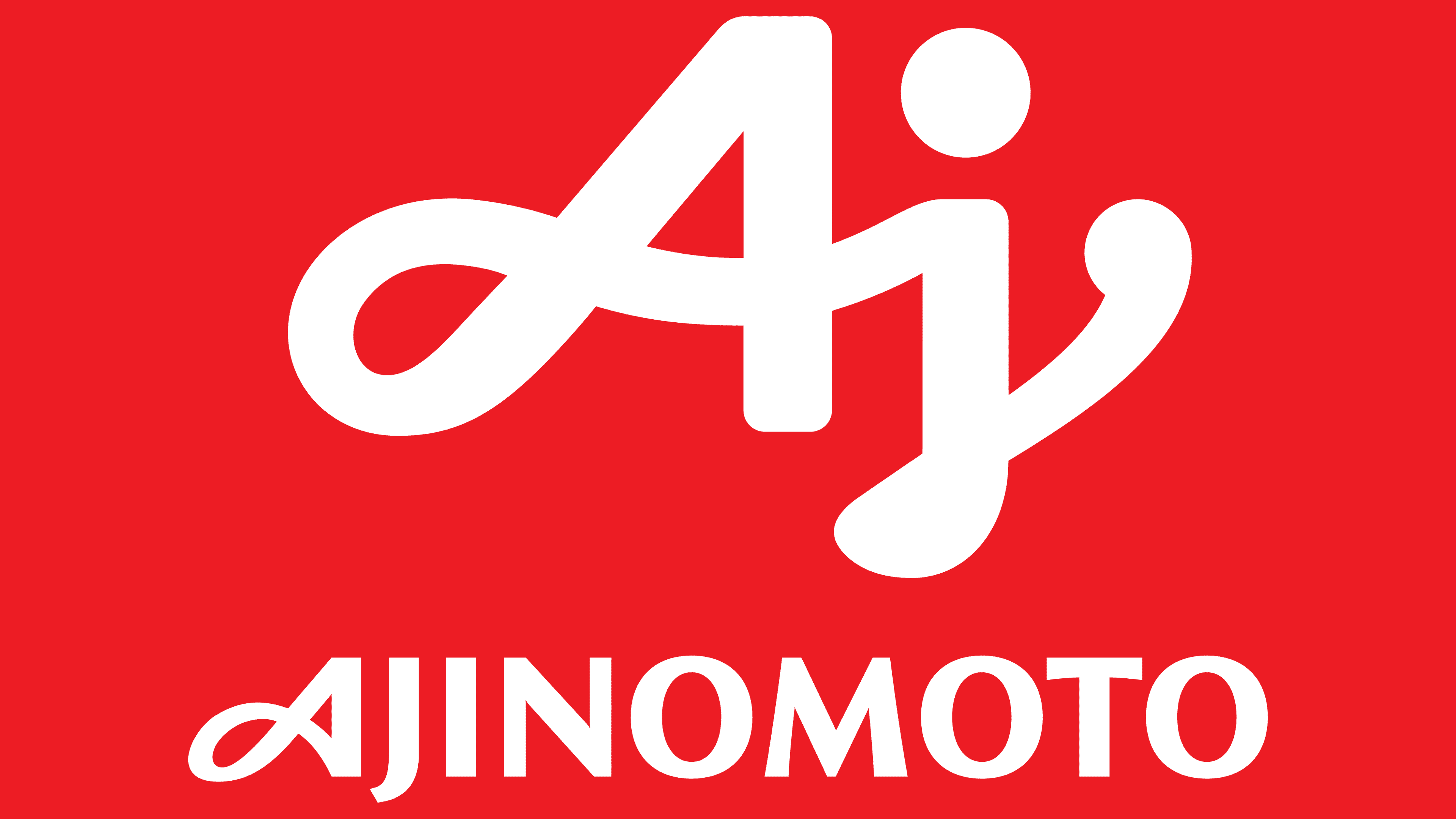
2018 – today
![]()
The most recent redesign of the company took place in 2018. The word “inscription” remained unchanged but was slightly reduced in size and placed under the updated designation “Ajinomoto”. These were handwritten letters “Aj,” made in smooth lines with rounded ends. Thus, the logo began to look friendlier, thanks to the company’s traditional red-and-white color palette.
Font and Colors
If the company tried to combine Japanese and world cultures in the first iterations of the logo, the latest redesigns have made the main element the inscription “Ajinomoto,” set in a classic sans-serif font, in capital letters.

The company’s main theme is a red-and-white color palette that evokes professionalism and brand strength.