![]() AKA Logo PNG
AKA Logo PNG
The AKA logo represents the noble cause for which Alpha Kappa Alpha Sorority, an intercollegiate sorority, was created. It focuses on the desire for independence, equality, and integrity as African American female students organize it. The simple images convey the desire for growth, and the chosen colors reflect black girls’ natural impulse to fully adapt to today’s society.
AKA (Alpha Kappa Alpha) is an African-American sorority created by a group of female students led by Ethel Hedgemon Lyle. Its origins are at Howard University, where historically black female students were educated. These women joined together to empower early twentieth-century women, remove barriers for African American women in hard-to-reach neighborhoods, and raise their status. The organization began in the winter of 1908 in Washington, DC.
Meaning and History
![]()
The idea for Alpha Kappa Alpha originated with Ethel Hedgemon Lyle, a student at Howard University, and her instructor, Ethel T. Robinson. She told her about a college sorority affiliated with Brown University and shared her thoughts on sisterhood. In this way, women could enter societies that had previously excluded them on the basis of race. To make her idea a reality, Ethel began campaigning among female students in 1907, encouraging her friends to take decisive action and awakening their interest in the opportunities ahead.
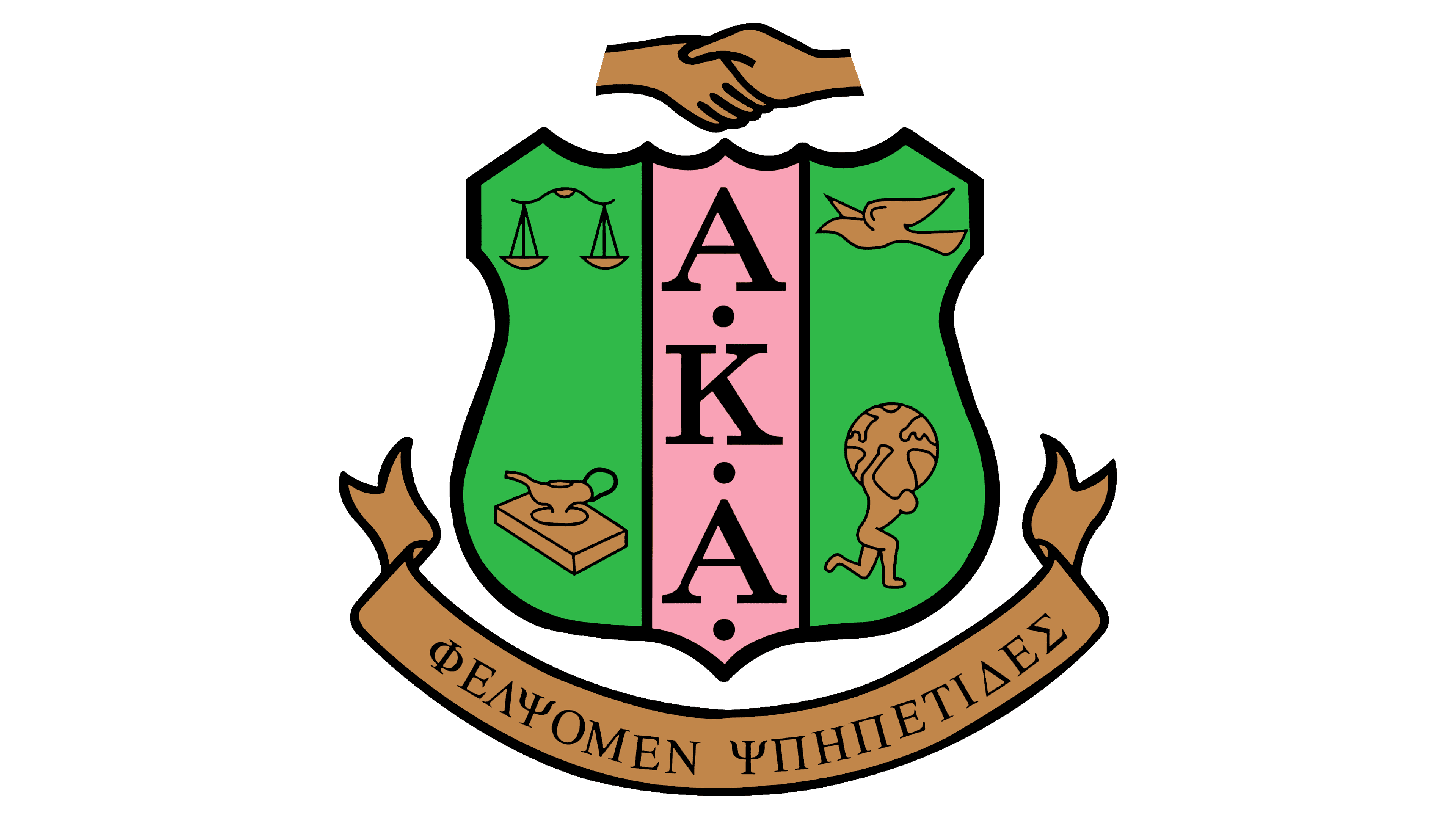
As a result, she brought together a group of sixteen people who laid the foundation of AKA in 1908. Naturally, in addition to a name, the new structure needed a personalized emblem to reflect its goals, objectives, and concepts. Thus, a heraldic design symbol was created. Salmon pink and apple green were chosen as the official colors. The key symbol of the organization was the ivy leaf, representing strength, endurance, constancy, and friendship.
What is AKA?
An acronym for Alpha Kappa Alpha sorority, AKA aims to support African American women by empowering them, raising their status, and addressing social injustices. The organization was founded in 1908 at Howard University by Ethel Hedgemon Lyle and the group of students she led. The organization is a member of NPHC (National Pan-Hellenic Council). The center of government is located in Washington, DC.
1908 – today
![]()
The AKA logo features several important symbols that play a crucial role in the sorority’s worldview. The first notable feature is heraldry: the emblem’s base is the coat of arms, with several points centered at the top and only one at the bottom. In the center is a pink stripe with a black inscription. The abbreviation is arranged vertically and is read from top to bottom. The letters are uppercase, Roman, and bold, but the thin lines balance the thickness nicely. To the right and left are green fields with iconic elements.
- A white dove symbolizes peace.
- With a globe on his shoulders, Atlas represents universal support, might, and boundless power.
- The scales symbolize the triumph of justice, law, and order.
- The book and the lamp serve as an allegory of light and knowledge.
All images are contoured, small, white, and drawn with thin strokes. Above the coat of arms are two hands clasped in a handshake. They also have an important semantic meaning, as Alpha Kappa Alpha strives for friendliness and harmony with the people around it. The organization is willing to lend a helping hand to every potential sorority member. At the bottom is a ribbon with an inscription in ancient Greek.
Font and Colors
The abbreviation is typed in a classic serif font and separated by bold dots. The lettering in Ancient Greek is in uppercase font and also has serifs. The palette includes the signature pink and green colors, Salmon Pink and Apple Green. White and black colors, used for outlining, harmoniously complement the logo, making it formal and strict.