


![]() AKG Logo PNG
AKG Logo PNG
The AKG brand logo visualization aims to accurately convey the high quality and reliability of its audio products. The minimalist style, geometric clarity of the abbreviation, and the brand name symbolize practicality, professionalism, and reliability.
AKG was founded in Vienna in 1947 by Rudolf Görike and Ernst Pless, who began trading used cinema equipment in postwar Austria. Demand from damaged theaters shaped the early business, leading to the creation of Akustische und Kino-Geräte Gesellschaft.
From the start, production was manual and varied, but Görike focused on microphones. Even before formal registration, the company released DYN series models in 1946, followed by the C1 condenser microphone in 1947. Output remained small, around 500 units annually, supplied to radio stations and clubs.
In 1949, AKG introduced its first headphones, K120 DYN. The 1950s brought key developments, including the D12 dynamic microphone in 1953 and the C12 condenser model with the CK12 capsule, which was adopted early by the BBC. In 1959, the K50 became the first open-back headphones.
By the 1960s, the company had fully shifted to acoustics, ending production of cinema equipment in 1965. Products like the BX20 reverb unit in 1970 and the C414 microphone line, launched in 1971, defined its studio presence. AKG equipment appeared at the 1964 Innsbruck Olympics and on a 1972 BBC anniversary stamp.
Ownership changed in 1977 when Philips Austria became a major shareholder. AKG went public in 1984 and expanded into the United States. In 1993, Harman International acquired the brand, along with JBL and Crown Audio, and integrated it into its global audio portfolio.
In 2016, after Harman’s acquisition by Samsung, Vienna operations were closed, and the brand moved to California. In 2017, former engineers founded Austrian Audio and continued development independently.
Meaning and History
![]()
As its logo, the company chose a shortened version of its original name, Akustische und Kino-Geräte Gesellschaft. The abbreviation “AKG” is placed on a white background and complemented by the word “Harman.” The logo’s minimalist style reflects the products’ reliability.
What is AKG?
AKG is an acronym for the Austrian company Akustische und Kino-Geräte Gesellschaft, which is part of Harman International Industries. Under this brand, it sells a wide range of audio equipment for home and professional use, including cinemas, theaters, and the music industry. AKG produces acoustic systems, microphones, and headphones with high technical specifications.
1994 – today
![]()
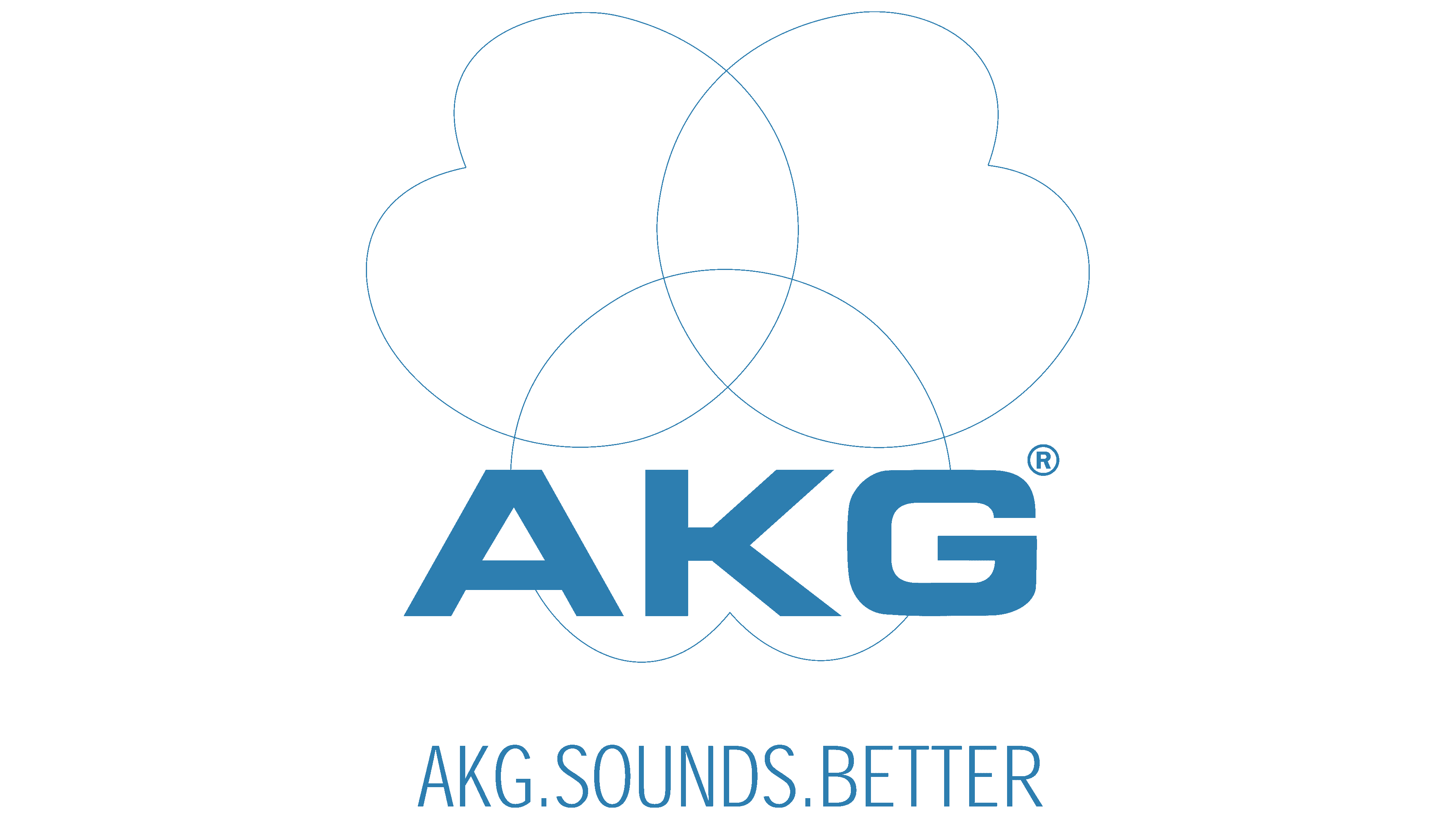
AKG’s debut logo still exists today. It’s a graphic-textual symbol that includes three figures resembling flower petals. They are curved inward, forming a Rolle triangle with their closed curves. There’s a small indentation on the outer side of each element. At the bottom of the composition is the acoustic company’s name, set in a bold sans-serif font. The capital letters have a strict geometric shape. All elements are colored in blue.
2010 – 2016
![]()
During this period, not only the logo’s design but also its color palette changed. Simple shapes, straight lines, and precise angles became predominant. The manufacturing company’s name was also complemented with the inscription “by Harman.” Unlike the word on the top line, it’s executed in thin letters. The construction of three geometric figures was removed. The main color of the emblem is gray.
2017 – today
![]()
The current AKG logo is similar to the previous one, but it has undergone significant changes. For instance, a different font was chosen, affecting the style of the inscriptions. The “K” and “G” in the top line are partially corrected, while all letters have been completely replaced in the bottom line. They became streamlined, with legs of varying thickness and points on the right. The letter “A” crossbar is now open rather than solid. Instead of gray, black was introduced.
Font and Colors

For the brand logo, developers used the Eurostile LT Pro Bold Extended font, a strictly geometric, wide, sans-serif font with clear edges. The large “AKG” inscription is in uppercase and spans the entire width of the logo.
To the right of the inscription (at the bottom of the “KG” fragment) is the word “Harman,” typed in a smaller font. “A” has an open bar: the line is left for the first letter and right for the second “A.” This gives the logo individuality without disrupting the strict style.
All emblem elements are black and set against a white background, which clearly highlights them and makes them easy to read. Thus, the designers conveyed the company’s practicality, strength, reliability, and seriousness. The emblem’s concise style successfully fulfills its task: it looks powerful and technical, inspiring trust.