


![]() Albertsons Logo PNG
Albertsons Logo PNG
Under the company’s protection, the client’s home will flourish, the Albertsons logo promises. The emblem guarantees safety concerning two main components: nutrition and health. Elements hint at the self-production of the goods being sold.
Albertsons began in 1939 in Boise, Idaho, when Joe Albertson, a former Safeway district manager, opened his own grocery store at 16th and State streets. He used $5,000 in savings, borrowed $7,500 from his wife Bertie’s aunt, and partnered with L.S. Skaggs. The first store covered 10,000 square feet, far larger than a typical grocery store of that period.
The business earned $9,000 in its first year, and within two years, sales passed $1 million. By 1945, Albertsons Corporation operated six supermarkets, generating nearly $3 million in annual revenue. In 1951, the company opened a 60,000-square-foot food-and-drug combination store. Albertsons went public in 1959 and, in 1969, partnered with Skaggs Drug Centers to expand the grocery-pharmacy format.
The company faced antitrust pressure following its 1972 acquisition of Mountain States, which led to a 1977 settlement and a forced sale. In 1978, Albertsons bought 46 Fazio’s Shopping Bag stores from Fisher Foods. After Joe Albertson died in 1993, the chain continued to expand and, in 1999, acquired American Stores, adding ACME Markets, Jewel-Osco, and Lucky stores.
In 2006, Albertsons was split among CVS, Supervalu, and Cerberus Capital Management. Cerberus rebuilt the company in 2013 by buying Albertsons, Acme, Jewel-Osco, Shaw’s, and Star Market from Supervalu, then acquired Safeway in 2015 for $9.2 billion, adding Vons, Pavilions, Randalls, and Tom Thumb. Albertsons returned to the NYSE in 2020 under ACI. Kroger’s planned $24.6 billion takeover was announced in 2022 but blocked and canceled in December 2024.
Meaning and History
![]()
In 1939, aspiring businessman Joseph Albert Albertson opened his first store, drawing on his experience as a manager at Safeway. It was considered very large for the time. It had several innovations, including a magazine shelf, a doughnut machine, and a bakery. The supermarket was located in Boise, where Albertsons is now headquartered. The company remains faithful to its home state but is also actively expanding in all directions, buying competing retail chains in other regions.
In the 2000s, the reverse process began: owners closed inefficient stores and liquidated entire divisions. After a brief decline, the food and drug retailer regained its position. It is now the second-largest supermarket chain in the U.S. in terms of locations.
The Albertsons brand has been known since 1939. Its logos have changed as often as generations of customers have changed because it has always tried to keep up with modern trends. But there’s continuity in the design: almost all its emblems contain its name in vintage script. Even the current version mimics the style of signage from an earlier era.
1939 – 1960
![]()
One of the first logos contained handwritten “Albertson’s” in black. The uneven line width made it appear as if it had been drawn with a brush. The word was slightly raised: the right side went up, forming a diagonal. In another version, the brand name was complemented by the phrase “food center,” which took up two lines on the right side. A bold, rounded, sans-serif font was used for it. Fine white lines were drawn inside each letter, repeating the shapes of the strokes.
1960 – 1972
![]()
The revised version contained the same lettering as before but in a different design. The word “ALBERTSONS” lost its apostrophe, and all letters were converted to upper case. A geometric typeface replaced the handwritten typeface with rectangular serifs. It was high contrast because the thickness of lines was sharply differentiated: all upper and lower strokes were disproportionately wide.
As for the phrase “FOOD CENTER,” it was shifted down one line and consisted only of capital letters. The font chosen was round, bold, and grotesque. All inscriptions were white and contained within a black rectangle with a light-colored border. This form was designed specifically for storefront signs.
1972 – 1976
![]()
After partnering with Skaggs, the Albertsons retail chain updated its logo. It became simpler because the words “FOOD CENTER” disappeared. The brand’s remaining name was changed: the designers used a new, more proportional font. All lines are almost equal in thickness. The serifs at the top and bottom became triangular. Almost all the letters had them, even the “O.” The only exceptions were the two “S’s” resembling a figure eight.
1976 – today
![]()
In the late 1970s, Landor Associates redesigned the Albertsons logo, changing it beyond recognition. The designers chose a slightly modified version of the Introspect font, with the letters touching one another. All but the first “A” was converted to lowercase. A new element appeared next to it: three leaves covered by a dome of two curving strips. The left side of the design is dark blue, and the right side and the word “Albertsons” are painted blue.
Font and Colors
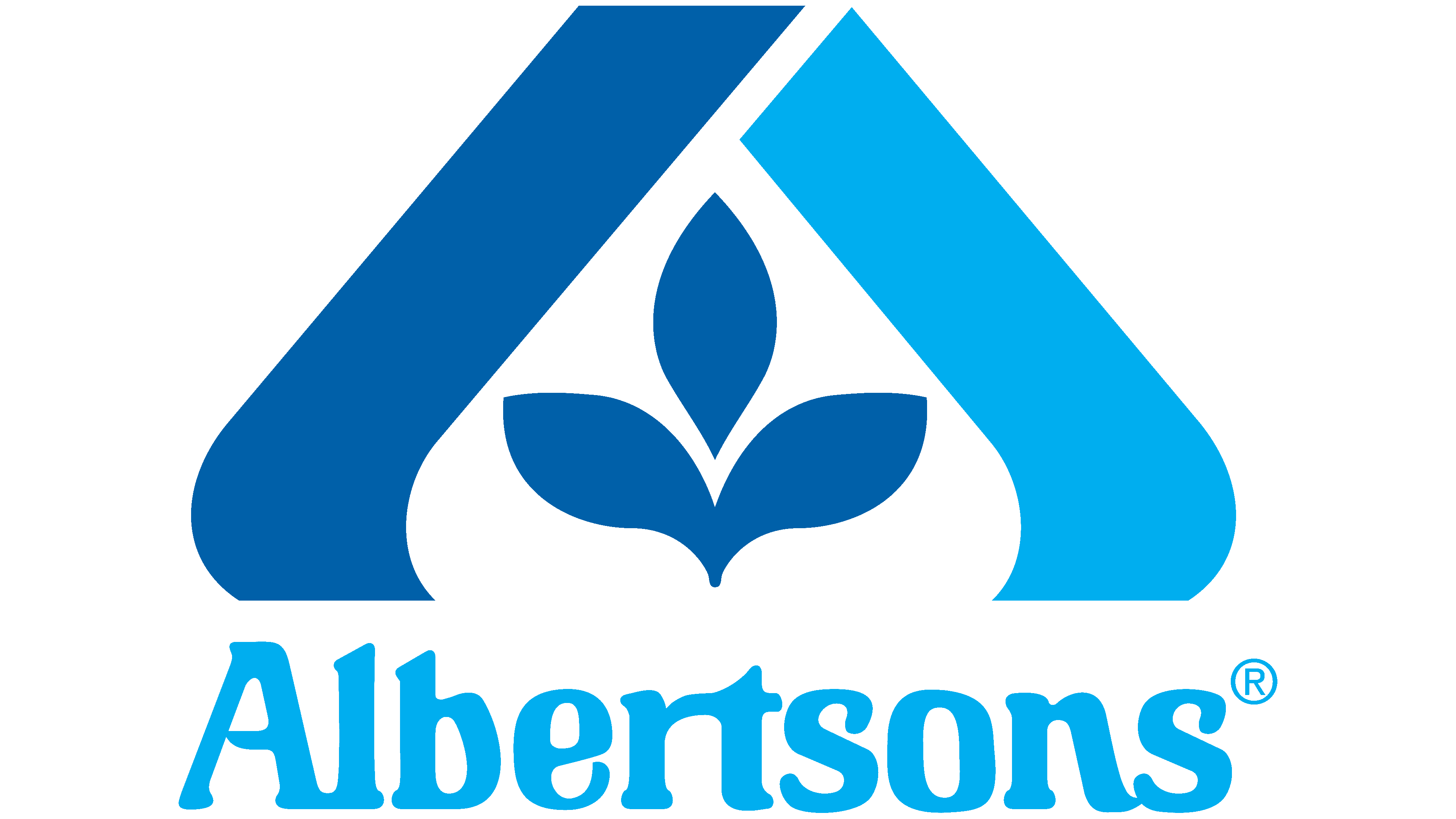
The floral pattern on the company’s logo symbolizes its exceptional approach to work. It shows that natural and organic products are available in supermarkets, even though they are not the basis of the assortment. The emblem also speaks to the safety of food and medicine. And because a protective dome carefully covers the three leaves, it is a clear hint of concern for nature. In addition, the design resembles a stylized “A,” the first letter in the word “Albertsons.”
The inscription looks very unusual, as if a custom set of glyphs was designed for it. But it does exist: it’s called Introspect and is the work of Phil Martin. Alphabet Innovations launched it in 1971, and a few years later, Albertsons chose it for its logo. Of course, the designers had to slightly adjust the letter shapes and round the corners. But behind all the changes, you can still see the original Introspect.

The main feature of the font is that the letters touch each other, as in poor printing. The strokes are disproportionate and asymmetrical, and some elements are slightly skewed. The ends are decorated with rounded serifs. As Phil Martin noted, this typeface became “the face of the supermarket.” It has been used by food packaging designers in the U.S. and abroad. The chain of stores, Albertsons, also followed their example because the smooth and expanding strokes look “appetizing.”
The logo color scheme is dark blue (#009FE0, Pantone Reflex Blue C) and light blue (#009FE0, Pantone Process Blue C), and white serves only as a background for the pattern and lettering.