


![]() Alcatel Logo PNG
Alcatel Logo PNG
The Alcatel logo is simple and modern, reflecting the company’s connection to mobile and satellite communications. The brand helps people stay connected wherever they are through mobile devices and telecommunications equipment.
Alcatel traces its roots to 1898, when Pierre Azaria and Paul Bize founded the Compagnie Générale d’Électricité in Paris, focusing on electrical equipment as telegraph and telephone networks were being built.
In 1966, CGE created Alcatel as a telecommunications division, which gradually became the group’s core business. During the 1970s and 1980s, the company developed the E10 digital switching system and worked on national network modernization programs in France.
In 1986, CGE merged its telecom assets with ITT Corporation, forming Alcatel NV. By the early 1990s, the company ranked among global leaders alongside Ericsson and Lucent Technologies, competing for major infrastructure contracts.
In the 1990s, Alcatel invested in submarine fiber-optic cables and expanded into mobile phones. Its devices gained presence in Europe and emerging markets, though competition from Nokia and Motorola limited growth.
The telecom downturn of 2001–2002 led to major losses and restructuring. In 2006, Alcatel merged with Lucent Technologies to form Alcatel-Lucent, combining Alcatel’s operations with Bell Labs’ expertise.
The mobile division had already shifted direction, becoming a joint venture with TCL in 2004 and later fully controlled by TCL.
In 2016, Nokia acquired Alcatel-Lucent for about €15.6 billion, ending its role as an independent telecom player, while the Alcatel mobile device brand continued under TCL.
Meaning and History
![]()
Due to frequent structural changes, the brand has undergone several logo updates. The company’s history is as confusing as its emblems, making it difficult to trace continuity and to understand precisely which legal entity each mark represents.
What is Alcatel?
It is a mobile device brand owned by Nokia since 2016, following the acquisition of the French telecommunications equipment manufacturer Alcatel-Lucent. The brand name has changed several times, and the products have evolved to feature modern tablet, phone, and smartphone functions. Examples of such innovative technologies include App Cloning and Face Key.
1987 – 2004
![]()
By 1987, the company already had a reputation as an advanced manufacturer in the communications field. Its logo was a dark gray rectangle with a concise ALCATEL wordmark in all-caps white. The typeface was simple, emphasizing the brand’s technological focus and business-oriented character.
A notable accent appears on the central letter A: a white upward-pointing triangle is placed in the middle of the word. It has no crossbar, yet, given its name, it is naturally perceived as the letter. Above this white triangle sits a second, mirrored, richly colored orange triangle. Together, these two elements form a vertical line that draws attention to the emblem’s center.
The color pairing is contrasting yet balanced. White reads as neutral and elegant, while orange acts as a warm accent that enlivens the otherwise strict background.
2004 – 2010
![]()
When Alcatel Mobile Phones was established in April 2004, it operated as part of a joint venture between Alcatel Lucent and TCL, a Chinese corporation. At that time, Alcatel Lucent held 45 percent, while TCL controlled 55 percent. Within a year, the partnership ended, and TCL bought out its European partner’s stake, becoming the sole owner of the Alcatel Mobile Phones brand.
The brand name was presented in a simple, high-contrast two-line black logo. The top line featured ALCATEL in large capital letters. Letter spacing was increased, making the wordmark appear wider and lighter. Beneath it appeared an explanatory line: the phrase’ mobile phones’. The typeface of the lower line was intentionally different. The letters are small, soft, and rounded, with smooth lines reminiscent of a neo-grotesque style.
The visual hierarchy is built on the contrast in size and form between the upper and lower lines. The main emphasis is on the ALCATEL name, which clearly identifies the brand within the overall logo.
2010 – 2016
![]()
The Alcatel OneTouch logo, introduced in 2010, appeared alongside a shift in the company’s positioning. At that time, the Alcatel OneTouch brand received corporate status. Later, in 2024, TCL returned to the Onetouch name, launching a line of feature phones under the separate TCL Onetouch brand, without mentioning Alcatel.
Designers focused on a fresher look and updated the logo text. The word “mobile” was replaced with “one touch,” set in lowercase and colored blue. The top line remained a larger, stricter ALCATEL wordmark in a black sans-serif typeface. The lower line adopted a softer, more rounded font, contrasting with the upper line through both form and color.
The lower line was made the same size as the upper one. Together, the two lines complement each other, creating a sense of freshness and lightness while reinforcing Alcatel OneTouch’s new corporate style.
2016 – 2024
![]()
After the Alcatel brand returned to its original name in February 2016, the company also updated its logo. This followed the transition of Alcatel One Touch under Nokia’s management, which initiated the new visual identity.
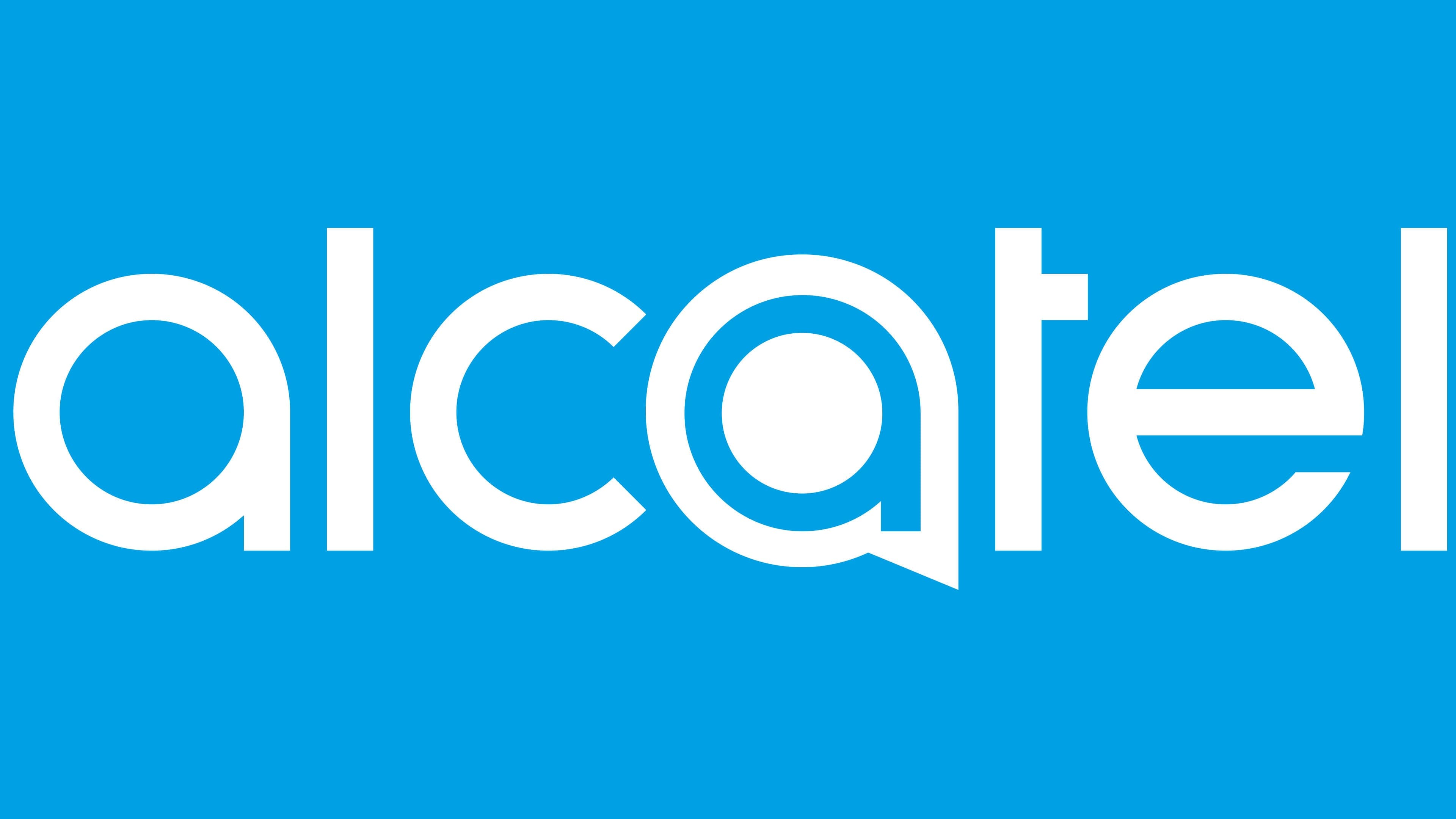
The name Alcatel began to be written in lowercase letters using a light, modern sans-serif typeface. The letters feature smooth lines and softened contours, visually recalling fonts such as Avant Garde, VAG Rounded, and Futura variants. The primary color of the entire logo remained blue.
The most distinctive feature of the logo is the stylized letter “a”. It takes the form of a symbol resembling a map marker or pointer. The outer shape is enclosed, with a sharp downward projection. Inside the letter sits a circle filled with the same blue color as the rest of the mark.
Visually, the logo is divided into two parts, with the letter “a” as the focal point, giving the brand a technological appearance.
2016 – today (telephone products)
![]()
In addition to the familiar Alcatel logo used by TCL, the brand’s phones were also produced by Atlinks, which developed a separate visual identity specifically for these devices.
The new mark uses the Alcatel name in a restrained black. The first letter is capitalized, with the remaining letters in lowercase. The typeface is a smooth sans serif, with rounded lines and soft stroke endings. In character, it resembles Avenir Rounded, Varela Round, or rounded versions of Futura.
The combination of an initial capital letter and lowercase characters gives the wordmark a natural, clean appearance.
Font and Colors
All Alcatel logos feature the company name, but the latest trademark differs from the previous ones: it uses different letters and a different style. The inscription is made in lowercase letters, and the second “a” is noticeably distinguished from the rest. It has a wide blue border and a matching blue circle at the center, making it the most recognizable part of the logo.

The logo uses an original font, specifically designed for Alcatel, with rounded letters and serifs. The unusual letter “t” catches the eye, which has neither a lower elongated line nor the left part of the upper horizontal stroke. The second “a” is also notable, with a complex structure and appearing as an independent graphic element. In terms of colors, everything is much simpler: the main palette includes only white and blue.