


 Alcorn State Braves Logo PNG
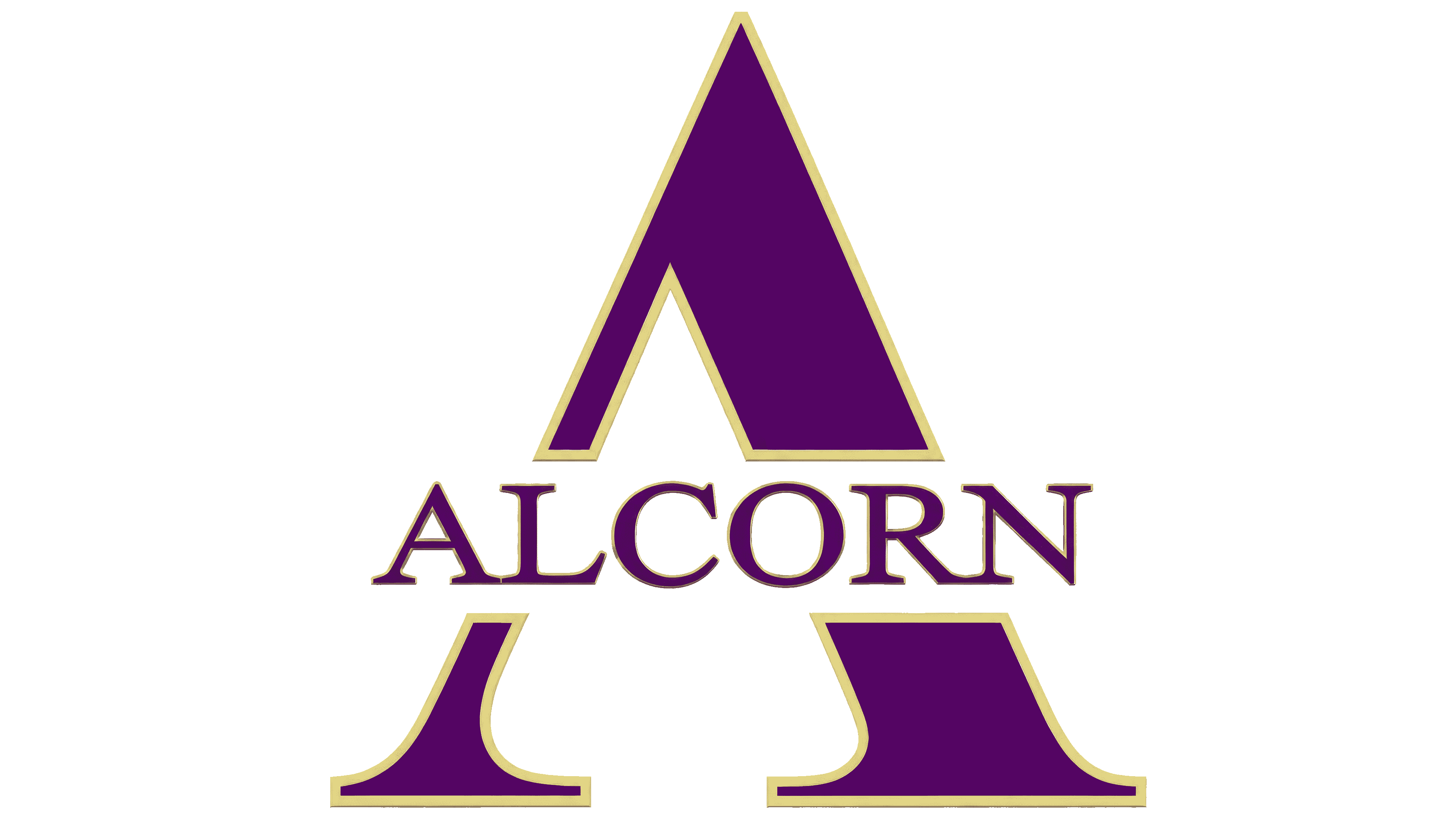
At first glance, the Alcorn State Braves logo is blocky. It symbolizes leadership, high aspirations, and a sense of being ahead of the competition. The large serifs, harmoniously connected to the bottom, embody the organization’s stability and steadfastness in achieving victories.
The Alcorn State Braves emerged in 1871 with the founding of Alcorn State University in Mississippi, one of the oldest HBCU institutions created to provide higher education for African Americans during Reconstruction. Sport developed alongside this mission as part of community building.
The Braves’ name reflected resilience, while purple and gold became the program’s permanent colors. During segregation, Alcorn competed within the HBCU system, separate from predominantly white institutions, which shaped its competitive environment and talent pipeline.
A defining figure was Steve McNair, who played from 1991 to 1994. He recorded over 16,000 passing yards and 5,000 rushing yards, finished third in the 1994 Heisman voting, and was selected third overall in the 1995 NFL Draft by the Houston Oilers before becoming NFL MVP in 2003.
The football program competes in the Southwestern Athletic Conference, facing rivals such as Grambling State and Jackson State. These matchups remain central within HBCU football culture.
In the 1970s and 1980s, Alcorn State won multiple SWAC titles, and its basketball program also claimed conference championships and reached NCAA qualifying rounds.
The move to NCAA Division I in 1992 expanded competition and visibility but required higher institutional investment. Through the 2000s and 2010s, the Braves continued to compete within the SWAC, with football remaining the core program.
Meaning and History

What is Alcorn State Braves?
Alcorn State Braves is an athletic association comprising 15 student teams at Alcorn State University. Based in Lorman, Mississippi, the program is a member of the Southwestern Athletic Conference and competes in NCAA Division I.
1996 – 2003
The Alcorn State Braves lettermark is rooted in the surname of the university’s namesake. The athletic teams represent Alcorn State University in Mississippi, founded in 1871 to educate African Americans. The institution was named for James L. Alcorn, the state’s governor at the time. His surname survived every subsequent name change and eventually became part of the athletic logo.
Originally called Alcorn University, the institution became Alcorn Agricultural and Mechanical College in 1878. The name reflected its emphasis on agricultural and technical education. In 1974, it gained university status as Alcorn State University.
The athletic nickname Braves refers to brave individuals and has historically been associated with Native American warriors. Before adopting a letter-based identity, the university used a Native American profile, and a student dressed as a Native American warrior appeared at football games. A lettermark later replaced the portrait, while the team name remained.
The Alcorn State Braves emblem used from 1996 to 2003 featured a large “A” with ALCORN lettering across it. The word replaced the crossbar, extended beyond the sides, and divided the letter into upper and lower sections. A horizontal band of white space separated the lettering from the surrounding purple surface.
The “A” had a classic serif form. A thin left diagonal and a heavy right diagonal met at a sharp apex. At the base, both strokes curved smoothly into long serifs. A thin gold outline bordered the purple fill. ALCORN appeared in uppercase serif letters with a light fill and a thin purple outline.
The 1996 version and the current logo are nearly identical in appearance. The enduring combination of an initial and the full name has been associated with the team’s commitment to sportsmanship.
2004 – 2016

The “A” bearing the Alcorn name became the university’s primary athletic mark in 2004, replacing the Native American profile emblem. The Braves name remained. Athletic director Robert Raines attributed the change to public debate over Native American imagery and years of discussion within the university. An NCAA study of such imagery preceded the revision.
The lettermark retained its earlier arrangement but acquired a three-dimensional treatment. The purple “A” became heavier. Light strips along its edges, dark areas, and tonal transitions simulated beveled surfaces. A bright diagonal highlight crossed the right-hand stroke. A dark outer border was added around the gold edge.
ALCORN continued to run across the initial in place of the crossbar. Light space around the word separated it from the large “A.” The uppercase letters became more compact and received a gold fill with contrasting highlights and shadows. Shading on the right side of the lettering enhanced the three-dimensional effect. The interplay of light and shadow made the letters resemble raised metal pieces.
Versions with a limited range of colors accompanied the dimensional logo. One paired a white “A” with purple outlines and purple lettering, while another used a gold treatment. All versions retained the same arrangement of the initial and name.
2017 – today

The 2017 Alcorn update retained the emblem’s structure while revising its colors and lettering. The large gold-outlined “A” still carried ALCORN in place of its crossbar. A light horizontal band around the word divided the initial into upper and lower sections.
The main changes involved the treatment of depth. Soft tonal transitions replaced the elaborate faceted-metal effect and its numerous sharp highlights. Purple became darker and richer, while gold replaced beige. The uppercase ALCORN letters retained their serifs and fine outlines, but their proportions were revised. An even gold fill replaced the surface previously broken into sections by dark shadows.
Purple and gold connect the athletic emblem to the university’s broader identity. The December 2020 standards specify Pantone 269 C Purple and Pantone 131 C Gold for print, with the corresponding hex codes #512D6D and #CC8A00 for digital use.
The athletic logo has also appeared in commemorative university imagery. In September 2017, it was incorporated into an emblem celebrating the 25th anniversary of Jack Spinks-Marino Casem Stadium. A purple shield brought together depictions of the west and east stands, a silhouette of the new video board, and a large number 25. The athletic “A” sat between the dates 1992 and 2017 at the bottom. The anniversary emblem was painted on the grassy slopes surrounding the field and on the field between the 20- and 30-yard lines.