The ALDI logo shows that shopping at supermarkets has many benefits. These are hot discounts, pleasure from purchases, and a large selection of goods. And the more often customers interact with stores, the more profitable offers they receive.
ALDI: Brand overview
| Founded: | 10 July 1946 |
| Founder: | Karl and Theo Albrecht |
| Headquarters: | Germany |
| Website: | aldi.com |
Meaning and History
The company’s history began in 1945 when the Albrecht brothers (Karl and Theo) inherited their mother’s small store. Already five years later (1950), they owned 13 stores and continued to expand their business. The first success was achieved through austerity: avoiding unsaleable goods, small selling space, avoiding extensive advertising.
In 1960, the brothers split the company based on a disagreement over the sale of cigarettes, bringing the total number of stores to 300.
In 1962, the company was named ALDI (AL – first two letters of the last name, DI – first two letters of the word “discount”). In 1966 the final division into Aldi Nord and Aldi Süd took place, both legally and financially.
From 1967 the company went international. Every few years, stores began to appear in different countries and even on different continents.
The company supports all innovations in the field of ecology and trade. The brand obliged its suppliers to use only recyclable materials for product packaging.
From the very beginning, the company’s attitude to advertising was uncharacteristic for the core market segment. At home in Germany, the company still does not use the services of advertising agencies. Producing a weekly information booklet, the brand ensures sufficient attendance at its outlets.
In the U.S., England, and Australia, it advertises in print, radio, and television. The company has Web sites in all countries.
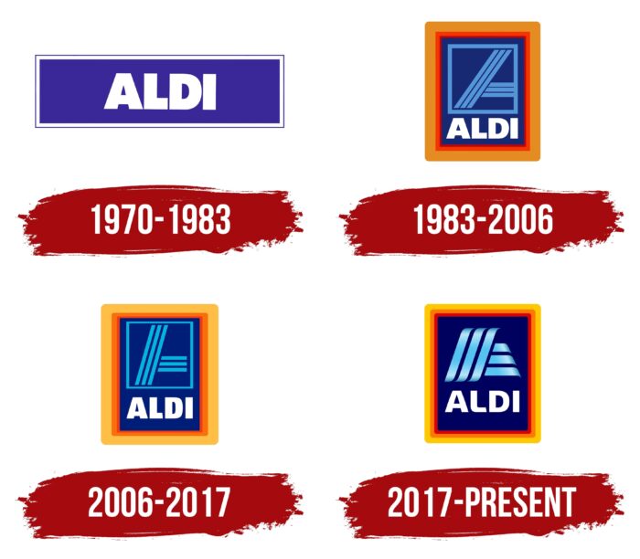
Until 1970, the company logos were written in different fonts, the owners’ last name. Initially, white letters were written on a red background. Then the rectangular base became dark blue. This concept, with some modifications, is still maintained today.
1970 – 1983
In 1970 the company name ALDI was used in the emblem for the first time. It was a concise logo in a dark blue rectangle. The sans serif letters, written in upper case, placed in a thin white frame conveyed the idea of the company’s policy itself – and discreetly. It was used this way for 13 years.
1983 – 2006
In 1983, the rebranding occurred. In this form, the company’s logo has existed for 23 years. Two colors were introduced – orange and red. It can be assumed that orange, as a color to attract attention, had to fulfill its direct function, and red was considered the original color of ALDI.
The colors were used in the logo frame. The orange outer frame is wider than the inner red. Many designers considered the combination with the blue background a very successful solution.
The graphic solution was the left half of the letter, consisting of three stripes. According to experts, this solution represented movement forward. A similar technique is used by some airlines and the automobile segment as a picture of the way, the road. The stylized letter “A” is in blue and framed.
Below the graphic part is the company name. The letters are very similar to those used in the previous version. The same white, upper case, maximum bold spelling echoes the traditional one.
2006 – 2017
The company slightly changed the design of the logo. The inner blue rectangle became narrower. Therefore, the letters have become narrower and more compact. Their reading was called clearer by specialists, especially when reducing the emblem for use on the website.
The graphic image also has changed slightly. Although the color scheme has remained the same, the lines have become thinner. Now the left side of the letter “A” went not from the bottom left corner of the frame to the opposite, but from ¾ of the bottom side of the rectangle to the middle of the top.
The biggest change in this version was the change in the tone of the orange and red. Frames became a little wider, but in order not to overload the overall look, the developers lightened the colors. This made the logo look lighter, softer.
2017 – today
The company’s latest rebranding sparked heated debate among designers. The changes were made not in line with trends but spite of them. While other companies simplify their emblems, which is dictated by the convenient layout and readability of logos in mobile smartphone apps, ALDI, on the contrary, made the design more complicated.
The designers translated the logo into a three-dimensional one from a two-dimensional plane. This was done by superimposing a gradient on the blue color in the letter “A.” The lines themselves became similar to waves: the edges were rounded and became softer. The inner blue frame was removed from the new logo. The letters also became softer, with smoother corners.
The framing got more complicated – now it is represented by three frames of the same width. This approach caused the most questions from the experts. They argue that this approach is not justified when used on mobile devices. All three frames merge into one and are not visible.
ALDI: Interesting Facts
Aldi, a well-known supermarket chain, stands out in the retail world for its history and way of doing business.
- Two Branches of Aldi: In 1960, Aldi split into Aldi Nord and Aldi Süd because the founders, Karl and Theo Albrecht, couldn’t agree on selling cigarettes. Aldi Nord covers the north of Germany and some other countries, while Aldi Süd is in the south of Germany and additional countries. However, both parts of Aldi stick to the same basic principles.
- How Aldi Started: Aldi’s story began in 1913 with a small food store in Essen, Germany, opened by Anna Albrecht. Her sons, Karl and Theo, took over in 1946, expanding to 13 stores by 1950.
- Keeping Costs Low: Aldi uses smart, simple strategies to keep prices low. Their stores are not fancy, and products are often displayed in their shipping boxes to cut down on handling. Most of Aldi’s brands are its own, making up about 90% of the items.
- The Aldi Effect: When Aldi opens in a new area, it often leads to lower prices across local supermarkets as they try to match Aldi’s low prices. This is known as the “Aldi effect.”
- Worldwide Reach: Aldi has grown to over 10,000 stores across 20 countries, becoming a major international retailer. It has a strong footprint in Europe, the USA, and Australia.
- Aldi and Trader Joe’s: In the USA, Aldi and Trader Joe’s are often confused. The confusion comes because the same company that runs Aldi Nord owns Trader Joe’s. However, the Aldi stores in the U.S. are operated by Aldi Süd. Despite this connection, Aldi and Trader Joe’s have different ways of doing things and brands.
- Eco-Friendly Efforts: Aldi is working to lessen its environmental impact. This includes using less plastic, wasting less food, and choosing sustainable sources. Aldi aims to cut its greenhouse gas emissions and use more renewable energy.
- Special Deals: Aldi is famous for “Aldi Finds” in the U.S. and “Special Buys” elsewhere. These are short-term deals on various products, from groceries to appliances, often at great discounts. These offers draw crowds and sell out fast.
Aldi’s approach is all about simplicity, cost efficiency, and making customers happy. Its success shows how sticking to basic principles while adjusting to local markets has made it a significant player in the retail world globally.
Font and Colors
Five colors were used in the last version of the logo:
- Dark Blue – Pantone 294C;
- Blue – Pantone 2995C;
- Light Orange – Pantone 123C;
- Dark Orange – Pantone 173C;
- Red – Pantone 032C;
- White
This information is laid out in the company’s brand book. It also states that the official font is Akzidenz-Grotesk. It is used in informational, official brand documents.
ALDI color codes
| Tangerine Yellow | Hex color: | #ffc900 |
|---|---|---|
| RGB: | 255 201 0 | |
| CMYK: | 0 21 100 0 | |
| Pantone: | PMS 7549 C |
| Safety Orange | Hex color: | #ff7900 |
|---|---|---|
| RGB: | 255 121 0 | |
| CMYK: | 0 53 100 0 | |
| Pantone: | PMS Bright Orange C |
| Red | Hex color: | #fb0000 |
|---|---|---|
| RGB: | 251 0 0 | |
| CMYK: | 0 100 100 2 | |
| Pantone: | PMS 172 C |
| Dark Navy Blue | Hex color: | #000061 |
|---|---|---|
| RGB: | 0 0 97 | |
| CMYK: | 100 100 0 62 | |
| Pantone: | PMS 2745 C |
| Vivid Sky Blue | Hex color: | #01c7f3 |
|---|---|---|
| RGB: | 1 199 243 | |
| CMYK: | 100 18 0 5 | |
| Pantone: | PMS 3125 C |
