Alert Logic: Brand overview
Established in 2002 to address the IT security needs of small and medium-sized enterprises, Alert Logic originally operated as a division of Fortra, a hosting company. Two years later, in 2004, the company released a pioneering intrusion detection system management service designed for Web-based applications, which relieved its customers of the burden of monitoring and maintaining intrusion detection systems (IDS).
Over time, Alert Logic has expanded its suite of security solutions for a wide range of computing environments – cloud, on-premises, or hybrid. A landmark moment for the company was the severing of its corporate ties with Fortra in 2010, when it became independent, devoting itself exclusively to cloud-based security technologies. After moving its headquarters to Houston, Texas, the company also received a $21 million financial infusion to accelerate growth.
Over the past few years, Alert Logic has focused on building Security-as-a-Service products designed to instantly identify and remediate threats. The company’s solutions provide end-to-end threat intelligence across multiple cloud infrastructures through machine learning, automated processes, and 24×7 expert staffing.
Alert Logic is now a global company and works with more than 4,000 customers and partners worldwide, serving key industries such as finance, healthcare, retail, and technology. The company has earned a reputation as a pioneer in cloud security, with its systems protecting more than half a trillion events from risk every day. Under the leadership of CEO Bob Lyons, Alert Logic is committed to strengthening its position as a leading source of managed detection and response services.
Meaning and History
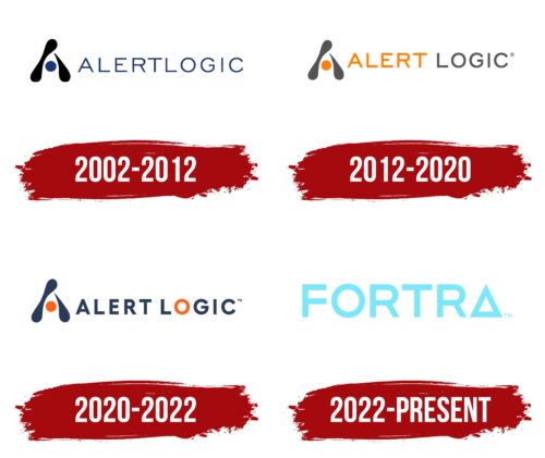
2002 – 2012
2012 – 2020
2020 – 2022
2022 – today
Alert Logic’s logo conveys the essence of the cybersecurity it provides to users. It originally focused on restricting access to certain areas, but now the concept has expanded to cover a wider area. This idea is embodied in the glyphs “resilient, robust, durable.” They are geometrically rigid, smooth, even, and chiseled. At the end of the word “Fortr,” written in capital letters, there is an equilateral triangle with sharp ends. All elements of the emblem are colored in turquoise – the color of calm, peace, and ease.
Glyphs as if saying: “We can handle it; do not worry.” Strict geometric shapes show that they are not noisy. The triangle resembles a guardian standing guard. The turquoise color creates a feeling of coolness and confidence that everything will be fine.
Alert Logic color codes
| Medium Sky Blue | Hex color: | #7ae8f8 |
|---|---|---|
| RGB: | 122 232 248 | |
| CMYK: | 51 6 0 3 | |
| Pantone: | PMS 319 C |
