The Alfa Romeo logo promises the dragon’s power and leadership on the road. Brand cars are created for confident people who want to drive the best premium cars. The sign shows the uniqueness and extravagance of the models.
Alfa Romeo: Brand overview
Alfa Romeo is a renowned Italian brand of premium cars he designs and assembles himself. It is a subsidiary of Stellantis. It was founded by businessmen Nicola Romeo and Ugo Stella in the summer of 1910. The main task of the carmaker is manufacturing luxury and sports cars, which it has been successfully coping with for more than 111 years. Today, it is considered one of the leading sports car brands globally, as evidenced by its participation in racing since 1911. The headquarters is located in Milan, in the Lombardy (Italy) region.
The legendary car brand’s career began with a French firm owned by Alexandre Darracq and sponsored by Italian businessmen. Her plant became ALFA’s first production site. The building was owned by SAID (Società Anonima Italiana Darracq).
At first, the company was located in Naples, but then the management decided that Milan would be the best place and bought land in its suburb – Portello. There, a new 8,000-square-yard plant was built from scratch. However, Darracq cars sold with difficulty, and at the end of 1909, the company was waiting for complete liquidation. Ugo Stella bought all the assets and opened another automobile company with Italian investors.
Meaning and History
The new structure was given a short name, which hid a long phrase since the four modest letters “A,” “L,” “F,” and “A” are nothing more than an abbreviation. They stand for “Anonima Lombarda Fabbrica Automobili”. That is, the company directly indicates that anonymous co-founders created it. So, the factory in Milan was saved from ruin. The second part of the name came five years later when Nicola Romeo bought the company. To begin with, the management decided to produce other cars that are more adapted to Italian conditions. Engineer Giuseppe Merosi designed them. After that, the company switched to racing cars.
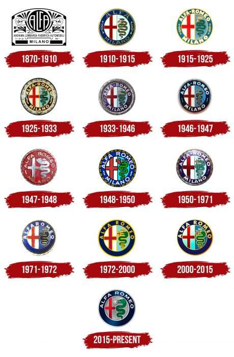
In parallel, she created new symbols. The case was again entrusted to Giuseppe Merosi. And he asked Romano Cattaneo, a young draftsman from the technical department, for a favor. The artist shared his ideas about including heraldic signs associated with the plant’s location in the logo. The management liked the idea very much. So, on the plaques of cars appeared a fragment of a red cross and a huge snake absorbing a child. The first sign personified Milan; the second symbolized the influential House of the Visconti dynasty, which ruled the city from the 14th century. During the entire existence of the trademark, eleven emblems have changed, and the twelfth is used now.
What is Alfa Romeo?
Alfa Romeo is an Italian company known for its premium cars. It is part of the Stellantis N.V. Corporation and was previously owned by Fiat Chrysler Automobiles N.V. The history of the iconic automaker began in 1910 when it was called ALFA. Each letter in the abbreviation stood for one word: “A” – “Anonima”, “L” – “Lombarda”, “F” – “Fabbrica”, “A” – “Automobili”.
1870 – 1910
The Alfa Romeo logo is rectangular with a curved top. Under the arc is a circle with the word “Alfa,” all the letters are adapted to the round format. The legs of side “A” are curved to fit perfectly into the ring. The letters “L” and “F” have been adjusted similarly. Large flowers on twisting stems with symmetrically arranged leaves are to the right and left of the black disk with the brand’s name. Below is the full name of the Italian automotive company, “Anonima Lombarda Fabbrica Automobili.” Under the line with curly hooks on the sides, the city where it is located is indicated. The emblem is black and white.
1910 – 1915
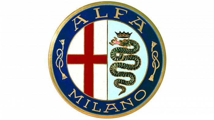
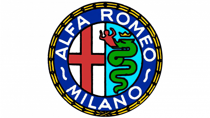
The debut logo contains all the iconic values associated with the automobile manufacturing enterprise’s area. A round badge is a basis—a seal, where legendary symbols are placed. Along the edge is a wide strip with the names the company “Alfa” and the city “Milano.” On both sides, they are separated by two Flemish knots. They are shaped like a figure eight, so they represent infinity.
A thin strip runs vertically through the central part, forming two identical fields. On the left side is a red cross on a white background. It is associated with Milan and is a great Christian symbol and a tribute to the Milanese knights. On the right side is a huge Biscione snake swallowing a person. It reflects power and omnipotence, being the heraldic sign of the Visconti family, the most respected in the city.
1915 – 1925
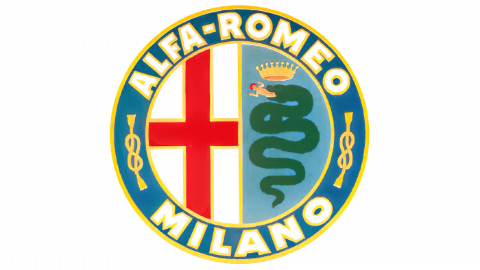
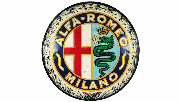
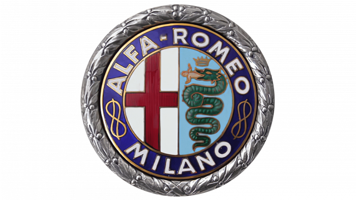
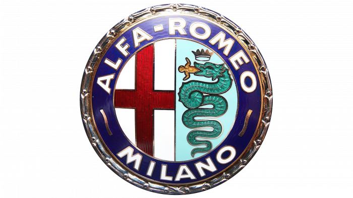
The designers corrected the emblem concerning the rebranding: the company received the name Alfa-Romeo after the purchase. This word is located on the wide rim. The font of the text has also changed. The signs became large, wide, and white. The color was also worked out: there is much gold in the logo (on the nodes, crown, all lines, and letters). The dark blue background is replaced with a light blue one.
1925 – 1933
The logo now has a silver wreath around the edge. The snake and the man sticking out of its mouth have also been corrected. The Flemish knots are larger, and the background is darker.
1933 – 1946
The developers have enhanced the shadows to make the drawing look bright and distinct. In addition, they enlarged the leaves on the wreath and expanded it. The texture of the elements has also changed: it has become visually rough and uneven. Small black strokes and jagged lines create this impression. It was the most textured version of all.
1946 – 1947
The logo of this period has been simplified:
- The wreath has disappeared from it.
- The crown has been reduced.
- The person protruding from the mouth has been corrected.
- The Flemish knots have been replaced with short pieces of rope.
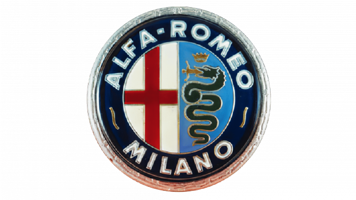
The designers made the snake thin and added a coil opposite the horizontal crossbar of the cross, and they silvered the edge of the circle.
1947 – 1948
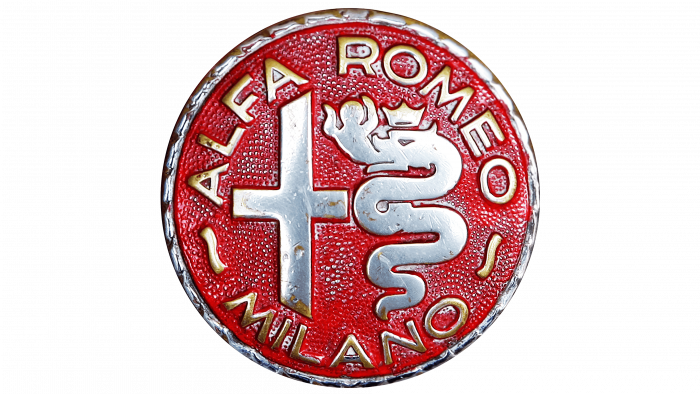
The logo’s design underwent a radical change: in this version, it is red-yellow. The inner circle’s borders have disappeared, so the cross, Biscione serpent, crown, and wriggling figure are surrounded by text. Moreover, this is the first time a company name is written without a hyphen. The sign’s background is scarlet, all elements are yellow, and the edging is black. The Flemish knots have turned into two undulating strokes.
1948 – 1950
Designers returned color to the emblem. Every detail is now painted. The right side is blue with a green serpent, a golden crown, and a red man. The left side is white with a large red cross. An inner circle also appears, surrounded by a thin black line. A strip of triple stitches runs along the edge. This ornament continues the previous logo.
1950 – 1971
The changes affected the shape of figures and elements. Now, they are strictly geometric. The cross is detached from the frame, and the serpent is enlarged. The logo’s border resembles an ancient Greek pattern of small strokes and circles. The “R” is now downsized, and the letters in the word “Milano” are merged, so it looks narrow.
1971 – 1972
First, the designers returned the silver curly border. Second, they made Biscione smaller and more compact, so its body turns were evenly distributed. The serpent turned from green to black, and the crown was enlarged and shifted to the side. The red cross is extended to the edge of the inner circle. The phrase “Alfa Romeo” is written together and stretched. Another important innovation is that the city’s name was removed along with the Flemish nodes, which no longer appeared in any variant.
1972 – 2000
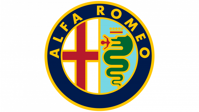
The emblem underwent a small redesign, which remained very long. The developers aligned the man’s figure protruding from the mouth of the snake and made it symmetrical. In addition, the authors added a red stripe to the golden color in the crown, separated the words “Alfa” and “Romeo,” outlined all the elements with a yellow outline, and painted the letters with the same color.
2000 – 2015
The logo of this period is distinguished by grace. The authors reduced the width and brightness of the edging stripes. They also added a gradient to the white background, changing from pure white (top) to heavenly (bottom). The inscriptions are colored similarly: white letters on the left and letters on the right.
2015 – today
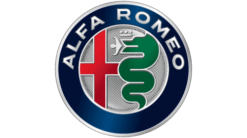
The changes made are related to the restructuring of the automotive industry. There are plans to merge PSA and FCA, which include Alfa Romeo. In 2021, other brands will join the Stellantis group, making it much larger. In this regard, the company has redesigned the logo. It depicts the same elements from the beginning: a giant serpent swallowing a person, a crown, a red cross, edging circular lines, and the name of an automobile manufacturer.
The logo came out metallic and voluminous, with a chrome texture. The dividing line has disappeared in the inner circle, so the cross is in contact with the snake. Biscione has several turns removed: now, it only has three body turns instead of five. The man received the outlines of an angel-like statue. The crown has shrunk to one short stroke with three dots. The font is reduced in size and has serifs. Instead of golden, silver is now a priority: it is with it that all elements are circled, including the inner and outer circles.
Alfa Romeo: Interesting Facts
Alfa Romeo is a famous Italian car brand known for its long racing history and unique designs. It started in Milan in 1910 and has since produced some of the most striking and powerful cars.
- Name Origin: “ALFA” stands for “Anonima Lombarda Fabbrica Automobili,” or “Lombard Automobile Factory, Public Company” in English. “Romeo” was added in 1915 when Nicola Romeo took over, shifting the company’s focus to military hardware during World War I.
- Racing Success: Alfa Romeo is a big motorsports company. It won the first World Championship for Grand Prix cars in 1925 and has excelled in Formula One, sports cars, and touring car racing.
- The Logo: Alfa Romeo’s logo, featuring Milan’s red cross and the Visconti serpent, reflects its Italian roots and connection to Milan.
- Quadrifoglio Symbol: The four-leaf clover, or Quadrifoglio, has been a lucky charm for Alfa Romeo’s racing cars and high-performance street cars since 1923, starting with a victory in the Targa Florio race.
- Innovation: Alfa Romeo introduced the twin cam engine and variable valve timing in production cars, showing its pioneering approach to car design and engineering.
- Unique Design: Known for sleek lines and a balance between beauty and performance, cars like the Alfa Romeo 8C Competizione and Giulia Quadrifoglio showcase the brand’s design philosophy.
- In the Movies: Alfa Romeo cars, known for their style, have appeared in many films, including “The Graduate” with Dustin Hoffman and “Quantum of Solace,” a James Bond movie.
- Alfa Romeo Museum: Located in Arese, Italy, the museum celebrates the brand’s history and displays over 200 vehicles and artifacts.
- Corporate Changes: Alfa Romeo joined Fiat Group in 2007, later becoming Fiat Chrysler Automobiles (FCA). In 2021, it merged with Stellantis, one of the world’s biggest car groups.
- Continued Appeal: Despite its ups and downs, Alfa Romeo remains beloved for its performance, style, and Italian craftsmanship. Recent models like the Giulia and Stelvio highlight the brand’s resurgence and ongoing appeal in the car world.
Alfa Romeo’s mix of speed, style, and Italian elegance keeps it beloved by car fans globally, cementing its status as a legendary car manufacturer.
Font and Colors
The logo’s shape is a print reminiscent of the modern version of a wheel rim. It initially had heraldry associated with Italy in general and Milan in particular. The cross is the symbol of the city where the company is located. It is a flag fragment and reminds us of the era of the knights, the first Crusades, and the Middle Ages. He also testifies to the blessing of God for the work that the automobile company is engaged in. The second important symbol is the serpent, representing the House of Visconti, the most influential dynasty since the 14th century.
The company opted for a thin serif typeface in early versions, which gradually evolved into a wide, massive sans-serif typeface. It stayed smooth and chopped over the years until it supplemented sleek, chunky overhangs in 2015. The previous version is Futura Bold, created by designer Paul Renner and released by Linotype.
The range of colors is diverse and has undergone tremendous evolution over many decades. It consisted of all shades of blue, red, gold, green, and burgundy. Now, a noble silver color has been used, replacing yellow.
FAQ
What is the serpent on the Alfa Romeo logo?
The logo features a snake eating a man, known as Biscione. This symbol comes from the Visconti family, important figures in Milan in the 11th century. Biscione represents Milanese tradition and has been part of the brand’s signature since its founding in Milan in 1910.
Initially, the Biscione symbolized power and rebirth, elements that the company incorporates into the design of its cars. Although some may perceive the serpent as a dragon, it is, in fact, a snake, which matches the historical descriptions in the heraldry of the Visconti family.
Who makes Alfa Romeo vehicles?
Fiat Chrysler Automobiles (FCA) produces Alfa Romeo vehicles. This large corporation manages the production and distribution of several automobile brands worldwide. Alfa Romeo leverages FCA’s vast resources, advanced technology, and global reach to maintain high Italian engineering and design standards.
What does the emblem on the Alfa Romeo mean?
The emblem is associated with the history of Milan and represents a red cross and a snake devouring a man. The Red Cross, known as the Cross of St. George, signifies the bravery of the Milanese warriors of the Middle Ages. The snake, part of the Visconti family’s coat of arms, symbolizes the historic victory over the Saracens. These elements show the rich heritage and triumph of Milan, which the brand strives to reflect in the design of its cars.
What does the Alfa Romeo logo symbolize?
The logo carries a deep meaning and is closely linked to Milan’s heritage. It depicts the coat of arms of the Visconti family and is divided into two parts. On the left, the red cross represents the St. George’s Cross, a symbol of Milan and its patron, reflecting the city’s bravery and military past.
On the right side of the logo is the snake, or Biscione, the historical emblem of the Visconti family. The meaning of the snake varies: some say it commemorates Milan’s victory over the Saracens, while others believe it depicts a legend in which a nobleman named Uberto, an ancestor of the Visconti, defeats a dragon, symbolizing victory over powerful enemies.
What does the clover symbol mean on Alfa Romeo?
The clover symbol, the quadrifoglio, is featured on Alfa Romeo cars. It was originally a mascot painted by Ugo Sivocci on his car to improve his racing luck. Sivocci, who often finished second, hoped this symbol would bring him victory, which it did in his first major win.
Unfortunately, Sivocci died in an accident while driving a car without the clover. The brand then adopted the cloverleaf in his honor. Now, it symbolizes good luck for the team of drivers, which included Antonio Ascari, Giuseppe Campari, Hugo Sivocci, and the young Enzo Ferrari.
