


![]() Alfamart Logo PNG
Alfamart Logo PNG
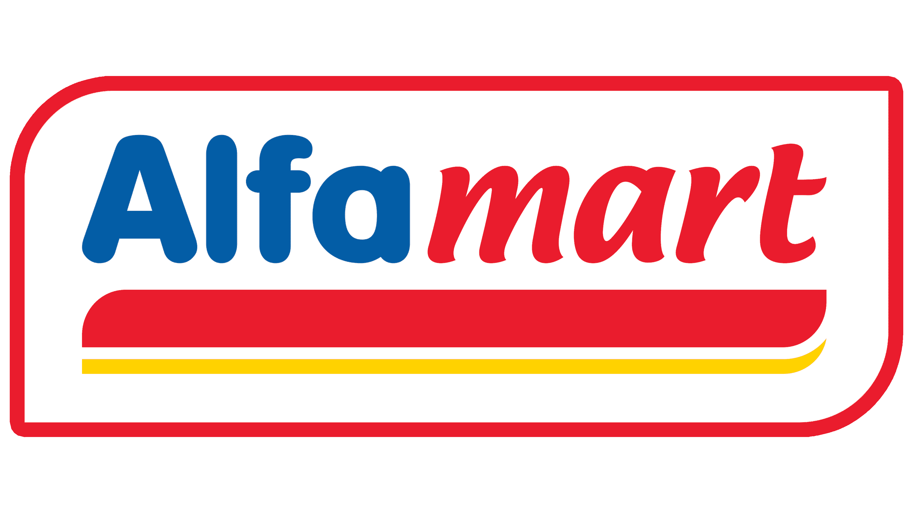
“If you urgently need groceries, you can contact the chain store at any time of the day,” says the Alfamart logo. The emblem conveys the idea of speed, availability, reliability, and quality service.
Alfamart’s story began with Djoko Susanto, born in Jakarta in 1950 to a Chinese-Indonesian family. After leaving school because of restrictions on children with Chinese names, he worked at his family’s food stall from age 17. In 1976, a fire destroyed most of the family’s capital, and his move into cigarette trading brought him into contact with tobacco businessman Putera Sampoerna.
On February 22, 1989, Susanto and his family registered PT Sumber Alfaria Trijaya in Jakarta. Later that year, PT HM Sampoerna Tbk took 70% of the company, while Susanto kept 30%. The partnership gave the business capital and access to a broad distribution network across Indonesia.
In 1999, Susanto opened the first Alfa Minimart in Karawaci, Tangerang, Banten. The format was a small neighborhood store with fixed prices and everyday goods. In 2002, the company acquired 141 Alfa Minimart outlets and began using the Alfamart name. Its main rival was Indomaret, owned by the Salim Group, which competed in the same dense retail areas of Java.
After Sampoerna sold its tobacco business to Philip Morris International in 2005, Alfamart’s ownership changed. In 2006, Susanto regained control through PT Sigmantara Alfaindo. Alfamart was listed on the Indonesia Stock Exchange on January 15, 2009, under AMRT, with about 3,000 stores. The group later expanded into Alfamidi and Lawson. In 2014, it entered the Philippines with SM Investments Corporation. By late 2019, Alfamart had over 14,000 stores in Indonesia and more than 600 abroad, while Alfagift launched the same year. In May 2025, Lawson’s operating company was placed under Alfamart’s control.
Meaning and History
![]()
The idea to open stores came to Indonesian entrepreneur Joko Susanto in 1999. Before that, he had been the director of a distribution company for ten years. He held a 30% share in this company, with the remaining 70% owned by the well-known cigarette manufacturer PT HM. Sampoerna Tbk. The business went well, and in 6 years, the entrepreneur opened almost 1,300 stores, allowing him to buy out part of the joint venture and secure a 60% share. The company continues to expand aggressively. By 2020, Susanto had not only opened about 7,000 branches in Indonesia but also 1,000 stores in the Philippines.
The brand logo has been changed twice. The first time was because of the store’s name change. After that, only “cosmetic” adjustments were made. They improved the visual perception and added lightness and motion to the logo.
What is Alfamart?
This is a chain of shops selling essential goods at affordable prices. This network includes about 10,000 outlets in Indonesia and the Philippines, most of which are franchised. The brand is privately held and owned by the Indonesian businessman Joko Susanto’s company, PT Sumber Alfaria Trijaya Tbk.
1999 – 2003
![]()
Originally, the stores were called Alfa Minimart, and the logo was developed under that name.
It was characterized by bright colors and its similarity to the flag: rectangular shape, two-color background with a large red stripe at the top and a yellow stripe at the bottom. The choice was related to the businessman’s homeland. Red is the color of the flag of Indonesia, where the Susanto family lived, and red-yellow of China, the country of his ancestors. At the same time, the present homeland’s sign prevailed, rooted in the past, as the family favored Indonesia. The businessman even changed his last name from Kwok Kwee Fo to Susanto.
In big blue letters, the inscription “Alpha” was written on the red part. She was pointing to the leader, the main position, and the first-choice convenience store. The white outline of the letters is a symbol of novelty.
The yellow stripe has black lettering, indicating the essence of the offer: a mini-market.
2003 – 2015
![]()
As soon as the business made a profit, Susanto considered modernizing the name and adopting a professional logo. As the company expanded rapidly and store sizes grew, the businessman removed the word “mini” from the name. The outlets became known as Alfamart.
A little later, the cigarette company sold its stock. Jocko bought 30% and became the owner of 60% of the business. He named his revamped company: PT Sumber Alfaria Trijaya Tbk.
The new logo retained only a remote resemblance to the first one. The red-yellow color remained in the thick stripe that emphasized the company name. It resembled a strip of multicolored toothpaste. Its placement at the bottom was a symbol of clean, fresh products and pointed to the base on which the renewed brand stood: Alfa mini-market stores.
The word Alfamart was visually divided in half, with the letters written in two different fonts: Alfa and Mart. The first part of the word was blue, like the first logo, but without white circling. The second part was written in red italics. This kept the emphasis on the word Alpha (leader). But it also gave an idea of what the brand offers.
In addition to the logo, they developed an advertising mascot – a bee named Albie. Its appearance is also dominated by the logo’s main colors – red, blue, and yellow. The bee was chosen for its diligence and speed. Anyone busy at work can quickly buy what they need at the nearest Alpha Marketplace at any time. The hardworking bee delivers goods practically to the house, around the clock (the markets were located in busy residential areas).
2015 – today
![]()
By 2014, the businessman had already opened 7,000 stores and was expanding, aiming to establish a chain in the Philippines. This was reflected in a slight revamping of the logo.
Its letters were elongated and enlarged, symbolizing an increase in the number of outlets. The blue hue of the name was lightened, evoking a climb to the sky. The white stripe between the red and yellow was made more visible, and the yellow line was extended further, making it look like skis. This is how the emblem reflected the movement, opening new stores, and the “move” to another country.
Font and Colors
The main colors of the Alphamart emblem:
- Blue – rationality, the right choice, reliability, high rating.
- Red is the color of the Indonesian flag, a symbol of leadership, and the favorite color of customers.
- Yellow – energy, quick solution to everyday problems.
- White – the color of the Indonesian flag, the freshness of products, and the constant renewal of the assortment.
The logo has a double font. Urbane Rounded Bold is used for the first part of the name, slightly modified Ciabatta Semi Bold Italic for the second.