The Alice Cooper logo is infused with the philosophy of rock music and reflects the artist’s approach to stage performances. The emblem, reminiscent of a scene from horror movie sets, evokes eerie images from the life of a maniac.
Alice Cooper: Brand overview
For over five decades, Alice Cooper has ruled rock music, captivating fans with his drama and unique stage presence. His mesmerizing performances have made him a beloved and iconic figure in the music world.
Born on February 4, 1948, in Detroit, Michigan, Vincent Damon Fournier was destined to become the rock legend known as Alice Cooper. Growing up in a family of music lovers, Vincent and his friends formed a band in high school. At first, they performed at local gigs, gradually carving out a niche for themselves.
In the late 1960s, the band, named after Vincent’s stage alter ego, began to gain momentum. Their unique sound resonated with rock fans, and the band’s albums and singles quickly gained a loyal following.
Cooper became a true rock ‘n’ roll pioneer, changing conventional norms with his striking and sometimes grotesque performances. In extravagant costumes, using theatrical props and artificial blood, his empathetic performances were unrivaled and left an indelible mark on the history of rock music. He became one of the founders of “shock rock,” revolutionizing the music scene with his daring performances and distinctive sound.
In the 1970s, Cooper embarked on a solo career, a bold move that paid off. The successful singles “Welcome to My Nightmare” and “Only Women Bleed” demonstrated that his solo career was as successful as his group career.
Throughout the 80s and 90s, Cooper’s career grew rapidly as he continued to tour and release hits. His fame was not limited to the music world: he starred in movies such as Wayne’s World and Freddy’s Dead: The Last Nightmare.
Today, Alice Cooper is a living legend in rock music. His significant contributions and enduring influence have earned him a place in the Rock and Roll Hall of Fame and numerous awards. Cooper is undeniably one of the most significant figures in the history of rock music. His unique style and stunning performances have left a lasting impression on rock musicians and fans alike, and his influence still resonates today in his music and the genre he helped shape.
Meaning and History
What is Alice Cooper?
He is a prominent figure in rock music. He is known for his unique style and sound, which has earned him many fans worldwide. Cooper was a pioneer in combining theatrical elements with hard rock, creating a memorable stage presence. His influence extends to various genres of rock and roll, inspiring many musicians with his distinctive approach to entertainment.
1986 – 1987
The artist’s logo emerged almost ten years after the release of his first solo album. The year 1986 marks Alice Cooper’s return to the stage after a two-year hiatus. This period became a significant milestone in his career, marking the beginning of a new phase in his work.
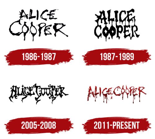
The black letters of his name, with paint drips, create a sinister impression. This style perfectly reflects the shock rock genre and theatrical performances often used by the musician. The emblem was designed for the album “Constrictor,” a name that refers to one of the sphincters that contract in fear and tension.
The handwriting on the logo appears uneven as if it were written by a trembling hand. This element emphasizes the atmosphere of horror and fear that became Alice Cooper’s signature style. The logo draws attention with its darkness and unpredictability, attracting those seeking thrills and unusual experiences. The interaction of horror and the audience, embodied in the emblem, makes it a powerful visual symbol of the album and the musician’s stage shows.
1987 – 1989
A year later, Alice Cooper’s logo became denser and more compact, like concentrated darkness. This new design is associated with the album “Raise Your Fist and Yell,” which fans praised for its rougher and more powerful sound. The thickness of the letters in the logo emphasized this aggressive and energetic style.
The new look enhanced the sense of fear and highlighted the direction of horror central to Alice Cooper’s work. The emblem perfectly matched the artist’s performances during the tour, which caused much controversy in Europe due to the highly theatrical shows featuring fake blood, dolls, and other horror elements.
2005 – 2008
The emblem in a sinister fantasy style became part of Alice Cooper’s most successful album, “Dirty Diamonds.” The font, resembling fairy tale script, evokes images of magical creatures from other worlds, spirits, and magic. The twisting letter glyphs resemble plant roots in an evil forest, creating a sense of a dark and mysterious atmosphere.
Other logo elements resemble horns and axes, enhancing the feeling of danger and horror. The symbols in the logo create a nighttime ambiance filled with frightening images and sounds, transporting the listener into the depths of a dark forest.
However, the logo includes hints of hope and peace. Hearts embedded in the letters “O” resemble windows of a safe cabin where travelers can find refuge. A star instead of a dot above the letter “i” transforms it into a candle, lighting the way in the dark forest, symbolizing hope and the possibility of salvation.
This logo was the first to include positive imagery alongside elements of horror. It highlights Alice Cooper’s multifaceted nature and creativity, showing that his music combines darkness and fear with elements of light and hope.
2011 – today
The logo of American rock musician Alice Cooper features his stage name with large drops falling from it, designed to appear as if written in blood. However, the red color is so thick that it resembles raspberry jam. This effect makes the logo less frightening, giving it a humorous twist on the horror style. Many of Alice Cooper’s stage personas carry a similar humorous tone, making this visual representation a perfect match for his work.
The logo acts like a trickster, playing with expectations. It starts with an eerie vibe and then surprises you with its jam-like appearance. This playful design mirrors Alice Cooper’s music, combining serious rock with fun elements. The unexpected blend keeps it exciting and memorable.
The thick, dripping letters add a dramatic touch, while the jam-like red color softens the overall look. This combination creates a unique and engaging visual. The humor in the design aligns with Alice Cooper’s stage presence, where horror meets comedy.


