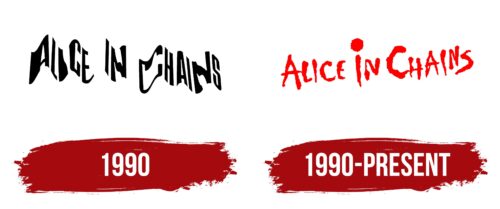
Due to its inscription style, the Alice in Chains logo is uncertain and slightly frightening. The emblem represents a group with a non-standard approach to performance. The logo embodies the variability of musical genres and themes in the group’s work.
Alice in Chains: Brand overview
| Founded: | 1987 – 2002, 2005 – present |
| Founder: | Jerry Cantrell, Sean Kinney |
| Headquarters: | Seattle, Washington, U.S. |
| Website: | aliceinchains.com |
Meaning and History
The group’s logo emerged after signing a contract and recording the first album – in 1990. The guys played without a known visual identity for three years before that. Starting to collaborate with Columbia Records, the group experimented with its name and emblem. Options varied. Fans could have been listening to songs, not of Alice in Chains, but the band “Fuck” if the friends had settled on that name. The logo examples also varied greatly. Ultimately, the choice was made in favor of readability and simplicity. The sign has remained unchanged for over 30 years and is associated with the performers.
What is Alice in Chains?
A rock group that enjoyed fan attention and popularity until the overdose death of its founder Layne Staley in 2002. The group’s main activity was in the late 80s and early 90s when the members had many side projects in parallel with the band. Activity diminished after Staley’s fiancée’s death in 1996 when he began to live in seclusion and use drugs. However, with new vocalist William DuVall, the group was revived in 2005 and continues to create.
1990
The band’s logo, chosen for the first album Facelift, consists of the name written in a unique style.
The group’s name was inherited from one of the founders – Layne Staley. Before joining the group, he sang with the guys from Sleze. It was they who, at the end of their existence, decided to rename themselves Alice in Chains. The idea was to mock the fashion of rock musicians to cover themselves with chains. The Sleze members decided performing in women’s clothes, playing rock would be cool. They chose the code name, Alice. However, they were scared off by a too-direct hint of slavery, so the group played under the name Alice N’ Chains for the last year of its existence.
But when Staley and Jerry Cantrell formed a new group in 1987, they used this interesting name.
The letters on the emblem are twisted like chains, embodying the band’s name. Each character is a separate link or a new song that allows the group to remain on the rock scene.
1990 – today
The band’s definitive emblem appeared after the Live Facelift video, recorded on Halloween, and sold in an edition of 50,000 copies. The logo for the video album was chosen in the holiday style – the title in bloody red letters. Each glyph, like the buzzing sound of the guitar, is characteristic of bands from Seattle. The album’s logo appealed so much to the musicians that it accompanied the performers throughout their creative journey.
Font and Colors
The inscription’s red color resonates with the title’s female name. Initially, it was associated with the theme of All-Hallows-Even, a celebration of death and the supernatural. From this angle, it was slightly frightening, hinting at something bloody. However, the associations with the color are not only scary. It conveys a good mood and enjoyment that the audience will get from the band’s creativity. It points to bright compositions and the unique personalities of the performers.
The font of the inscription is individual. The logo seems to have been painted on a wall. The messiness of the smeared, uneven characters conveys the dirty guitar sound of grunge, in which many of the band’s compositions are recorded. The large dot over the ‘i’ draws attention. The drawing transforms the letter into a microphone. It metaphorically points to the band’s drive towards a certain goal, around which their creativity is built.
Alice in Chains color codes
| Red | Hex color: | #fe0000 |
|---|---|---|
| RGB: | 254 0 0 | |
| CMYK: | 0 100 100 0 | |
| Pantone: | PMS 1655 C |


