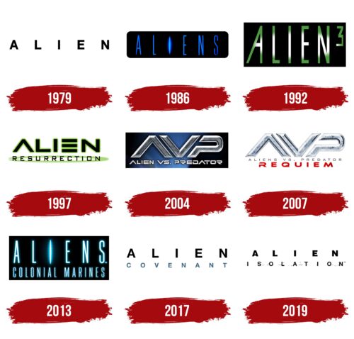
The Alien logo is fantastic and soaring. It talks about cosmic spaces, weightlessness, and ships carrying extraterrestrial life. The symbol is full of survival struggles and desperate battles. It opens the curtain to an unknown world.
Alien: Brand overview
| Founded: | 1979 |
| Founder: | Dan O’Bannon, Ronald Shusett |
| Headquarters: | United States |
Alien – a fantastic cosmic American franchise telling about the collision of humans with aliens. The first part was released in 1979. Sigourney Weaver played the main role in the initial four parts. Ridley Scott directed the first story and all prequels. The second part was directed by James Cameron, the third – by David Fincher, and the fourth – by Jean-Pierre Jeunet. The first and second parts had the largest box office collections – $184 and $183 million. The first prequel was the most profitable – $400 million.
Meaning and History
Audiences and critics received the picture so well that in the following years, 20th Century Fox released three sequels, which also had significant success. As a result, there appeared additional crossovers, games, toys, and other proposals. Each logo of the series relates to the next film adaptation. As part of the overall franchise, the emblems do not demonstrate evolution but are dedicated to individual films. However, each has an element of mystery and mysticism.
What is Alien?
A series of films from 1979-2019 dedicated to the theme of extraterrestrial beings that use humans as hosts and incubators. There have been four main parts of the franchise. Then two crossovers unite Aliens and other popular aliens. Subsequently, the creators turned to the history of the Alien universe, creating three prequels. Work is currently underway to continue the main storyline.
1979
The logo of the original film adaptation. It consists of simple capital black letters written at a great distance from each other. The space indicates cosmic space and weightlessness. The technique leaves mystery between the symbols, expecting sudden events. The sign retains understatement.
Black letters resonate with the color of the alien-xenomorph and the background of space outside the spaceship’s windows. They are associated with horror and night.
1986
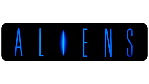
The first sequel to the Alien movie appeared in 1986. It is associated with a deliberate mission for which the heroine Ripley goes to the planet in search of alien monsters.
The logo reflects the theme of space in the form of a black rectangular base with rounded corners. The dark background also points to danger and the unknown. The team doesn’t know what awaits them upon landing. The inscription is done in blue neon letters. The central I is transformed into a narrow slit from which light is pouring. Stepping inside, travelers will see a new world.
The glow is reminiscent of the semi-darkness on the ship, lit by hidden LED lights.
1992
The third part, “Alien 3”, where the events unfold on a prison planet.
The logo’s square black background hints at enclosed space. Ripley has to deal with an Alien that hid on her ship. The confined background with large letters inside reflects the idea of a cell.
Large green letters of the title are as if illuminated by a flashlight, depicting how a jailer, approaching the cell, shines a flashlight in the face. The lines of symbols resemble the prison tunnels where the inmates lived in the movie.
1997
The fourth film told about the clones of aliens and Ripley. It was released in 1997 under the name “Alien: Resurrection.” The emblem of the version is the most unusual and has no repetitions. The word Aliens is executed futuristically. E lacks the main glyph, and A is missing a crossbar. The technique indicates a loss of completeness. Characters are not real but cloned individuals.
Three identical stripes instead of E speak of the process of changing chromosomes, creating externally similar creatures. The word “resurrection” is surrounded by an oval figure, a symbol of reproduction, a closed cycle.
Green shades draw a parallel with the previous part.
2004
Thanks to the franchise’s success, several films were released with a related plot, uniting the story of two alien monsters, each of which was filmed in separate films earlier. The 2004 film was called “Alien vs. Predator.”
The series got its own logo, different from the previous ones. The emblem consists of three letters made from an unusual alloy. The first comes from the word Aliens but without a partition in the letter A. The second letter is part of VS. In Latin, the word Versus, shortened to VS, means “against.” The last element, R, is Predator.
The spelling of each element is slightly simplified, indicating lower life forms, in which the main themes are reproduction and survival, to which the battle between them is dedicated.
Below the abbreviation is the full decoding of the name in small letters.
The emblem chose a black background with a gradient – a glow coming from the planet. The space theme prevails, as the main participants are aliens. The action takes place in the ice of Antarctica, which presumably gives the glow to the logo’s background.
2007
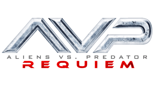
In 2007, the second part of the crossover “Aliens vs. Predator: Requiem” appeared. The main abbreviation and caption remained the same. Meanwhile, a more prominent red inscription Requiem has been added, and the background has been removed.
The white substrate speaks of events unfolding on Earth in broad daylight. The red color of the inscription indicates bloody battles and many injured people.
2013
The film “Prometheus” served as a unique prequel to the story, addressing the origins of the alien monsters encountered by Captain Ripley. The same year the prequel was released, Aliens: Colonial Marines – a computer game based on the Aliens universe – was also launched. The game received harsh criticism and is considered one of the worst in history.
Its logo resonates with the second installment of the franchise. The black background is symbolic of space. The rectangular canvas displays letters glowing like the lights of a spaceship. The brightest, central letter I is designed as an entrance to subspace for jumps across vast distances. This element represents the entrance to another world unknown to man. All that remains is to draw back the curtain.
2017
The sequel to Prometheus, titled closer to the previous installments as “Alien: Covenant,” was known at the time of filming to have at least two more prequels to follow. Therefore, the film was prepared as one of three parts.
The emblem’s basis was taken from the franchise’s first logo, with a small element added: the blue subscript “Covenant.” The first word, Aliens, indicated belonging to the same series of franchises, while the second linked the film to the logos of past installments.
2019
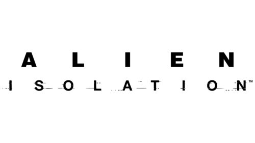
“Alien: Isolation” became the final prequel installment, telling the story of the xenomorphs’ creator and leading to the franchise’s first film. The logo has a significant nod to this message. The emblem replicates the 1979 logo.
Large black letters with substantial spaces between them. The characters in Alien have become slightly thicker to represent the long history separating the installments. Each element is a separate puzzle piece of the story, forming a unified picture. The inter-letter spaces symbolize the distances between planets. The difference between the series’ first and last logos is evident in the addition of the word “isolation” below the main title.
The story isn’t over; further sequels to Alien are planned. In 2022, it was announced that work had begun on the film “Alien: Romulus.”
Font and Colors
The main logo shades are black, green, and blue. The colors reflect the main themes and locations where the films’ stories unfold.
- Black – the color of space. It represents the appearance of the aliens and conveys the theme of horror, fear, and death that they bring.
- Blue – the prototype of stars and their glow. This shade is used in conjunction with neon light, adding to the overall picture. The blue palette relates to technology, indicating future technical progress.
- Green – the color of life. It tells of Earth, the desire to survive, to protect the home from threat. It indicates the theme of reproduction.
The font of some of the emblem inscriptions is simple and even, indicating the straightforward goals and collective organization of the monsters. In some logos, futurism is evident, with characters taking on whimsical forms.
Alien color codes
| Black | Hex color: | #000000 |
|---|---|---|
| RGB: | 0 0 0 | |
| CMYK: | 0 0 0 100 | |
| Pantone: | PMS Process Black C |


