


![]()
Alma, an AI-powered app for nutrition tracking and personalized food discovery, will launch in 2025 with a fresh logo and visual identity designed by Philadelphia-based Smith & Diction. In beta testing, Alma aims to change how people experience food tracking by focusing on simplicity, personalization, and a more human-centered approach to healthy eating. The new branding reflects this vision, combining clean design with meaningful details to help the app stand out in the crowded health-tech space.
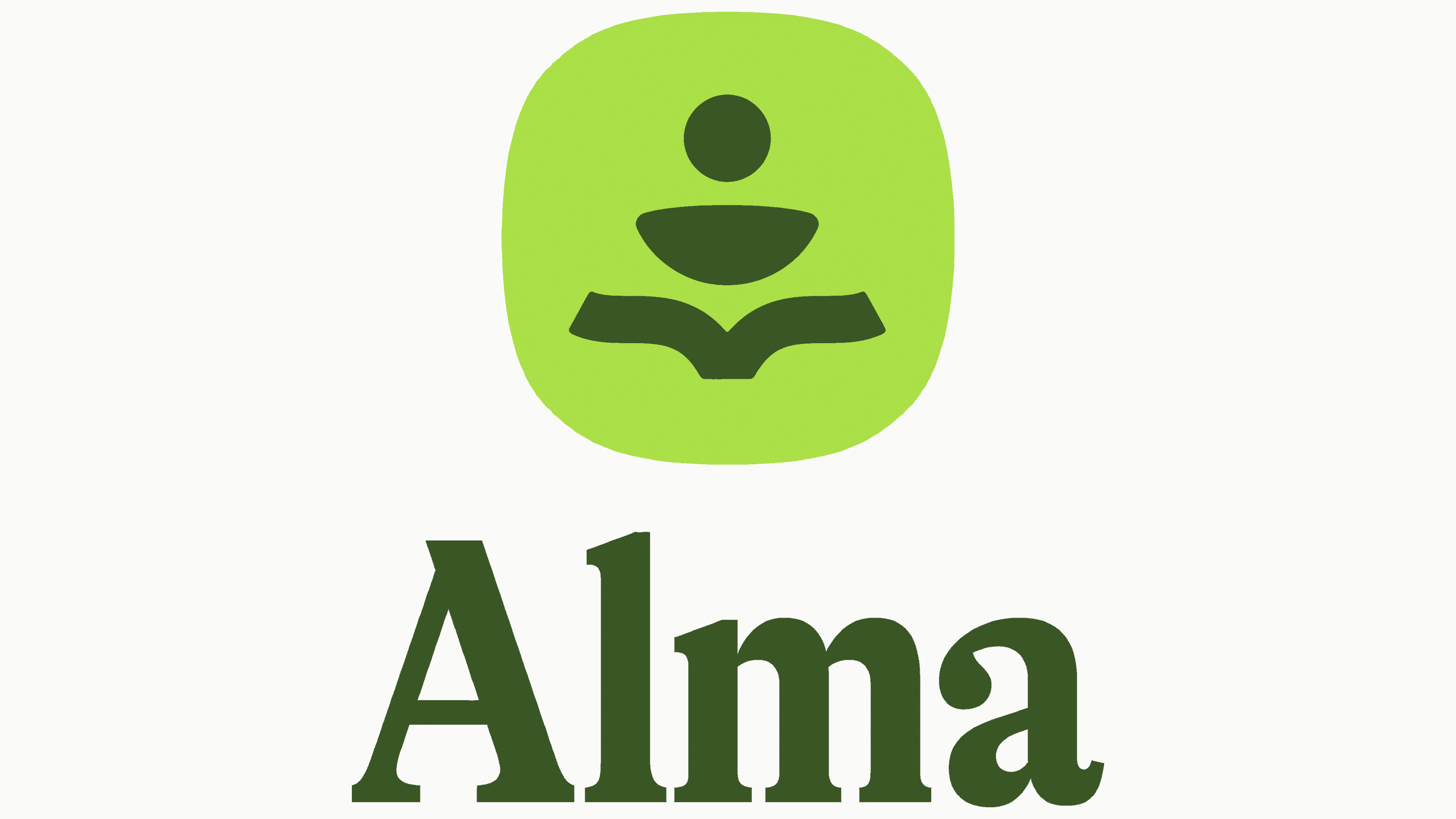
The Spanish name “soul” is fitting for a service designed to bring warmth and life to the often routine tasks of meal planning and tracking. The sense of soulfulness runs through every part of the new logo, from the visuals to the typography.
The logo features two main elements: a geometric emblem and a sleek wordmark. The emblem, though simple, carries layered meaning. It comprises three shapes—a circle, a semicircle, and a line resembling an open book. Together, they form an abstract design that reflects the app’s core values. The circle at the top represents the human connection, focusing on personalization. The semicircle below hints at a dish, nodding to recipe recommendations and the joy of exploring new flavors. The open-book shape suggests learning and self-discovery, aligning to help users understand their nutrition habits. These elements subtly form an “A,” adding a clever detail that strengthens brand recognition.

The wordmark uses GT Alpina Condensed Bold, a serif font from Grilli Type that blends modern style with a classic feel. The bold serifs and strong contrast give the logo presence while still feeling approachable. Its clean lines make it easy to read, and the slightly vintage vibe adds a sense of familiarity as if this service has been part of your routine for years.
The color palette focuses on rich shades of green, from deep forest tones to lighter, refreshing hues. Green was chosen for its connection to growth, health, and balance—the core ideas behind the project. This natural palette focuses on wholesome nutrition while creating a calm, grounded look that sets it apart from the clinical feel of many health and fitness apps.
The design doesn’t stop at the logo. The same aesthetic applies to the app’s interface, marketing materials, and packaging. Minimalist design, thoughtful icons, and a cohesive color scheme create a user-friendly, modern, and welcoming experience. The app’s clean layout mirrors the logo’s simplicity, making it easy to navigate and reinforcing the mission to make healthy eating feel effortless.
Though the new logo is minimal, every detail serves a purpose. The emblem’s layered design is dedicated to personal growth, discovery, and well-being. The bold yet refined typography builds trust without seeming too formal. Even the earthy color palette reflects the focus on authenticity and connection.
The name and visual style were inspired by founder Rami’s time in Spain, where the vibrancy of local food and culture left a lasting impression. This influence appears in the brand’s balance of modern simplicity with a soulful, handcrafted feel.