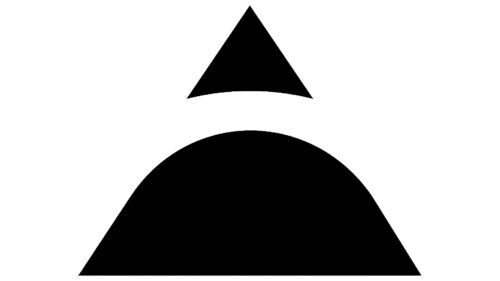
ALTA logo embodies simplicity and depth, intricately employing geometric shapes to create a subtle and eye-catching effect. At first glance, the emblem consists of a small black triangle and a trapezoid with rounded top edges. These shapes are arranged to form the outline of an “A” through the negative space adjacent to them. This stylized “A” captivates much more attention than standard alphabetical characters.
The use of geometric shapes lends a feeling of stability and reliability. Triangles are generally associated with dynamism, while trapezoids can symbolize balance and support. These elements are colored black, commonly signifying sophistication, elegance, and formality. The black hue contrasts with the white background, drawing immediate focus and allowing the ‘A’ to stand out prominently. It is noteworthy how the company cleverly uses negative space to create the ‘A.’ Negative design space grabs attention and leads the eye toward the core message, in this case, the brand name ALTA.
The trapezoid and triangle are more than mere shapes; they work together to form the first letter of the brand’s name. This layering method indicates depth and complexity behind what appears simple, echoing the common saying that ‘less is more.’
Subtlety is another hallmark of this design. There are no loud colors or intricate designs, just a black-and-white palette that has its brand of magnetism. The ‘A,’ formed by the negative space, operates on the principle of minimalism. It demonstrates how subtraction often speaks louder than addition in design, fostering a brand image of sophistication and modernity.
Black and white suggest a timeless quality. Trends in design come and go, but the monochromatic palette remains a constant in conveying class and refinement. As a result, the logo successfully portrays an image that’s both contemporary and lasting.
Beyond its initial impression of simplicity, this emblem has several layers of meaning. Through brilliant geometric shapes and color psychology, it successfully creates an image that conveys stability, sophistication, and an underlying complexity. It serves as an apt representation of the brand it stands for, signifying not just an identity but a set of values and aesthetic principles.
ALTA: Brand overview
| Founded: | 2015 |
| Headquarters: | Dubai, United Arab Emirates |
| Website: | altalab.io |
Established in Dubai in 2015, ALTA started as a laboratory dedicated to exploring blockchain technology’s possibilities and practical applications. Its founders recognized the transformative power of distributed ledger technology (DLT) and understood that numerous fledgling companies struggled to translate this technology into tangible real-world applications. To hasten blockchain implementation, ALTA offered an array of services, from mentorship and promotional assistance to facilitating introductions to potential investors for startups in their initial phases.
As time passed, ALTA collaborated with many startups spanning various fields, such as finance, supply chain management, and healthcare. Among the companies that benefitted from ALTA’s guidance were PayTabs, a digital payment service, and CargoX, a provider specializing in freight logistics.
By the time 2019 rolled around, ALTA had evolved into more than just a startup accelerator. It began offering consultative services to larger corporations contemplating integrating blockchain technologies. This evolution solidified ALTA’s reputation as a foremost authority on blockchain in the Middle East. In this capacity, the company also contributed to government-led initiatives in the United Arab Emirates focused on DLT.
ALTA persists in offering advisory services to a worldwide clientele, covering blockchain technology and delving into other emerging areas such as cryptocurrencies, non-fungible tokens (NFTs), and the metaverse.
Meaning and History
2015 – 2023
2023 – today
ALTA color codes
| Black | Hex color: | #000000 |
|---|---|---|
| RGB: | 0 0 0 | |
| CMYK: | 0 0 0 100 | |
| Pantone: | PMS Process Black C |

