A smile with an arrow is the main feature of the brand’s identity, and the platform uses the Amazon Prime Video brand logo – with a curved arc that is located under the name of the service and stretches from the first to the penultimate letter. But there is another characteristic feature – the “start” button. It is disguised as an “O” and is colored olive green.
Amazon Prime Video: Brand overview
| Founded: | 2006 |
| Founder: | Amazon |
| Headquarters: | Seattle, Washington, United States |
| Website: | primevideo.com |
Meaning and History
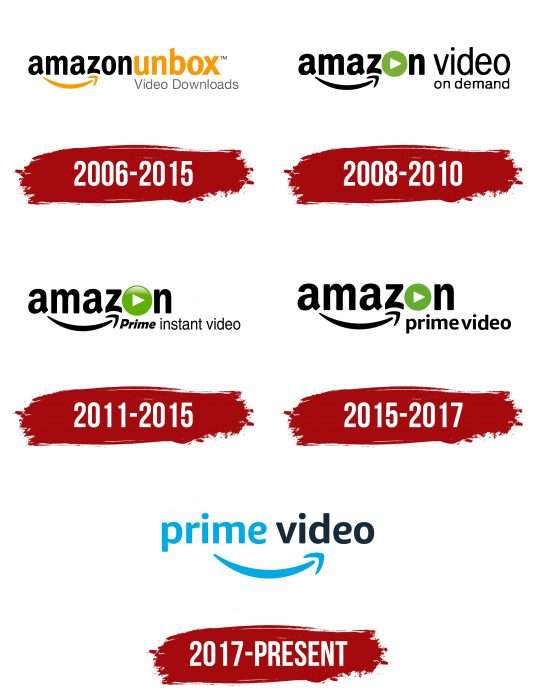
Prime Video’s popularity skyrocketed during the COVID-19 pandemic when movie theaters disappeared. Now, even more, people know what this service’s logo looks like: a two-color inscription with the famous Amazon arrow. But the wordmark was not always that way. It frequently changed along with the streaming platform to reflect its name. And there were a lot of them: in 2006 – Unbox, after 2008 – Video on Demand, since 2011 – Prime Instant Video, and all with the word Amazon at the beginning.
The online service received its current name only in 2015, almost nine years after its inception. During the same period, she acquired a black and blue emblem, which culminated in the rebranding.
What is Amazon Prime Video?
It is an American streaming platform for films and TV series produced primarily by Amazon Studios. It now contains content from other producers as well. The transmission is carried out in two formats: paid (by subscription) and free (offline). The service was founded in 2006. The head office is located in Seattle, Washington state.
2006 – 2015
The very first logo of this brand consisted of two text parts. To separate them, the developers placed the inscriptions on different lines and delimited them with the font. The upper phrase had large letters, the lower one small. The first was the then name of the company – “Amazon Unbox” with a branded arrow in the form of a smile. The words were close to each other and differed in color. The second was the inscription “Video Downloads,” executed in thin sans serif characters. Moreover, the bottom line was shifted to the right, so it went beyond the top. The colors were dominated by black and orange.
2008 – 2010
After the rebranding, the company received a different logo. More precisely, it remained the same in form but not in content. The developers introduced a new name for the service: at the top, it was written “amazon video,” at the bottom – “on demand.” Each word was found separately. Instead of the “O” in the word “Amazon,” the designers have placed a media play button. Both rows have been right-aligned, so the end of the lines is flat. Green appeared instead of orange.
2011 – 2015
After another renaming, the service approved the logo with the corresponding inscription. It contained many diverse elements. The first word was written in the same way as on the Amazon logo: in black letters on a white background, and the font did not change. An arrow went from “a” to “z,” indicating the global nature of the trading company and the fact that it allows you to buy everything – literally “from A to Z.” The only new detail is the “O” styled as a play button. It looked like a green circle with a gradient and a white triangle in the center.
Below, to the right of the arrowhead, was the phrase “Prime instant video.” All letters except “P” were lowercase. “Prime” was in bold italics, and “instant video” was in straight thin font.
2015 – 2017
In 2015, the word “Instant” disappeared from the name of the entertainment service. There was no longer a need for it because watching online videos has become a massive and generally accessible phenomenon. The upper part of the logo remains the same – only the lower inscription has changed. The designers have updated the “prime video” font by converting all letters to uppercase and making them bold. The interval between the two words was so small that they were perceived as one whole.
2017 – today
To close the gap with Netflix, Amazon has repositioned Prime Video. It expanded its streaming services to dozens of new countries and began producing sports content. The platform finally reached the international level, so it needed a brighter and more modern wordmark. Part of the new identity is “prime video,” with the same arrow as Amazon. For the first time, the developers used blue for decoration and made black a little lighter.
While the arrow in the Amazon corporate logo hints at a wide range of products (“from A to Z”), then in Prime Video, it starts near the “i” and points to “e.” Thus, the original concept is lost: the designers transferred this element without giving it special meaning. That is, the arrow looks like the famous Nike swoosh: no one can say what this symbol means, but everyone knows who it belongs to.
On the other hand, a curved line looks a lot like a smile. It embodies the good mood that users will get from watching movies, and more globally, a “friendly” and customer-oriented service.
In early 2021, the Amazon Prime Video platform changed the Display Picture on its social media pages. So her fans saw the familiar logo in a new design, without the “me” at the end of the word “prime.” Simultaneously, the platform launched a flash mob by publishing a post with the hashtag #WhereIsMe. Other brands such as Panasonic, Amazon Prime Music, and Tinder have joined the search group. Most likely, this is nothing more than another ad campaign.
Amazon Prime Video: Interesting Facts
Amazon Prime Video, launched by Amazon, has become a big name in online streaming.
- Starting Out: It began in 2006 in the U.S. as Amazon Unbox, changed to Amazon Instant Video, and now it’s known as Amazon Prime Video.
- Worldwide Reach: By December 2016, Prime Video was available in over 200 countries, challenging other big streaming services like Netflix.
- Making Its Own Shows and Movies: Prime Video has created popular shows and movies like “The Marvelous Mrs. Maisel” and “Manchester by the Sea,” which won two Oscars.
- X-Ray Feature: A cool tool in Prime Video, X-Ray lets you learn more about actors, songs, and fun facts about what you’re watching with just a click.
- Live Sports: It’s also streaming live sports, including NFL games, Premier League soccer, and ATP tennis, adding variety to its lineup.
- Better Quality Viewing: Prime Video allows you to watch 4K and HDR shows, which means better picture quality and colors.
- Download to Watch Anywhere: You can download shows to watch offline, which is handy for traveling or when you cannot access the internet.
- Personalized Profiles: Prime Video lets you set up different profiles for family members, so everyone gets personalized recommendations.
- Amazon Channels: Prime Video allows you to subscribe to over 100 channels, such as HBO and Showtime, making it easy to find all your favorite content in one place.
- Working with Big Names: Amazon collaborates with famous directors and producers, such as Jordan Peele and Barry Jenkins, to create original content.
- Fans Help Pick Shows: In the beginning, Amazon lets viewers vote on pilot episodes to decide which shows should get full seasons.
- Big Budgets: Amazon spends a lot on Prime Video content, with $11 billion spent in 2020 alone, showing how serious it is about offering great content.
These highlights show how Amazon Prime Video has grown quickly, offering new and innovative ways to enjoy shows and movies.
Font and Colors
The first two versions of the logo gave birth to a branded typeface with a curved “z.” But neither the early nor the late versions used a serif typeface – it always remained smooth. The color scheme has changed from black-orange to black-green.
The wordmark font resembles Sana Sans Alt Bold. Designer Felipe Sanzana designed the Sana Sans family of typefaces for Latinotype in 2016. It includes 32 styles that are commonly used in publishing for print and silkscreen printing. The letter “e” has been slightly corrected only on the Prime Video logo: the designers have made the diagonal line horizontal.
Primary colors are black (# 1E2B3C), similar to Midnight blue (# 21303E), and blue (# 00AAE2), close to Iris Blue (# 03B4C8). Both shades are visible against a light background and echo the official Amazon palette.
FAQ
What does the Prime Video logo mean?
The Prime Video logo uses elements from Amazon’s main logo to keep a consistent brand image. The curved arrow, known as the “smiley arrow,” is a key part of this. It looks like a smile, giving a friendly feel. The arrow goes from the letter “A” to “Z,” showing the wide range of products and services the brand offers.
This arrow appears on delivery boxes, envelopes, invoices, packing slips, and web pages. This makes the logo easily recognizable as part of Amazon, and this familiar symbol helps build trust and loyalty.
The “smiley arrow” is a smart branding tool. This well-known symbol in the logo shows the brand’s connection to Amazon.
Where is Prime Video from?
Prime Video is a streaming service from the United States. It is a part of Amazon and serves customers worldwide, except for countries like Mainland China, Cuba, Iran, North Korea, Sudan, Russia, Belarus, Syria, and Vietnam.
Since its start, the service has grown significantly. It offers a large library of movies, TV shows, documentaries, and original content. Being part of Amazon helps the brand use the company’s resources and global reach to give millions of users a high-quality streaming experience.
What does the arrow on Amazon Prime video mean?
The curved arrow in the logo comes from Amazon’s main logo for brand consistency. Known as the “smiley arrow,” it usually connects the letters “A” to “Z” in Amazon, highlighting the wide range of products and services.
The arrow in the logo connects the letters “i” to “e.” This design helps users recognize the service as part of Amazon. You see this arrow on delivery boxes, envelopes, invoices, packing slips, and web pages, creating familiarity and trust.
The “smiley arrow” is a strong branding tool. This connection helps the logo stand out in the streaming market and builds customer loyalty using Amazon’s established reputation.
What is the Amazon Prime video logo?
The logo has a friendly smile at the bottom. This smile is an inverted arch with an arrow pointing to the right. The curved line starts under “prime” and ends under “video,” connecting the two words.
This emblem shows the service’s name and the joy of watching videos. The smile in the logo represents a positive experience and a good attitude towards users. It reflects the brand’s commitment to providing enjoyable streaming services.
The logo’s simple and meaningful design creates a recognizable and trustworthy image. It assures users of a pleasant experience when using the service.
What is the logo for the Prime video?
The Prime Video logo features a curved arrow from Amazon’s main logo. This arrow called the “smile,” is a key part of the brand’s identity and appears on all associated products.
The arrow in the logo shows a friendly and approachable brand. It connects the letters “i” and “e” in “Prime Video,” creating a unified look. The “smile” can be used within the full logo or alone as an icon.
Using this familiar symbol, the brand links strongly to Amazon’s branding. This helps users recognize and trust the service, reinforcing the brand’s positive image. The logo’s design reflects the joy and satisfaction users expect from the content.


