Under the dome of the cinema, spectators are waiting for exciting pictures, emotional experiences, and delight. The AMC Theaters logo focuses on the visitor experience. The emblem reflects the concern for their convenience and a pleasant time.
AMC Theatres: Brand overview
| Founded: | 1920 |
| Founder: | Edward Durwood, Maurice Durwood, Barney Durwood |
| Headquarters: | Leawood, U.S. |
| Website: | amctheatres.com |
AMC Theaters is an alternative name for a movie theater chain that is officially registered as AMC Entertainment Holdings, Inc. She owns about a thousand locations in different countries of the world. And since many of them are megaplexes and multiplexes, the total number of screens reaches more than 10 thousand. Until recently, the company was owned by the Wanda Group, but during the COVID-19 pandemic, the Chinese conglomerate sold off a majority stake, in part because the shares had risen in price.
The beginning of the network was laid in 1920 when the three Dubinsky brothers decided not to show films in tents but to buy the Regent Theater and settle there. They changed their last name to Durwood to rename the company Durwood Theatres. And only then did their descendant Stanley Durwood give the brand a new name – American Multi-cinema, which was shortened to AMC.
The cinema chain is not afraid of experiments. In 1962, she opened the world’s first multiplex, and 33 years later, a megaplex appeared – a complex that can accommodate thousands of people simultaneously. In addition, AMC Theaters came up with the idea to use armrests with cup holders. In 2000, the company decided to sell tickets online. Then she made it possible to get restaurant meals without getting up from your chair – the audience needs to press a button to place an order.
While innovating, AMC does not forget to expand. It constantly buys up competitors, so by 2016, it became the world’s largest cinema chain. In the US, all acquired locations now operate under one of three brands: AMC Dine-In Theaters (bars and kitchens), AMC Classic Theaters (traditional), and AMC Amazing (premium).
Meaning and History
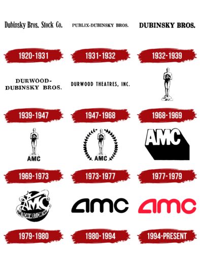
Each building is adorned with a sign with a common logo, and the distinctive signs of obsolete trademarks have been removed. The development of the identity took place in stages. The company has changed its image several times to keep up with the digital age. JLL carried out the last modernization of the theaters, but it did not touch the logo – the version adopted in 1994 is still used.
What is AMC Theatres?
AMC Theaters is an extensive chain of cinemas that is considered the largest in the world. She appeared in the United States but gradually went beyond the borders of her homeland to Canada and European countries. It owns many subsidiaries there—an interesting fact: AMC introduced the fashion for armrests with cup holders.
1920 – 1931
The founders of AMC Theaters were brothers from Kansas City, who, as early as 1906, began touring the United States with small theatrical productions, and in 1920 bought a movie theater. Their troupe was registered as the Dubinsky Brothers Stock Company. This name has become the basis for a minimalist logo with a black and white inscription. The phrase was designed in a slanted serif font. Its approximate analog is Chalcedon Regular from FontSite Inc.
1931 – 1932
The cinemas, which were called Publix-Dubinsky Bros., had a logo with the corresponding inscription. All the letters were in upper case, apparently drawing potential customers’ attention. The font was somewhat reminiscent of CA Normal Serif ExtraBold from Cape Arcona Type Foundry. It had the same contrasting stroke weight and long, slightly thickened serifs.
1932 – 1939
In 1932, the second era in the history of Dubinsky Bros. began. – the time when its network has grown to 40 cinemas. The word sign of this period differed from the previous ones in bolder type. But the elegant style of letters and long serifs remained unchanged. The same goes for the classic black color – it continued to be used for printing the logo in newspapers.
1939 – 1947
The heir of Russian emigrants, Edward Dubinsky, decided to adapt his surname to the English language and changed it to Durwood. Then it became necessary to note this in the name of the cinema chain. This is how the Durwood-Dubinsky Bros. brand was born, and her emblem contains a two-level inscription. The first hyphenated word was on the top line, and the rest were on the bottom, centered.
1947 – 1968
The entertainment company, rebranded as Durwood Theatres, Inc., received a logo with minimalistic black lettering. The absence of serifs was a major change because they used to be heavily used in the design. The redesigned font with stretched glyphs looked like a cross between Hanford JNL Regular by Jeff Levine Fonts and Prenton RP UltraCond Medium by BluHead Studio.
1968 – 1969
In 1968, the brand was named American Royal Cinemas, and a new emblem: a black and white image of the Oscar statuette. Only if, in the original, the knight stands on a reel of film and holds a sword, here the film is in a man’s hands. With this symbol, the company wanted to show its involvement in high cinema and films that deserve prestigious awards.
1969 – 1973
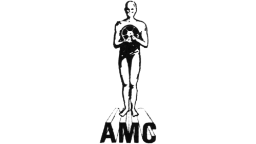
In 1969, the new head of the Stanley Durwood cinema chain registered the American Multi-cinema brand. Its emblem contained an image of a man who looked like an Oscar figurine – the main symbol of the film business. The artists did not detail the figure and facial features. Instead, they focused on a piece of the film held by a faceless man. The film was wound on a reel and was in the foreground.
The man looked intimidating: he had no hair, shoes, clothes, a mouth, and there were dark gaps in place of the eyes. At the same time, because of the falling shadows, it seemed as if a very bright light source was located on the right. The man stood facing the viewer. Under his feet was a black lettering “AMC” with letters extended backward.
1973 – 1977
In 1973, a new element was added to the existing logo – two laurel branches folded in the shape of a wreath. The artists depicted them on the right and left in such a way that the base of the branches was opposite the abbreviation, and the upper leaves were next to the human head. Laurel was used as a symbol of victory and glory.
1977 – 1979
The silhouette imitating the Oscar statuette has been removed. The “AMC” inscription remains, but its configuration has completely changed. First, the letters have become white, and their spacing has practically disappeared. Secondly, the strict grotesque was replaced by a font with rounded corners. Thirdly, the edges that were stretched back, which created the effect of volume, were removed – instead of them, a black shadow appeared, directed to the lower right corner. It looked like a large spot of a clear geometric shape.
1979 – 1980
Another logo of the cinema chain contained a black circle wrapped in white ribbons. Moreover, these were not just ribbons but curly parts of the inscription “AMC,” located in the center. All letters merged, so the abbreviation was perceived as a single decorative element. Wide winding stripes interconnected “A” and “C.” The top one was adorned with a five-pointed star, while the bottom one had the company’s full name: AMERICAN MULTI CINEMA. As far as is known, the star is one of the main attributes of the Hollywood Walk of Fame, where the names of actors, producers, and other artists are immortalized.
1980 – 1994
In 1980, the company changed its name to the current one: AMC Theaters. Its first part was formed from the words “American Multi-cinema” and served as the basis for the new logo. Although the abbreviation was black in the official version, the red variant appeared more often on the screens. It was used in the introductory videos for films that played in the chain’s theaters. True, in the commercials, the inscription was animated and changed color to attract the audience’s attention. It is no longer known who exactly came up with the original design. Contrary to all expectations, this work turned out to be very successful: the iconic logo still exists but in a different design.
The author unusually depicted the letters. Initially, “a” looked like a quarter of a circle. The “m” followed was like two “u” stacked together and turned upside down. And “c” had the form of a ring, disconnected on the right side. All elements were rounded; only the edges of the “c” ended in corners.
1994 – today
Shortly before opening the first megaplex in North America, the AMC Theaters cinema chain again improved its logo. The red version, which was used much more often than the black one, has finally become official. But the change of color was not limited to: the designers unified the letters, adjusting them to a single standard. As a result, the “c” corners were rounded off. Now it is as smooth and streamlined as the “a” and “c” in front of it.
Font and Colors
The company hasn’t changed its symbol since 1994, so it’s easily recognizable by its stylized “amc” lettering. The impression of the emblem is “softened” by rounded corners. This is a psychological trick designed to create subconscious trust in customers. The latest rebranding, which involved refurbishing theaters and running an expensive multimedia campaign, did not affect the visual identity of AMC Theaters. On the contrary, the logo continues to proliferate: used on the network’s official website, on signs, and in movie intros.
The inscription “amc” was created from scratch: each letter is unique and unrepeatable. Even if some fonts guided the designers, they modified them beyond recognition. All strokes are bold and match in width. Serifs are absent; the ends are rounded. In 2015, the AMC Theaters typeface was developed based on the logo. It is included in the Daniel Lyons font package. By the way, a similar “m” can be found in Ardilla Small Regular by Rodrigo Typo, but the rest of the characters do not match there.
The red version of the emblem was used even before it became official. It was approved only in 1994. Since then, the color scheme has never changed because the rich shade of red is now part of the AMC corporate style.
AMC Theatres color codes
| Alizarin Crimson | Hex color: | #e41e39 |
|---|---|---|
| RGB: | 228 30 57 | |
| CMYK: | 0 87 75 11 | |
| Pantone: | PMS 185 C |

