


![]() American Tourister Logo PNG
American Tourister Logo PNG
Although simple, the American Tourister logo is incredibly informative. It conveys many important messages to potential customers, encouraging them to use the brand’s products confidently. That’s why almost every traveler takes a sturdy suitcase or a branded bag
In 1933, European immigrant Sol Koffler opened a small workshop in an empty grocery store in Providence, Rhode Island. He had worked with steamer trunks and handbags and had seen the weakness of cheap American luggage. Most low-cost suitcases used thin plywood covered with paper or fabric. Koffler founded American Luggage Works with a practical target: a stronger suitcase priced at one dollar.
The company sold 5,000 suitcases in its first year. Its major technical move came when Koffler adapted machinery once used to bend plywood for radio cabinets. The process created suitcase shells from a single curved piece with rounded corners, reducing the weak seams that often cracked. The line, fitted with zippers and soft linings, was named American Tourister, and the product name gradually replaced American Luggage Works.
In 1946, the brand launched its first national advertising campaign. During the 1950s, as postwar travel grew, American Tourister introduced molded plastic hard-shell luggage and the Trim and Slim Tri-Taper line. Later, Hi-Taper suitcases were designed for air travel, with lighter bodies and tapered profiles. In the 1960s, flight attendants tested the luggage on real airline routes, and the famous gorilla TV campaign turned durability into the brand’s main public message. Samsonite remained its main competitor in the higher-price segment.
In 1978, Koffler sold American Tourister to Hillenbrand Industries. In 1993, Hillenbrand sold it to Astrum International for about $70 million. Astrum already owned Samsonite, bringing the two major U.S. luggage rivals into one group. Astrum became Samsonite Corporation in 1995, and in 1996, it closed American Tourister plants in Rhode Island and Florida. The brand stayed separate, positioned as a more affordable alternative to Samsonite.
Meaning and History
![]()
Irving Koffler and the Sol brothers founded the company. The first investments in the future world-famous project came from the Sol brothers. Already in 2009, the company was acquired by Astrum International Corporation. Subsequently, it was renamed Samsonite Corporation. Even though the brand’s history goes back almost 100 years, its logo has changed only twice. This enabled a significant increase in the brand’s visual recognition.
What is American Tourister?
At the very least, it is an opportunity to buy a quality travel bag at an adequate price. Suitcases are available in different sizes and colors, ranging from children’s bags to sporty ones.
1933 – 1962
![]()
The first version of the logo appeared almost immediately after the company’s founding in 1933. It was made using a black-and-white color palette. It was a rectangle with rounded corners, inside which was the company logo and the brand’s name. The emblem was a stylized airplane wing with a circle between them. Similar emblems were used by many airlines at that time. The background of the emblem was all black. At the top was the word “American,” and at the bottom “Tourister” in classic bold, sans-serif type. They were uppercase white letters with a black outline. Also, the company logo references the American market, as it completely repeats the style of those years.
1962 – 2014
![]()
The first major redesign made the logo more modern and appealing to the target audience. Its style is extremely similar to airline logos. It is an oval with a gradient gray edge, creating a sense of three-dimensionality. At the same time, closer to the center, the color becomes completely white. In the center, the company’s name, “American Tourister,” is presented in classic bold sans serif font. Voluminous, thick lines in capital letters look formal and serious, attracting buyers from all over the world. At the top and bottom of the name are two curved lines, red and blue. This is also a reference to the airplane. Below the blue line on the right is also the inscription “Since 1933”. In this way, the company demonstrates a great deal of experience and market understanding.
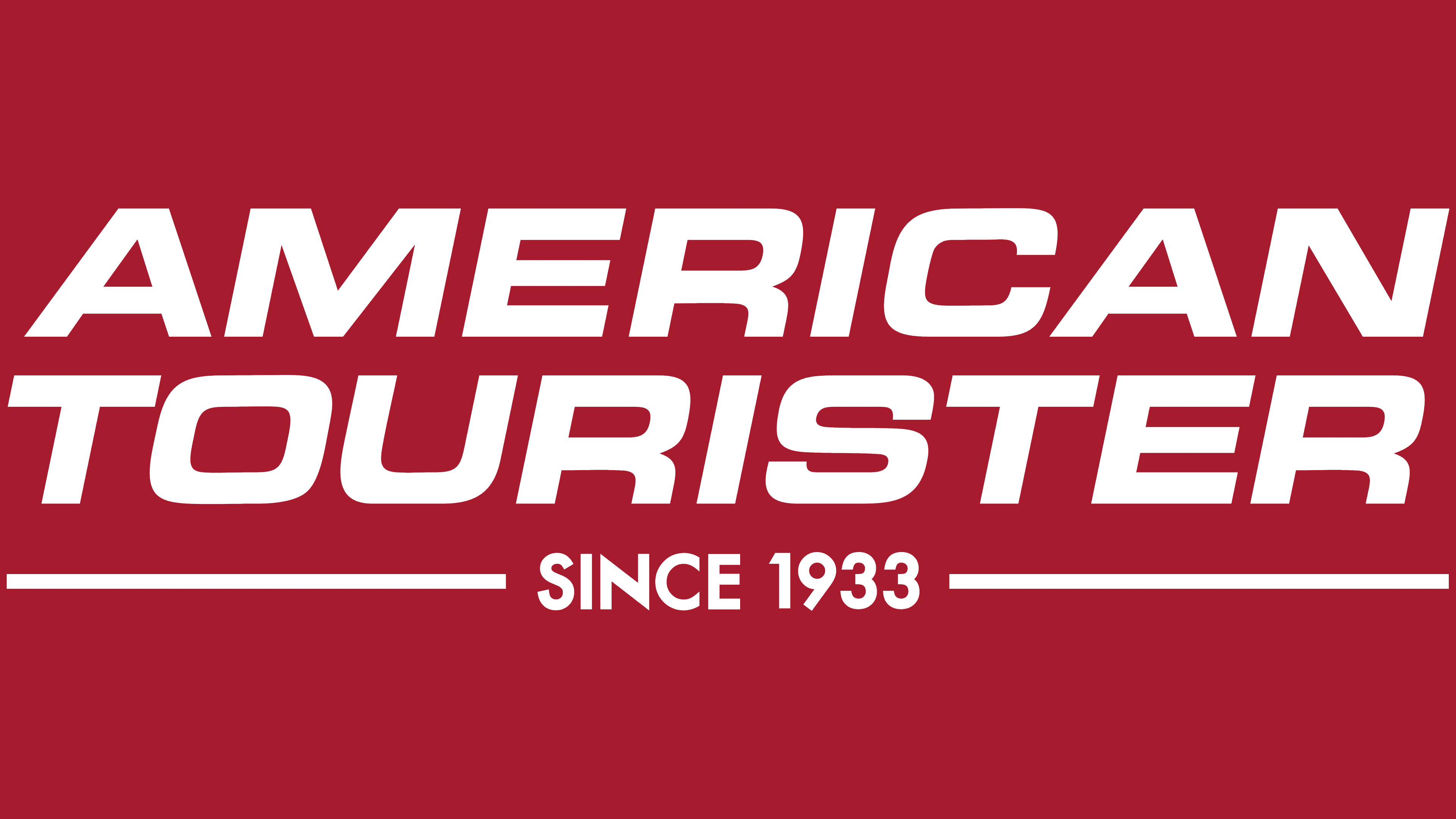
2014 – today
![]()
The last logo redesign to date took place in 2014. As a result, it became even more minimalistic, with the logo completely removed and only the wordy name remaining. It is in the same font as the previous version, except that all the letters are slightly angled to the right. Overall, you get the feeling that they are written in italics and therefore add speed to the logo. The dark red color looks more distinctive and fresh than the old color palette.
Under the name, a horizontal line runs through the middle, on which “Since 1933” is written in capital letters of the same color.
Font and Colors
As a rule, American Tourister always chose comfortable, readable fonts. As a rule, they were classical sans-serif fonts made with capital letters.
At different stages of the company’s functioning, a different color palette was used for the logo. The last variant to date is related to the dark red color. It symbolizes passion and the desire to develop. Given that the company is a world-renowned brand, it fully realizes its goals.