The Amtrak logo symbolizes railroad tracks stretching beyond the horizon. They are like ribbons stretching across the ground. The emblem shows the company’s scale and communicates that passengers will be delivered to their destination on time.
Amtrak: Brand overview
| Founded: | May 1971 |
| Headquarters: | Washington, D.C., U.S. |
| Website: | amtrak.com |
Meaning and History
It all started to form a rail and passenger corporation of national importance, made by congressmen in 1970. Over the years, the carrier has experienced many ups and downs. Everything depended on the technical capabilities of the time, the population’s ability to pay, the need for travel, and the number of offers. Today it is the largest structure with progressive equipment and an extensive transport fleet.
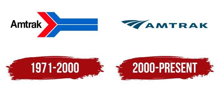
Every day 87 thousand people use its services, who travel on more than 300 trains. Nearly two-thirds of passengers come from ten metropolitan areas, and 83 percent use close routes (up to 400 miles). This means that most Americans are familiar with the rail carrier’s brand name. And during the entire existence of the transport service, it had two logos.
At first, the system was planned to be called Railpax. Still, after deliberation and consultation with the branding agency Lippincott & Margulies from New York, a different name was chosen – Amtrak. The same studio created the corporate logo and suggested the colors for the trains.
What is Amtrak?
Amtrak is the trade name for the National Railroad Passenger Corporation. This company provides passenger transportation services in most US states and several Canadian provinces. It was formed in 1971 and immediately addressed railroad issues. It managed to almost double its annual passenger traffic: from 15,800,000 people in 1972 to 32,000,000 in 2019.
1971 – 2000
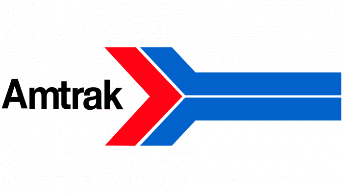
The name of the railway transport service is the basis for the debut logo. It is derived from the words “AMerica” + “TRACK.” In the early years of its existence, the name consisted of one capital letter and six lowercase letters. That is, it was written according to the generally accepted spelling, without separating two different bases.
To the right of it was an arrow-shaped or chevron-shaped indicator that indicated movement. Such a dynamic logo conveyed the purpose of the direction and high speed of movement, as noted in the official manual. The emblem contained a red triangular arrowhead and two stripes resembling a boomerang. They were located parallel to each other and marked the railroad tracks.
2000 – today
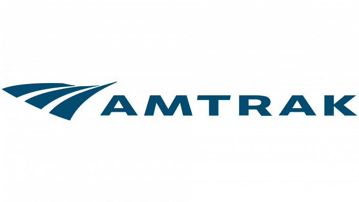
The developer of the new logo is OH & Co. It is much more dynamic in style than the previous version and fully meets modernity and the corporate concept requirements. The motion effect is created by a three-line path (abstract stripes) and negative space, forming curving rails. They become thinner – as if they turn and go to the horizon. The title has been moved to the right and in capital letters. Moreover, the colors of the text and graphic parts are identical.
Amtrak: Interesting Facts
Amtrak, officially known as the National Railroad Passenger Corporation, plays a crucial role in America’s transportation, offering train rides between cities.
- Starting Off: Congress founded Amtrak in 1971 to save intercity train services that were losing money and falling out of favor. Its main aim was to keep trains running across the U.S.
- Funding Style: Amtrak is unique because it’s a for-profit company with the government as its main shareholder, leading to many debates over its funding and how it’s run.
- Wide Reach: It runs on more than 21,000 miles of track across 46 states, the District of Columbia, and three Canadian provinces, serving long trips across the country and shorter ones between cities.
- Famous Routes: Trains like the Coast Starlight and the Empire Builder are well-known for their breathtaking views along the coasts and through mountains and plains.
- Car-Carrying Train: The Auto Train lets you take your car with you on a direct trip between Virginia and Florida, a unique feature among U.S. trains.
- Speedy Trips: The Acela Express is Amtrak’s fastest train, zipping between Boston and Washington, D.C., at speeds up to 150 mph, making it the quickest in the Western Hemisphere.
- Growing Popularity: Before COVID-19, more people were riding Amtrak than ever, although the pandemic hit it hard, like many forms of travel.
- Remembering the Past: Amtrak keeps its history alive by naming trains based on historical and regional themes and through the Amtrak Historical Society.
- Looking Ahead: Amtrak is working on improving, like introducing new Acela trains and considering new routes, to serve travelers better.
- For Everyone: It focuses on making travel easy for everyone, including those with disabilities, and promotes train travel as a greener option than flying or driving.
- In Culture: Amtrak isn’t just for travel; it’s also a part of American culture, appearing in movies, songs, and books as a symbol of adventure.
Amtrak is more than just a train service; it’s an essential part of America’s travel network, preserving the nation’s railway heritage while planning for future transportation needs.
Font and Colors
The brand name exactly corresponds to the direction of work of the railway passenger service. In the first case, it contains a pointer arrow and makeshift rails. In the second – the image of railway tracks stretching to the horizon. The lines are uneven and slightly tapered on the opposite side, giving the impression of moving forward.
The early emblem uses a modified Helvetica typeface. It conveys a minimalist style – simple, sleek, sans serif. The current version uses a wide font – large, massive, grotesque. This time, all characters are in uppercase.
The logo palette is also very different. If in the debut version the colors are bright, juicy, and resemble the American flag in color, now the colors are much more modest. One of the shades of dark blue is selected for the emblem.
Amtrak color codes
| Dark Cerulean | Hex color: | #004c70 |
|---|---|---|
| RGB: | 0 76 112 | |
| CMYK: | 100 32 0 56 | |
| Pantone: | PMS 3025 C |
