The American marketing company with a vivid name – American Way of Life, abbreviated – Amway, and equally bright visual identification – sells beauty, health, and home care products. The Amway logo is designed in a minimalist style and focuses attention on the name and its connection to the business profile.
Amway: Brand overview
| Founded: | November 9, 1959 |
| Founder: | Richard DeVos, Jay Van Andel |
| Headquarters: | Ada, Michigan, United States |
| Website: | amwayglobal.com |
Meaning and History
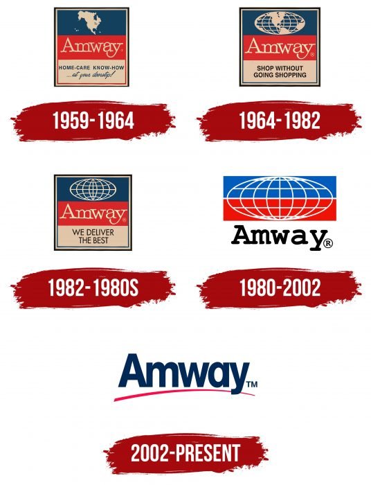
The debut of the first logo coincided with the company’s founding year. Throughout its existence, it has changed five emblems, which are not very diverse. All have the same shape and consist of the same elements, with redesigns only involving refinements. Thus, their history is an evolution from a multi-component sign to a minimalist one.
What is Amway?
Amway is an American multi-level marketing company that has been operating since 1959. Founded by Jay Van Andel and Richard DeVos, it consists of numerous branches located in over 100 countries and is the largest marketing brand by revenue. The company’s headquarters is in Ada, Michigan.
1959 – 1964
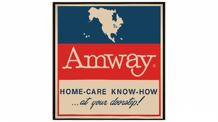
The initial variation used the colors of the U.S. flag. The top blue stripe contains a white map of North America. In the middle red rectangle is the word “Amway” – the brand name. On the white bottom stripe is the phrase “Home-care know-how” (in large serif font), followed by “at your doorstep!” (in lowercase italics). All elements are placed in a standard rectangle with triple bordering.
1964 – 1982
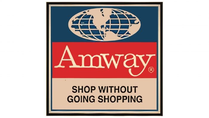
The redesign updated the previous logo. In the guide, the map of the North American continent was replaced with a map of the southern hemisphere of the planet with a grid of meridians and parallels. This reflects the company’s international expansion and the opening of its first overseas office in Ontario, Canada. The company’s entrepreneurial ambitions are reflected in the new logo.
It still resembles a tricolor – a flag with three different colored fields. Other changes occurred. The top field depicts a diagram of the Earth’s southern hemisphere; in the middle is the word “Amway,” and at the bottom, the slogan “Shop without going shopping.” For this, the developers chose a classic serif font.
1982 – 1980
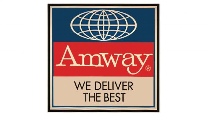
In this version, continents disappeared from the world map, so the emblem depicted an abstract hemisphere with a grid of parallels and meridians. Instead of the old motto, a new one appeared: “We deliver the best.” This redesign was due to the expansion of the company’s international activities.
1980 – 2002
Since then, the colors of the logo have become bright and clear. The white bottom line merged with the background, and instead of the slogan, the word “Amway” appeared in the original writing.
2002 – today
The current logo is minimalist, consisting of a single element – the company name with a barely noticeable underline. The line is arc-shaped and pointed on the right side.
Amway: Interesting Facts
Amway is a big company that sells many things, like vitamins, beauty products, and cleaners. It started in 1959 in Michigan by two guys named Jay and Rich. They began with just one cleaner and grew the company into something huge that works worldwide.
- Starting Out: Jay and Rich started Amway with a liquid cleaner. Now, Amway sells lots of things all over the globe.
- What They Sell: They have many products to make you healthier and make your skin look good. Nutrilite is one of their best sellers for vitamins.
- Around the World: Amway is everywhere, in over 100 places. They sell things by having people run their own little Amway businesses.
- Skincare and Makeup: Amway has a brand called Artistry that’s good for your skin and makeup. It’s known for being high quality.
- Helping the Planet: Amway tries to be good to the Earth. They use wind and solar power and ensure their ingredients come from places that are okay with the environment.
- Farms: They grow their plants for Nutrilite products to ensure they’re the best in the US, Mexico, and Brazil.
- Jobs: Amway helps many people make money by selling their products. They also teach them how to be good at it.
- Helping Kids: Amway works to improve kids’ lives worldwide with its One by One Campaign, starting in 2003.
- New Ideas: They spend a lot of money researching and ensuring their products are great. They have labs and scientists working on this.
- Amway Center: They even have a big place for sports and concerts in Florida named after them, where the Orlando Magic basketball team plays.
So, Amway is more than just a company. They’ve grown a lot since they started, sold many different products, worked hard to be good to the planet, helped in communities, and kept coming up with new ideas.
Font and Colors
Early versions of the Amway trademark consisted of three equally wide stripes of different colors. Until 1964, the background square had a triple border, then a double, and by the mid-80s, it disappeared altogether. In 2002, the label was simplified to the maximum: all elements were removed, leaving only the company name.
The emblem uses two types of fonts: print (in all) and italic (in the debut logo). The letters are uppercase, sans-serif. The primary colors are blue, red, and white.
Amway color codes
| Blue | Hex color: | #002f5f |
|---|---|---|
| RGB: | 0 47 96 | |
| CMYK: | 100 51 0 63 | |
| Pantone: | PMS 648 C |
| Red | Hex color: | #ed174c |
|---|---|---|
| RGB: | 237 23 76 | |
| CMYK: | 0 90 68 7 | |
| Pantone: | PMS 1787 C |

