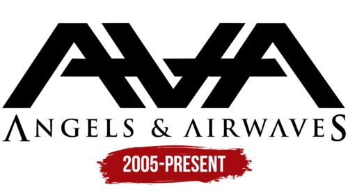
The Angels And Airwaves logo resembles the meeting of two elements converging in one space. This collision changes and transforms each one. The emblem shows how the band’s music touches the hearts of listeners. After concerts, the performers and fans always change, influencing each other.
Angels And Airwaves: Brand Overview
Angels and Airwaves is more than just another name on a long list of rock bands – it is an artistic initiative driven by a mission to inspire and touch the depths of human emotion. Founded by Tom DeLonge, former guitarist and vocalist for Blink-182, in 2005, this innovative company seeks to resonate with its audience through music, film, and other art forms.
After parting ways with Blink-182, Tom DeLonge ignited a desire to create a unique blend of music, art, and storytelling that explores themes of love, optimism, and the essence of human relationships. Along with guitarist David Kennedy, drummer Atom Willard, and bassist Ryan Sinn, DeLonge set out to bring this grand vision to life. Their collaboration bore its first fruits in 2006 with the release of their debut album, We Don’t Need to Whisper.
More than just a band, the group sought to go beyond music and reach out to their audience through various creative mediums such as film, literature, and other expressive forms. DeLonge characterized the project as a bold endeavor that pushed the boundaries of creativity and sought to offer listeners a diverse, multi-layered experience. With an innovative spirit, Angels and Airwaves sought to create music and a powerful display of creativity that moved and inspired.
Winning their fans with their unique blend of music and artistic vision, this American rock band quickly earned a special place in people’s hearts. Their uplifting anthem-like songs with soaring melodies and heartfelt lyrics have resonated with people’s hearts. The band presented several short films and documentaries to understand better the creative process and the themes addressed in the songs.
Angels and Airwaves have continually pushed the boundaries of musical expression throughout their journey, delving into electronic experimentation to create their unique soundscape. Throughout their albums and EPs, the band tackles topics ranging from science fiction to spirituality, personal growth, and more, utilizing film and other media to enrich their creative expression further. The band continues mesmerizing their fans with their evolving sound with each new release.
Meaning and History
What is Angels and Airwaves?
Angels and Airwaves, often abbreviated to AVA, is an American rock band that has been capturing the hearts of listeners with its unique sound since its inception. The band has an impressive lineup, with notable musicians such as Tom DeLonge, David Kennedy, Ilan Rubin, and Matt Rubano showcasing their talent and versatility in every song. Founded on a desire to create music that would provide an immersive, cinematic listening experience, the band sought to fuse their rock roots with elements of space rock and electronica. The result is a sound that is both familiar and innovative, a distinctive musical signature that quickly attracted listeners and built a solid fan base.
2005 – today
Angels And Airwaves are shortened to three “A’s,” yet the band’s logo reads “AVA.” Tom DeLonge, who created the symbol, flipped the middle “A” 180 degrees. He dedicated this unique design to his daughter Ava. The large sign, made of black polygons, is balanced by the small inscription “ANGELS & AIRWAVES” written in Trajan font with small serifs. The letters “A” in the inscription have no horizontal lines, making them distinctive.
The logo resembles a puzzle with its blend of letters and shapes. Flipping the letter “A” upside down adds an element of surprise, suggesting, “Expect the unexpected.” This design gives the band’s identity a unique twist. The small details, such as the distinctive font, give the logo a sophisticated feel.
The black polygons create a bold and modern look, while the flipped “A” adds intrigue. The Trajan font with small serifs adds elegance, balancing the boldness of the black polygons. The unique design of the letters “A” without horizontal lines makes the inscription stand out.
The logo’s design showcases a blend of creativity and thoughtfulness. The flipped “A” creates visual interest and reflects the band’s innovative approach. The balanced composition of the bold sign and elegant inscription creates a cohesive and striking visual.


