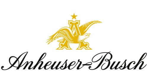
The Anheuser-Busch logo looks elegant, lofty, and magnificent. It symbolizes the ascent to the peaks and a long journey through time. The logo presents the brand as exclusive and appealing to true beer connoisseurs.
Anheuser-Busch: Brand overview
| Founded: | 1852 |
| Founder: | Eberhard Anheuser, Adolphus Busch |
| Headquarters: | St. Louis, Missouri, U.S. |
| Website: | anheuser-busch.com |
Anheuser-Busch is a historic American brewing company that owns 12 breweries with 19,000 employees. The company generates a profit of $10 billion and owns over a hundred brands. Since 2008, the company has been part of the AB InBev corporation.
Meaning and History
The company’s logos combine respect for America and the founders’ family values. Initially, it was an expression of gratitude to the country for the opportunities provided, and later – an aspiration to exalt the nation with an outstanding product known in every corner of the world. Family values are also reflected in the emblems. Although different generations of the Busch family managed the company, the letter “A” was always preserved in the logo in honor of the first owner (Anheuser’s father-in-law) and the first representative of the Busch family – Adolphus.
The Anheuser-Busch logo also emphasizes the quality and brewing traditions passed down from generation to generation. This aspect highlights the long-term vision and dedication of the Busch family to their business, making their products truly unique and prestigious.
What is Anheuser-Busch?
A large company engaged in the production of beer, energy drinks, and bottled water, with its headquarters in St. Louis. It was the first company in America to transport its products over long distances using refrigerated railcars, selling bottled, pasteurized, and mechanically cooled beverages.
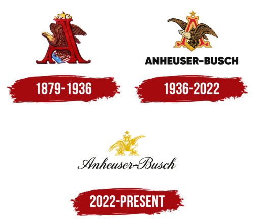
1879 – 1936
The company’s first visual logo appeared when Adolphus Busch took over the business management. Adolphus was a progressive and experienced entrepreneur who elevated the company to new heights. In addition to numerous innovations, he contributed to the creation of a unique identity.
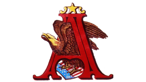
The logo was compact, simplifying its application on labels. It consisted of a large letter “A” executed in an old-style font and an eagle standing on the US flag inscribed within it. The eagle is an American symbol representing greatness, nobility, and superiority over competitors. In the emblem, the bird seems ready to take off, lifting its wings upwards. This sign heralds the company’s prosperity.
The use of the letter “A” corresponds to the company’s name at the time: E. Anheuser Company’s Brewing Association. Although the name soon changed, the first letter of the father-in-law’s surname – Anheuser, remained in the logo throughout the centuries. Perhaps Busch also imbued the symbol with another meaning – the first letter of his name, Adolphus.
The flag added a patriotic touch to the logo, demonstrating that, thanks to America, a German immigrant was able to establish his business and achieve the American dream. This reflects the idea of the United States as a land of opportunity. The logo also emphasized that the company’s development and beer sales took place in America, which the flag on the emblem also symbolized.
In addition to the original description, it is worth noting that the first Anheuser-Busch logo also spoke of the strong roots and values of the company. It reflected respect for the traditions and culture on which the business was founded and served as a guarantee of success and long-term sustainability in the market.
1936 – 2022
2022 – today
Since 2022, Anheuser-Busch has been part of a giant brewing corporation for 14 years, controlling 30% of the global market. The company’s development and prosperity are reflected in the logo.
The overall image of the emblem is similar to the previous one, but it has gained more prestige and shine. The golden eagle and letter “A” on the logo symbolize the financial stability and achievements of the company. The image emphasizes experience and greatness. In the new corporation, Anheuser-Busch is the oldest in age.
The image of the eagle was mirrored and turned to the right, indicating that the company is looking towards the future, development, and growth. The eagle no longer stands on the American flag but soars upwards. The AB InBev corporation, which includes Anheuser-Busch, is a global manufacturer whose products are known far beyond America. Therefore, the American symbol was removed.
Below the image, the company’s name is written in an elegant font with beautiful flourishes. This inscription symbolizes nobility, high quality, and unparalleled taste of the beverages. An interesting fact: although the company is called Anheuser-Busch, the brewery was founded by George Schneider in 1852, and Eberhard Anheuser became the owner only in 1860. The Busch surname was added in 1979, a year after Eberhard’s death and after 20 years of Adolphus Busch’s work and even involvement in the company. However, it was Adolphus who made the greatest contribution among all owners to the development and global recognition of the company.
The updated logo also reflects the company’s adaptation to modern market demands and its readiness for an innovative approach to its products. This makes the logo relevant and in demand while maintaining a historical connection.
Font and Colors
The main colors of the logo are gold and white. The gold color symbolizes wealth, luxury, and leadership, reflecting the company’s dominant position in the market. The white color symbolizes renewal, new beginnings, and the readiness of forces to enter the next century.
The logo font resembles Calligri Bold Italic but leans more towards a handwritten execution. This emphasizes the uniqueness and family nature of the company since several generations of one family have managed the business.
Anheuser-Busch color codes
| Mustard Yellow | Hex color: | #e4b407 |
|---|---|---|
| RGB: | 228 180 7 | |
| CMYK: | 0 21 97 11 | |
| Pantone: | PMS 7408 C |
| Smoky Black | Hex color: | #10100d |
|---|---|---|
| RGB: | 16 16 13 | |
| CMYK: | 0 0 19 94 | |
| Pantone: | PMS Neutral Black C |
