


 Anvil Logo PNG
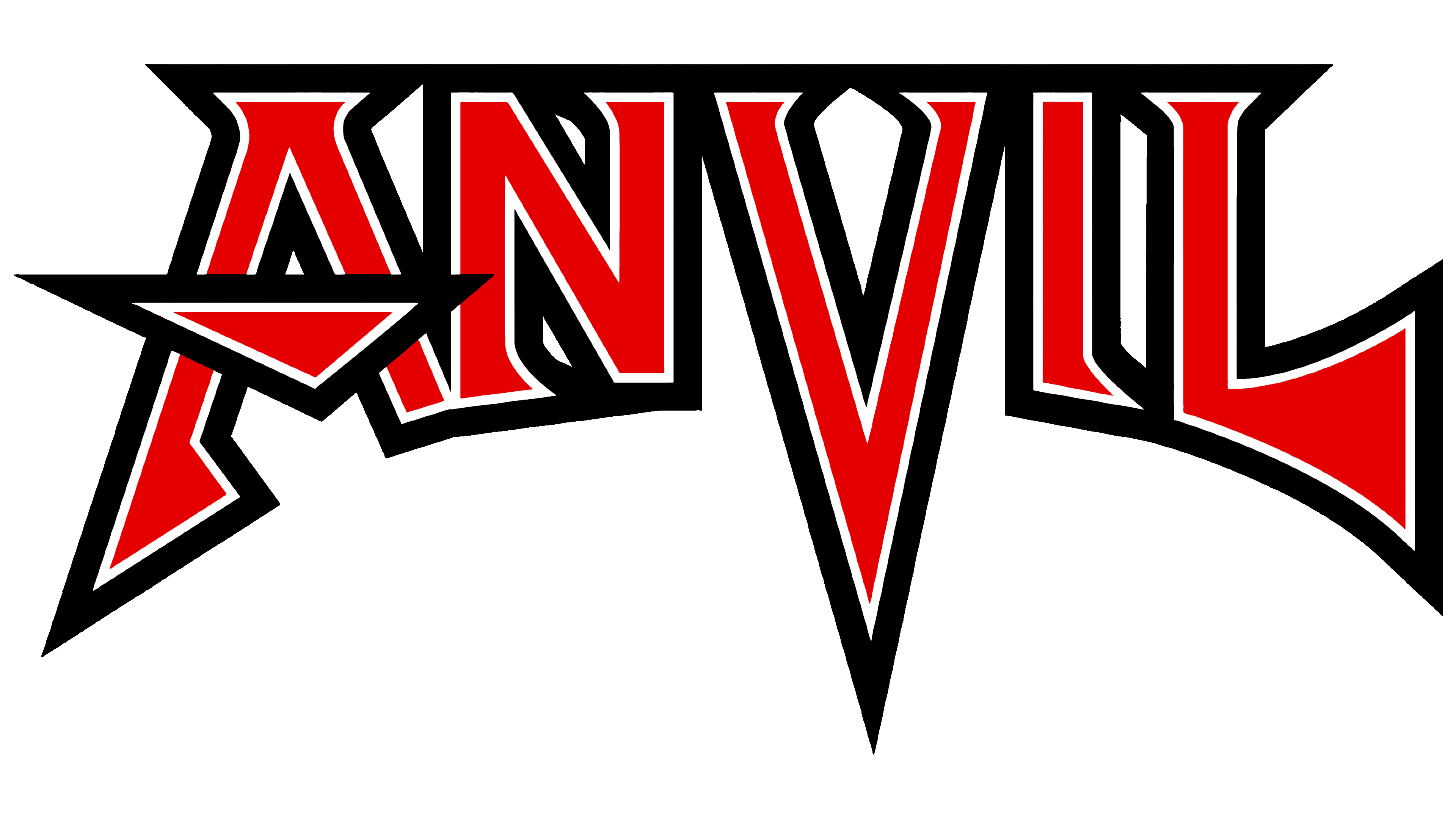
The Anvil logo is vibrant and strong. It tells the story of a band that has dedicated years to music. The logo reflects the expression inherent to heavy metal. The angular composition almost makes you hear loud, sharp sounds.
Anvil formed in Toronto in 1978 around guitarist and singer Steve “Lips” Kudlow and drummer Robb Reiner, friends since their teenage years. The name referred to the heavy, hammering sound they wanted. At the same time, Kudlow and Reiner remained the band’s core through later lineup changes and long periods of poor sales.
In 1981, Anvil released Hard n’ Heavy, followed by Metal on Metal in 1982. The second album became a key reference point for early thrash metal, with fast riffs, aggressive drums, and a raw sound later associated with Metallica, Slayer, and Megadeth. Forged in Fire arrived in 1983 and strengthened the group’s standing in the metal underground.
During the early 1980s, Anvil toured in Japan and shared stages with future major acts. Musicians such as Slash from Guns N’ Roses, Tom Araya from Slayer, and members of Metallica later credited the band as an influence. Commercial success still eluded them, while Metallica’s 1986 Master of Puppets helped push thrash metal to a much larger audience.
Through the 1980s and 1990s, Anvil kept recording despite weak label support and unstable lineups. Kudlow worked regular jobs, including as a school cafeteria cook, to keep the band alive. A renewed wave of attention came with the 2008 documentary Anvil! The Story of Anvil, shown at Sundance in 2009 and often compared with This Is Spinal Tap. Afterward, Anvil received new touring offers, reissues, and media coverage. It later continued releasing albums through AFM Records with bassist Chris Robertson in the lineup.
Meaning and History

The name and logo of Anvil first appeared in 1981 on the band’s second album. This followed a lengthy search for a name and style. In 1978, the founders formed the band Lips and self-published their first album. The name was a nickname for the band’s ideologue, Steven Barry “Lips” Kudlow, probably because of his big mouth. After signing a contract, Attic Records suggested the band shift drastically from a romantic-sexual tone to a more powerful, louder one. The recommendation wasn’t about musical style but about avoiding confusion with the rock and disco group from Minnesota, Lipps, which was popular in the late 70s. To avoid confusion, the band agreed to rename itself Anvil. They chose an emblem that matched the new name.
What is Anvil?
A Canadian band characterized by persistence and dedication. Despite not being popular, the band has been playing for over 40 years. Two of the three members have been part of the lineup. But seven bassists came before Chris Robertson, who has been with the group since 2014. Their main style is speed metal.
1981 – today

The band’s emblem features their name in a sharp, expressive design. The choice entirely reflects the band’s musical style. Starting with their second album, Metal on Metal, where the logo debuted, the band transitioned to heavy rock and became engrossed in the speed genre. Every hit on the keys, strings, and drums sounds like a hammer at work. Beautiful melodies emerge from the members’ virtuoso hands, just as beautiful metalwork emerges from an anvil.
Each element in the band’s logo reflects the anvil theme.
- The crossbar of the A resembles the tool’s surface.
- The long, stretched-out V replicates the anvil’s shape in profile and corresponds to the device’s horn.
- The last letter, L, resembles an axe.
- Each glyph ends with a point reminiscent of arrows and swords, items forged on an anvil.
- The thick black outline of the letters merges into a solid base, like an object’s surface.
The whole sign looks sharp and cutting, matching the heavy rock theme and drawing an analogy between forged metal and music.
Font and Colors
The letters of the inscription are a hot red, like molten, glowing iron. The shade indicates loudness, expressiveness, and speed, as the style implies a fast, active pace in melodies.
The color indicates passion and love for their craft. The band has been on stage for about 45 years, but music has provided members with enough income to live on only for the past decade. Before that, the band held on through enthusiasm, working solely out of passion for the craft.
The double white-and-black outline of the inscription speaks to the theme of creativity. The band’s songs explore life and death, joy and sorrow, and the struggle between good and evil. This approach shows dedication to music, despite life’s ups and downs. It speaks of constancy and the band’s unity around a single goal.
The inscription’s font is distinctive because of its transformed letters.