AOL and dot, the user has nothing else to look for. Everything you need will be found on the portal, says the AOL logo. The emblem is a symbol of abbreviation, behind which lies a sea of information.
AOL: Brand overview
| Founded: | 1983 |
| Founder: | Marc Seriff, Steve Case, Jim Kimsey, William von Meister |
| Headquarters: | New York City, United States |
| Website: | aol.com |
Meaning and History
Now the media corporation includes dozens of divisions representing different areas: interactive video, cable systems, publishing houses, networks, educational resources, and much more. All of them are united under the AOL brand, which differs from competitors by advanced features and a minimalistic logo.
What is AOL?
AOL is an acronym that stands for America Online. This was the name of the American holding company that owns media resources. It was sold to Apollo Global Management in 2021 and will now become part of the Yahoo brand.
1983 – 1985
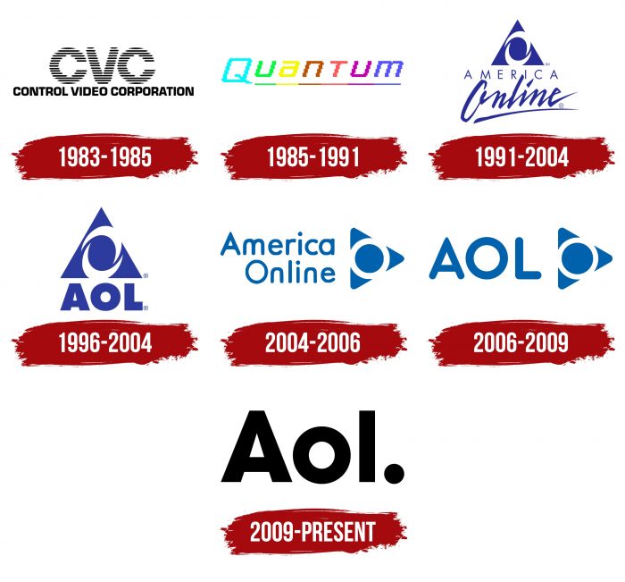
In 1983, AOL’s distant predecessor, Control Video Corporation, appeared. This company worked for only two years and presented only one product – the GameLine portal. She was also remembered for her verbal trademark. It looked like a dark blue rectangle with two white captions: a large abbreviation “CVC” and a small phrase “Control Video Corporation.”
1985 – 1991
After CVC went bankrupt, Quantum Computer Services was created on its basis. The new organization’s logo was markedly different from the previous one: the designers removed the dark background and wrote the word “Quantum” in italic pixel font. Each letter has been underlined and colored in a different color.
1991 – 2004
In 1989, the firm changed its name to America Online. This influenced her visual identity, the centerpiece of which was a triangle with two semicircles inside. According to the legend, the original symbol was based on a drawing scribbled on a napkin. Company executives jumped at the idea and went to a design studio to turn the simple pattern into an America Online emblem.
The blue triangle symbolized the capital letter “A,” and the vortex looked like “O.” Below was the company’s full name, written in two lines. The first word was in a strict sans serif typeface- the second half of the text imitated handwriting.
2004 – 2006
When the company became mega-popular, its owners decided to change the logo. The opinions of numerous focus groups became the main reference point. As it turned out, people liked the triangle because they felt stability, and the whirlwind, on the contrary, was associated with danger and caused distrust.
Designers from branding studio Desgrippes Gobe removed the swirl and replaced it with a blue circle in a white ring. They also put a triangle at one of the corners to make it look like a big arrow. The pointer was pointed forward to the future, symbolizing America Online’s continuous movement and commitment to excellence. He defined a new brand positioning.
The company name shifted to the left and was written in streamlined sans serif block letters. The font matched well with the rounded sides of the triangle. The flowing lines showed openness and friendliness.
1996 – 2004
In 1996, a logo appeared with the abbreviation AOL and a swirl in a triangle. It was used intermittently over the next eight years.
2006 – 2009
When the company dropped its full name, it had to update the logo again. The 2004-2006 version was taken as a basis. The designers replaced America Online with the short AOL caption, keeping the font with rounded corners and the iconic geometric symbol.
2009 – today
The current brand logo is the result of painstaking work by Wolff Olins. He completely changed the identity of the media conglomerate to mark a new round in its history. The designer put a point on the triangle with a circle, literally. After the company’s name, this punctuation mark is depicted, which symbolizes completeness and confidence according to the author’s idea.
“AOL” no longer looks like an abbreviation because only the letter “A” remains in the capital. Thus, the company decided to show its independence from the old concept of America Online and create completely new branding. Critics praised the changes, as evidenced by the logo’s victory in the 2009 Brand New Awards.
AOL: Interesting Facts
America Online (AOL) was a big deal when the internet was just starting. Founded in 1985, it changed how we communicate, find information, and enjoy digital content.
- Early Days: AOL didn’t start as AOL. It was first a service for Commodore 64 and 128 computers, offering games, email, and forums. In 1991, it became the AOL we know.
- Flat-Rate Pricing: In 1996, AOL introduced a flat monthly fee for unlimited internet access, a game-changer that made the internet more accessible.
- Famous Sounds: The “You’ve got mail!” alert and the startup sound of AOL became iconic, bringing a sense of nostalgia for early internet users.
- Trial CDs Everywhere: AOL’s marketing sent free trial CDs to households worldwide. At one point, half of the world’s CDs were AOL trials.
- AIM: In 1997, AOL launched Instant Messenger (AIM), a pioneer in real-time chatting that existed long before today’s social media apps.
- AOL-Time Warner Merger: In 2000, AOL and Time Warner merged in a massive deal. Though it aimed to create a media giant, it’s now known as a notable failure.
- Online Ads: AOL was a trailblazer in online advertising, introducing many to digital ads and helping shape the online ad industry.
- Becoming a Media Company: After splitting from Time Warner in 2009, AOL focused on digital media, acquiring sites like The Huffington Post, TechCrunch, and Engadget.
- Bought by Verizon: In 2015, Verizon bought AOL for $4.4 billion and later merged it with Yahoo under a new name, Verizon Media.
- Cultural Impact: AOL left its mark on pop culture, with references in movies, TV shows, and songs that remind us of the internet’s early days.
AOL played a key role in introducing the internet to millions and shaping our digital world despite the ups and downs it faced over the years.
Font and Colors
Conspiracy theorists believed that AOL’s original triangle was like the other side of the Great Seal. They saw a secret meaning in this: it seemed to them that the media corporation was connected with the Illuminati society. To get rid of such associations, company executives turned the triangle on its side. So the “all-seeing eye” turned into an arrow – a symbol of forwarding movement.
In the latest version of the logo, geometric shapes have disappeared. They were replaced by the usual black dot, which should be interpreted as the fulcrum for all AOL products.
A non-standard sans serif font was used for the inscription. It is similar to Helvetica Bold, Futura Heavy, and Gill Sans Bold at the same time, but the differences are quite large when you look at the shape of the individual strokes. On the other hand, the color scheme is very simple: black letters on a white background.
FAQ
What company owns AOL?
The company is owned by Yahoo and managed by AOL Holdings LLC. This ownership consolidates major internet brands into one organization. AOL Holdings LLC oversees AOL and Yahoo, combining their strengths to offer various online services and content. This alignment aims to improve user experiences, expand market reach, and drive innovation in the digital space.
Why is AOL called AOL?
AOL is called AOL because it evolved from a service called PlayNet, originally known as “CVC.” PlayNet later became Quantum Link (Q-Link). When it was time to rebrand, Quantum’s employees held a contest to find a new name. The winning entry was “America Online,” eventually shortened to AOL. This name was chosen to reflect the company’s mission to make the Internet accessible to a broad American audience.
What does the AOL logo look like?
The logo features a stylized version of the brand name, “Aol.” with a dot at the end. The characters are black, bold, and sans serif, giving the logo a modern and clean look. This design emphasizes simplicity and clarity, making the logo recognizable and memorable.
The black color conveys authority and professionalism, while the bold typeface adds strength and presence. The sans serif font gives it a contemporary feel, reflecting AOL’s adaptation to the digital age. The dot at the end adds a unique touch, setting it apart from other brand logos.
Does AOL still exist in 2024?
Yes, it still exists in 2024. However, it has changed significantly since its peak as a leading internet provider and email service in the 1990s and early 2000s. It is a digital media company focusing on online content, digital advertising, and media services.
The change in direction started with its merger with Time Warner in 2001. This partnership ended, and later, Verizon Communications bought AOL in 2015. This helped the company move more into digital media and advertising. Verizon included AOL in Verizon Media, which has properties like Yahoo.
The brand runs various websites, creates digital content, and manages advertising platforms. It uses its long experience online to offer valuable services to advertisers and content creators. Although it no longer leads the internet service provider market, it has found a new role and remains active in the digital media industry.
Does AOL have a new logo?
The brand’s logo has not been updated since 2009. The 2009 logo uses a clean, sans-serif typeface, with the letters “AOL” appearing in different contexts and backgrounds. This makes the brand look more modern and versatile.
The 2009 redesign was a big change from the old logos, which had more detailed and old-fashioned elements. The goal was to make the brand look more contemporary and suitable for different media and platforms.
