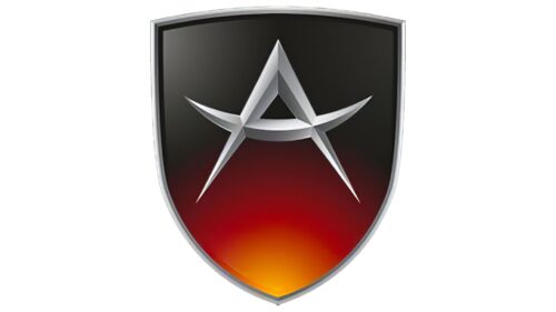
The Apollo logo is sharp and classy. The emblem is full of fire and indicates movement on high-speed tracks. The sign contains an element of protection to show the reliability and safety of the machines’ operation.
Apollo: Brand overview
Apollo is a German manufacturer of modern supercars. Ideal Team Venture has owned him since 2016. The Apollo logo can be seen on the Apollo racing models, Apollo S and N, Arrow Concept, and Intensa Emozione.
The company received the name Apollo in 2016 after its bankruptcy in 2013 in the face of Gumpert Sportwagenmanufaktur. The head of Audi’s sports division founded the brand. He had a burning desire to create a car capable of racing and serving as a passenger city car. This is how the Apollo machines were born.
Meaning and History
There are Asian features in the visual sign of the brand. This is visible in the image elements. The similarity indicates the ownership of the brand by the Asian concern Ideal Team Venture.
What is Apollo?
It is a German automaker known for producing sports cars. The company is recognized for its flagship model, Apollo IE (Intensa Emozione), which combines advanced technology and striking design. The brand’s cars are characterized by exceptional speed and engineering excellence. The brand provides exciting driving sensations, thanks to which its cars are in great demand among car enthusiasts and collectors.
2004 – 2016
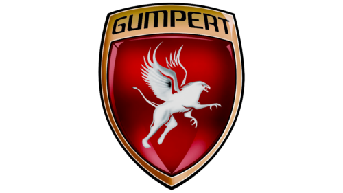
From 2004 to 2016, Apollo marked a vibrant chapter in automotive history. The brand’s logo, shaped like a shield, featured a rising griffon symbolizing strength, vigilance, and mastery over land and air. These qualities of the griffon emphasize the focus and attention required by drivers when handling high-speed vehicles. Racing tracks and urban roads, depicted in the logo as two elements, highlight the dynamism and adaptability of the cars.
Gumpert Sportwagenmanufaktur, founded by Roland Gumpert, owned and manufactured this new brand. The first logo featured the name Gumpert, paying homage to the founder. The product was initially named Gumpert Apollo, establishing a strong association with the brand.
The emblem’s shield-like shape refers to the theme of safety, crucial for high-speed vehicles, and resembles the shape of a headlight, emphasizing the theme of automotive engineering. The red color in the logo symbolizes speed and underscores the premium class of the brand’s vehicles, highlighting their performance and prestige.
2016 – today
On the sign is a shield with a rising gradient, and the letter A is made of sharp blades. The shield is an element of protection. It represents safety, which is important for the rider. Sharp sabers are like perfectly fitted parts and honed craftsmanship of manufacturers.
The letter A is the first in the brand name. The company was named after a Greek deity. Apollo is a versatile person and is considered the patron of many activities. However, extraordinary beauty is one of the most remarkable features of the son of Zeus.
The external brightness connects the Greek youth with the brand’s cars. Racing cars’ designs are impossible to ignore: turned edges, streamlined elements, and shining carbon fiber bodies.
“Beautiful” and the characteristics of the car. The low weight allows the machines to move gracefully and quickly at 335 to 360 km/h speeds. And their power reaches 700-1000 horsepower. Acceleration to 100 km occurs in 3 seconds.
The connection with Apollo can also be traced in the visual sign. The elements of the letter A resemble a curved bow. The creation of the bowstring and arrows is attributed to a resident of the Greek pantheon and his sister, Artemis.
Therefore, Apollo is the patron of the young brand, helping it grow and develop.
Font and Colors
The main colors of the brand are associated with a gradient. Inside the dark carbon-fiber body, a hot red heart lights up and beats, animating the machine and starting its movement.
The shades match the body colors of the Apollo cars. The Arrow car is orange, and the Intensa Emozione is a black car with red or orange elements on wheels; the ApolloN is a black and white handsome man. The transition from orange to black on the shield shows the models’ evolution by appearance date.
There are no inscriptions on the sign. The font of the letter A is unique. The elements look like a star – one of the symbols on the coat of arms of Hong Kong, the area where the new brand owners are located.


