


 Apple Music Logo PNG
The Apple Music logo links the service to the famous computer giant, signaling quality to users. The emblem suggests that only the best compositions belong here, and its full range of high and low frequencies will please even the most demanding ear.
Apple Music grew out of iTunes, which Apple launched in 2001. In 2003, Apple launched the iTunes Store with tracks priced at $0.99, following agreements led by Steve Jobs. The model centered on owning music.
By 2006, Spotify introduced subscription streaming, expanded in Europe in 2008, and entered the US in 2011. As streaming grew, iTunes sales declined, and Apple didn’t respond directly.
In May 2014, Apple acquired Beats Electronics for $3 billion, including Beats Music. Jimmy Iovine and Dr. Dre created the service, which emphasized human-curated playlists.
On June 8, 2015, Tim Cook introduced Apple Music at WWDC. Apple launched the service on June 30 in 100 countries, with pricing aligned to Spotify. Beats 1 radio, led by Zane Lowe, accompanied the release.
Early criticism focused on interface complexity and overlap with iTunes libraries. Within six weeks, the platform reached 11 million trial users.
A dispute over unpaid royalties during the trial period led to public criticism from Taylor Swift. Apple reversed its policy within a day and agreed to pay artists.
By January 2016, the service had 10 million paying users, rising to 15 million by mid-2016. In 2018, Apple Music overtook Spotify in US subscriptions.
In 2019, Apple rebranded Beats 1 as Apple Music 1 as part of a broader radio lineup. In 2021, Apple added Lossless Audio and Dolby Atmos without increasing prices. In 2022, the subscription price rose to $10.99.
Meaning and History
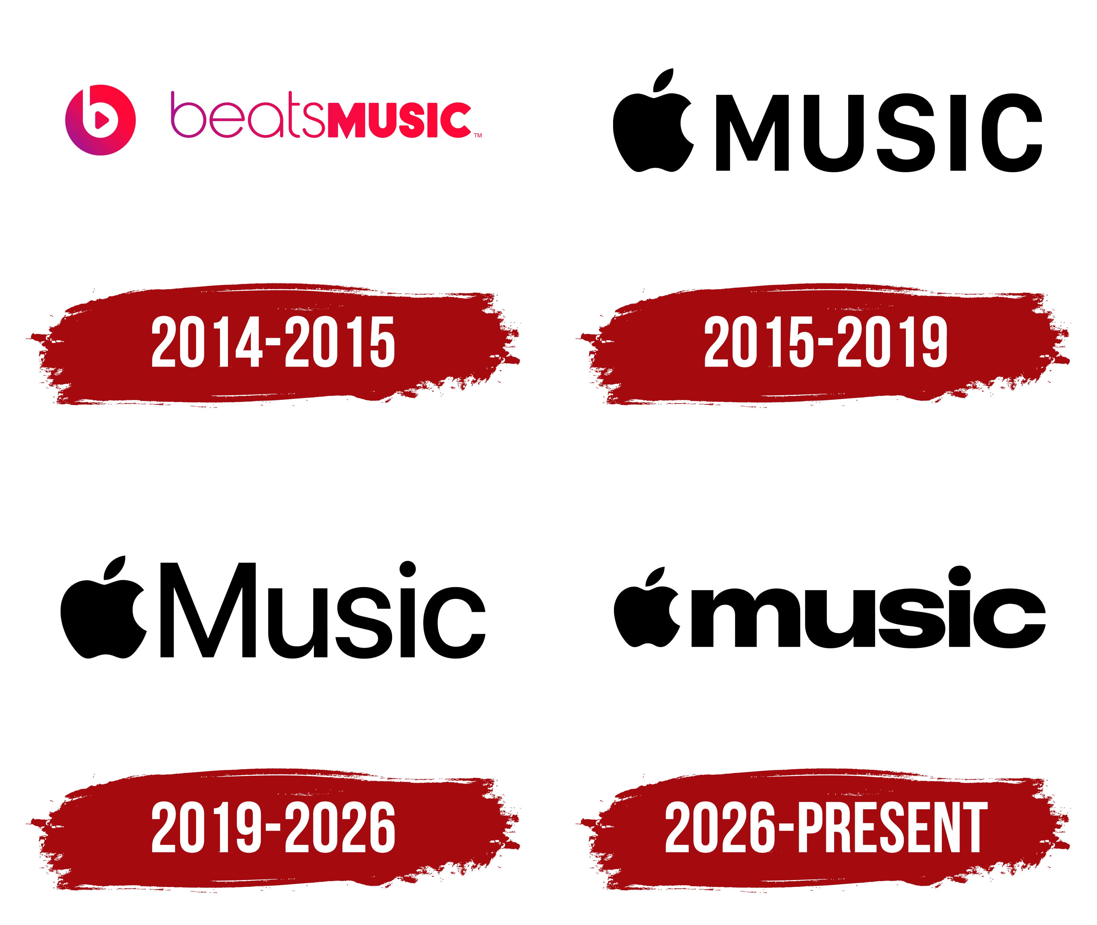
While Apple Music and Beats Music share many similarities, their logos differ in how they deliver songs across their services. To avoid changing its traditions, the American manufacturer of computers, phones, and audio players has marked its music service with the famous “bitten” apple.
What is Apple Music?
Apple Music is one of Apple’s services that lets you listen to audio from the iTunes Store media library.
2014 – 2015

Apple Music built on Apple’s music business, established through iTunes, bringing together streaming, radio, and artist-led programming. Apple announced the service on June 8, 2015, and launched it on June 30. The name combined Apple’s corporate name with the word “Music.” The logo uses the Apple symbol to represent the company’s name, with “Music” beside it.
The service followed Apple’s 2014 acquisition of Beats Music and Beats Electronics. Beats Music launched in the United States on January 21, 2014. Its name came from Beats, the brand founded by Jimmy Iovine and Dr. Dre. The word “beats” refers to strikes or rhythmic pulses in music. Adding “Music” distinguished the streaming service from the brand’s headphones and other audio equipment.
The Beats Music logo adapted the parent brand’s circular emblem, featuring a white lowercase “b.” A right-pointing triangle was added inside the letter, echoing a play button. The circle connected the service to Beats, while the triangle signaled music playback. A linear gradient replaced the original red fill. Set at a 45° angle, it shifted from red at the upper right to violet at the lower left, passing through shades of purple.
The circle appeared beside the name beatsMUSIC, written without a space. The thin, rounded lowercase letters in “beats” used the same gradient, while “MUSIC” appeared in heavy uppercase sans-serif lettering. Differences in stroke weight and capitalization distinguished the two parts of the name within a single line. The 2014 brand guidelines included the primary emblem, a separate wordmark version, and alternative arrangements of the circle, name, and triangle. The logo appeared in full color, white, black, and shades of gray.
In May 2014, Apple acquired Beats Electronics. Further development of its music business led to the launch of Apple Music. Apple shut down Beats Music on July 1, 2015, in favor of its new platform.
2015 – 2019

The transition from Beats Music to Apple Music in 2015 brought a new logo. The circle containing the “b” and play triangle gave way to Apple’s bitten apple. To its right, “MUSIC” appeared in five uppercase sans-serif letters. Apple released the identity guidelines in June 2015 as it prepared to launch the service.
The apple silhouette came from Apple’s corporate identity. Rob Janoff created it in early 1977 while working as art director at the Regis McKenna agency. The emblem debuted in April alongside the Apple II. The bite helped establish the fruit’s scale and distinguish an apple from a cherry. Janoff showed Steve Jobs versions with and without the bite, along with striped, single-color, and metallic treatments. Apple Music inherited the outline with a bite on the right and a separate, angled leaf. A black-and-white version of the corporate symbol appeared in 1998.
In the service’s logo, the apple and “MUSIC” formed a horizontal line. The design consisted of a flat silhouette and wordmark. The letters matched the height of the apple’s body and reached the base of the leaf. All five letters shared the same top edge. The large “M” introduced diagonals alongside the rounded “U,” the curves of the “S,” and the open shape of the “C.” The leaf sat above the apple, separate from the lettering, and extended beyond it.
The Music app icon was used alongside the service logo. After Apple Music launched in iOS 8.4, the icon featured a white square with rounded corners and two joined musical notes. The notes used a gradient that transitioned through pink, purple, and blue. The notes alone identified the app, while the Apple Music logo retained the apple and service name.
In July 2020, the third beta of iOS 14 changed the icon’s colors. The background became red, and the notes turned white. The rounded square and musical symbol retained their shapes. White notes on red replaced the multicolored notes on white.
2019 – 2026

In 2019, Apple Music changed its wordmark capitalization while retaining the apple. “MUSIC” became “Music,” with an uppercase “M” followed by lowercase “u,” “s,” “i,” and “c.” The initial letter was enlarged so that its top reached the midpoint of the leaf. A separate round dot appeared above the “i.” The black treatment continued Apple’s corporate identity. The uniform height of the uppercase lettering gave way to a large “M” paired with rounded lowercase forms.
The revised wordmark was part of a broader update to the Apple Music identity. By then, the brand encompassed music releases, radio, interviews, awards, and live performances. The identity was developed to work across genres, artists, partners, and media. Apple’s in-house team in Los Angeles worked with studio BUCK on the Apple Music Brand Refresh. The project received a Merit award at The One Show in 2021.
The logo served as the basis for compositions that filled its letters with imagery related to the featured music. Static versions were accompanied by sound-responsive animations. Images and typography changed as the music played. The Apple Music ID team included creative directors Siavosh Zabeti and JC Abbruzzi, associate creative director Filip Kronerud, and art director Patty Toner. BUCK served as the production partner.
The service name remained consistent regardless of how the logo was treated. Apple’s guidelines specify two separate words, Apple Music, with capital “A” and “M.” The name remains in English in localized materials. The logo is available in color, black, and white versions for use on light and dark backgrounds.
2026 – today

In fall 2026, a logo with lowercase “music” appeared in the identity for Apple Music Hall. On September 21, Apple announced the concert venue’s opening at London’s Battersea Power Station. The apple remained on the left, while the lettering changed. A lowercase “m” replaced the tall uppercase “M,” matching the body height of the remaining letters.
The wordmark grew heavier and tighter. The two rounded shoulders of the “m” sat alongside the low curve of the “u” and the broad curves of the “s” and “c.” Narrow gaps brought the letters together into a compact wordmark. The previous contrast between the large initial “M” and the lowercase letters gave way to a consistent body height across the name.
In October 2026, the lowercase wordmark appeared in the third beta of iOS 27.2 and macOS 27.2. The app icon changed next. In the fourth beta of iOS 27.2, released on October 13, black and white replaced red and white. Light mode displayed black notes on a white background, while dark mode displayed white notes on a black background. The musical symbol and rounded square retained their shapes. Switching modes reversed the background and note colors.
Font and Colors
The apple on the logo symbolizes knowledge and insight associated with medieval alchemists, the English physicist Isaac Newton, and the first people on Earth, Adam and Eve. Alan Turing was also poisoned by this fruit, an event that influenced the development of artificial intelligence. The music service has inherited this mark, as do other Apple products.
The word “MUSIC,” located on the right side of the logo, is written in the San Francisco Compact typeface. It split from the WatchKit framework and was renamed in 2014. Unlike other fonts in the San Francisco family, Compact has fairly wide letter spacing and flat sides because Apple developed it specifically for the Apple Watch. Symbols have no serifs, and all lines are roughly the same width.
While the Beats Music logo was colorful, Apple Music’s logo is more minimalist. The designers used a monochrome palette, choosing black as the main color and white as a neutral background.
FAQ
What are symbols in Apple Music?
Apple Music uses symbols on its home screen to help users navigate the app and access features. Here’s what each symbol means:
- Listen Now (Circle with Play icon): This symbol takes you to a personalized section with music recommendations based on your listening habits. It includes playlists, albums, and mixes tailored to your preferences.
- Browse Icon (Four Squares): This icon lets you explore new releases, top charts, curated playlists, and music genres. It’s a place to discover new music and see what’s trending.
- Radio (Sound Waves): The Sound Waves icon takes you to the Radio section, where you can listen to live radio stations, including Apple stations like Apple Music 1. The section features genre-based stations and other curated content.
- Library (Rounded Square with Music Note): This icon, a rounded square with a music note inside, takes you to your music library. You can access your saved songs, albums, playlists, and downloaded music.
- Search Icon: This magnifying glass icon lets you search the Apple Music catalog for songs, albums, artists, playlists, and more.
- Profile Picture Icon: This icon, usually showing your profile picture or initials, gives you access to your account settings, preferences, and personalized recommendations. You can view your playlists and see what your friends listen to.
- Floating Player: This small player appears at the bottom of the screen and shows the song currently playing. It lets you quickly pause, play, skip, or view more song details without leaving the current screen.
- Horizontal Line: Located at the top of sections or menus, this line lets you expand or collapse the view. Swiping up on this line usually reveals more content or options.
These symbols help users navigate Apple Music and access their favorite features easily.
What is Apple Music’s slogan?
The company’s slogan is “Introducing Apple Music All The Ways You Love Music. All in One Place.” This slogan captures what Apple Music offers and highlights that the brand combines various ways to enjoy music on one platform.
The slogan emphasizes the service’s convenience. If you stream the latest hits, listen to curated playlists, discover new artists, or enjoy live radio stations, Apple Music has it all. By saying “All in One Place,” the brand assures users they don’t need multiple apps for their music needs.
How do I get the Apple Music icon?
To get the Apple Music icon, follow these steps:
- From the App Store: If you don’t have the Apple Music app on your device, download it. Open the App Store, search for “Apple Music,” and tap Download. Once installed, the Apple Music icon will appear on your home screen.
- On an iOS Device: The Apple Music app is usually pre-installed on iPhones and iPads. Look for a white icon with a multicolored music note on your home screen. If you don’t see it, you may have moved it to a folder. Swipe on your home screen and type “Apple Music” to locate the app.
- On a Mac, Apple Music is integrated into the Music app. Open the Applications folder and look for the Music app icon, which resembles the Apple Music icon.
- From the Internet: You can find high-quality images of the Apple Music icon online if you need it for design or presentation. Search for the “Apple Music icon” on your preferred search engine, go to the Images section, and select an appropriate image. Make sure you have the right to use the image for professional purposes.
These steps will help you get the Apple Music icon on your device or use it elsewhere.
What color is the Apple Music logo?
The logo uses hot pink and white. The main element is a hot pink music note on a white background. This vibrant color combination makes the logo easy to recognize and visually appealing.
Hot pink represents energy, creativity, and passion, reflecting the dynamic experience the brand offers its users. The white background creates a modern look and keeps the focus on the music notes.
Does Apple Music have an icon?
Yes, the app has its own icon. It features a hot pink music note on a white background. This bright color makes the icon easy to spot among other apps.
The music note represents the app’s main purpose: providing a comprehensive music experience. The simple, modern design reflects the brand’s focus on ease of use. This icon helps users quickly find and open the app, ensuring a smooth and enjoyable music experience.
When did the Apple Music logo change?
Apple last changed the Apple Music logo in 2020. This update refreshed the app’s look and aligned it with modern design trends. The new logo is more streamlined and contemporary, making it more appealing and recognizable.
Apple Music for Artists updated its logo in 2021. This update showed Apple’s commitment to providing artists with a dedicated platform that aligns with the brand identity.
The updated logos keep the brand fresh and modern, helping it remain a leader in the music streaming industry.