


![]() Aquafresh Logo PNG
Aquafresh Logo PNG
The Aquafresh logo is a stylized representation of extruded toothpaste and a name indicating the product’s affiliation. The emblem’s bright colors reflect fresh breath and symbolize triple protection.
The history of Aquafresh traces back to a long British pharmaceutical lineage. Beecham dates back to 1842, when Thomas Beecham sold medicinal pills in England. Over time, the company expanded through acquisitions, including Maclean’s toothpaste in 1938, building a base in oral care that led to the launch of Aquafresh in 1973.
Development took place in the laboratories of Smith Kline & French, linked to Beecham through corporate ties. The goal focused on differentiation from dominant players such as Colgate and Crest, both of which are centered on fluoride and clinical positioning. Aquafresh introduced a contrasting approach.
The product entered the market as the first striped toothpaste. Blue and white layers represented separate functions: cavity protection and breath freshness. The concept tied into the name and early advertising, which was built around ocean imagery rather than a medical framing.
Aquafresh launched in the UK in 1973 and expanded to the US and other markets by 1979. In 1981, a red stripe was added, forming the Triple Protection formula with three functions, including gum care. The three-color stripe became a defining visual identifier.
Corporate changes followed industry consolidation. In 1989, Beecham merged with SmithKline Beckman to form SmithKline Beecham. In 2000, the company combined with Glaxo Wellcome, creating GlaxoSmithKline. Under GSK, Aquafresh expanded globally and extended its range to include toothbrushes and mouthwash.
In 2022, GSK spun off its consumer healthcare division into Haleon. Aquafresh moved under Haleon alongside Sensodyne, Parodontax, and Panadol.
Meaning and History
![]()
In half a century, the brand has changed seven logos; currently, the eighth is in use. The first version was approved a year after the brand’s launch.
What is Aquafresh?
This brand from GlaxoSmithKline transformed oral hygiene with its iconic three-stripe toothpaste, a globally recognized symbol. Each stripe represents a specific benefit, such as cavity prevention, fresh breath, or gum protection, making comprehensive dental care clear. In addition to this famous striped toothpaste, the brand offers a wide range of mouthwashes, toothbrushes, and specialized products for children and adults with various oral care needs.
1973 – 1986
![]()
The debut emblem is very concise: it features a white “Aquafresh” inscription with shadows, creating a three-dimensional effect. Above the letters “q,” “u,” and “a” is a “track” of toothpaste. The logo’s background is gray, elongated, and rectangular.
1986 – 1989
![]()
In 1986, the inscription’s background became white, the toothpaste took on clear contours, and the name turned blue.
1989 – 1992
![]()
At this time, the company switched to an emerald version of the word “Aquafresh.” The toothpaste stroke was moved down and added color. Since then, it has been white, red, and blue.
1992 – 1996
![]()
The designers left only the inscription and removed everything else. The blue letters are positioned diagonally, slightly tilted to the right.
1996 – 1998
![]()
The company had a very colorful sign. The letters are large, dark blue, with shading on the right. From the tail of “q” to the middle between “r” and “e,” three-color toothpaste is depicted.
1998 – 2005
![]()
The inscription acquired muted colors, a slight tilt to the right side, and the toothpaste stroke shifted to the leg of the letter “a.”
2005 – 2012
![]()
The designers softened the color palette and removed the slogans “Fluoride Toothpaste” and “Triple Protection.”
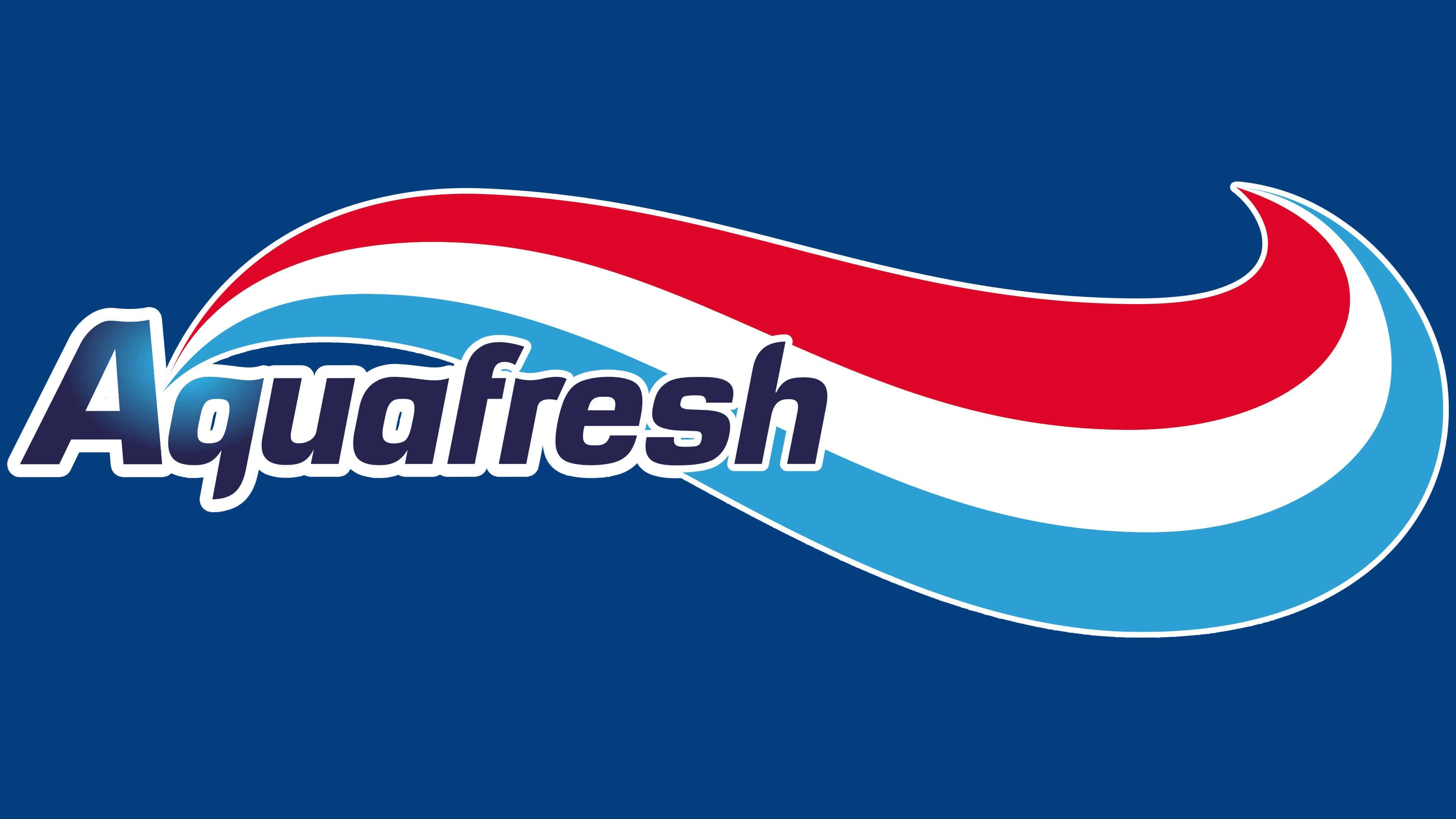
2012 – today
![]()
The ratio of “extruded” toothpaste to the brand name has changed: graphics now predominate over the inscription. The brush stroke became a gradient and starts with emphasis next to the capital “A.”
Font and Colors

Since the trademark’s founding, the logo has not changed in concept: it has always included toothpaste and the word “Aquafresh.”
The main font of the inscription is Sans Serif with italic elements. The brand palette comprises white, blue, and red shades.
![]()