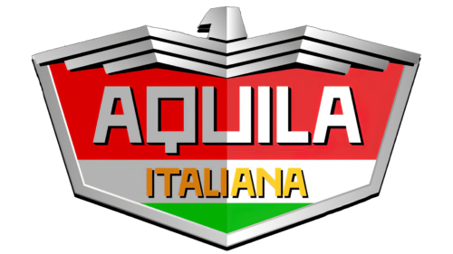
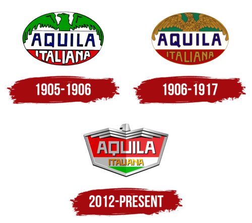
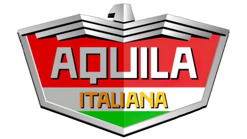
The Aquila Italiana logo resembles an iron high-tech bird representing the country on the roads. The symbol features precise mechanisms that distinguish the company in the market. The image of a shield embodies safety and reliability.
Aquila Italiana: Brand overview
In the early 1900s, the ambitious Aquila automobile company was founded in Turin. In 1906, a group of investors founded Società Anonima Aquila to create a range of cars. A year later, the company emphasized its national roots by rebranding and calling itself Società Anonima Italiana Aquila.
In the early years of its existence, Aquila focused on designing and producing small cars and “voitures,” equipped with its line of engines that had up to 35 horsepower. This phase of Aquila’s history saw a significant shift in 1909 when the Marsaglia banking family took over the company. The company was renamed Aquila Anonima Italiana di L. Marsaglia, and Vincenzo Marsaglia became its president.
Under Marsaglia’s leadership, Aquila started producing luxury cars, making a name for itself with its advanced engineering technology and quality bodywork during the First World War. However, this recognition could not save the company from the ravages of war.
Wartime conditions proved disastrous for Aquila. The company faced rising costs and a lack of resources, leading to its closure in 1917 and marking the end of its short but significant journey in the automobile industry.
In its heyday, Aquila was a large employer with 500 employees. The high-end cars produced by the company were often compared to Fiat’s luxury models. Despite these achievements, harsh economic conditions during the war led to the company’s eventual collapse.
Meaning and History
What is Aquila Italiana?
It is an Italian automobile manufacturing company based in Turin. It operated in the early 20th century and produced luxury cars known for their advanced engineering and elegant design. The cars were packed with features and aimed at the high-end market. Despite their quality and sophistication, the company encountered financial difficulties and eventually ceased operations.
1905 – 1906
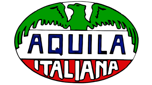
Aquila Italiana was founded in 1905 and continued its operations until 1906. The name “Aquila,” which translates from Italian as “eagle,” serves as both a word and a symbol, a key element of the company’s visual identity. In the logo of Società Anonima Aquila, the eagle is depicted with outstretched wings embracing a globe. This globe is styled like the flag of Italy, symbolizing the company’s dedication to its homeland and global ambitions, as the brand’s cars participated in races worldwide.
The Aquila Italiana logo includes an image of a capsule enclosing all the mentioned elements. This capsule image emphasizes ideas of safety and protection, which are important for the brand’s perception. The company was established through the combined efforts of several investors, enabling the organization to operate cohesively and effectively for the common good. This small car manufacturer is presented as a business exemplifying close collaboration and joint effort to benefit all participants and the community.
1906 – 1917
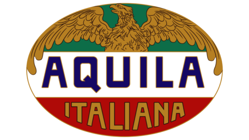
In 1906, a significant event occurred for the company with the release of its first cars: it was renamed Società Anonima Italiana Aquila. The company’s logo changed, becoming brighter and more expressive. A golden eagle used in the design shone brightly against the backdrop of the Italian national flag, resembling a figure on a car hood. The name of the country of origin was rendered in a golden color, intended to highlight the Italian roots and origin of the brand. At that time, the company began offering cars with six-cylinder engines, which was considered one of the most modern and advanced technological solutions in the early twentieth century. The emblem featuring the resonant golden eagle thus adorned the products and emphasized the premium, high-class status of the brand’s vehicles, designed for those who value quality and innovation.
2012 – today
This car company chose a logo featuring a ferocious eagle that evolved from realistic to abstract. The bird of prey is depicted as three zigzag lines of different lengths. Above them, in the center, is a makeshift head. Under the wings, on a red trapezoid, is the word “Aquila.” It is written in geometric letters, stylized under chrome steel. The square letters “Q” and “U” stand out. The second part of the name is colored yellow and is located on a white stripe. A green triangle can be seen underneath it. All these are the colors of the Italian flag.
The zigzag lines of the eagle resemble super cool feather labels. They give the impression that the bird is eager for action. The red, green, and white colors symbolize Italy. “Aquila” means “eagle” in Italian, and the chrome letters give it a modern and elegant look. The design is like a story about the brand, but without being too abstruse.
