


![]()
The Arbor Day Foundation has launched a refreshed brand identity designed by BLVR, marking a new chapter in its presentation. The update reflects its deep-rooted commitment to environmental care while introducing a modern, streamlined look. The goal is strengthening connections within its global community of individuals and organizations dedicated to tree planting and environmental protection.
The updated logo’s heart is the tree, which has always symbolized the Foundation’s mission. The tree’s design has shifted from a detailed, intricate illustration to a simpler, more iconic form. Clean lines and geometric shapes make it adaptable across digital platforms, print materials, and more. The new style highlights the universal meaning of trees—growth, renewal, and sustainability—while offering a fresh, contemporary appeal.
![]()
The circular element that frames the tree has also been refined. Previously thick and prominent, it’s now thinner and more subtle, creating a clean frame without overpowering the tree. The minimalist design choice adds a modern feel while representing ideas of continuity and life cycles—key themes in environmental work. The light, balanced outline complements the tree, giving the logo a sense of stability and growth.
The Foundation has moved from a traditional serif font to a clean, sans-serif typeface that’s easier to read and feels more current. The uniform stroke widths and slightly rounded edges give the text a softer, approachable feel. Careful letter spacing balances the design, allowing the typography to support the logo without feeling stiff or formal.
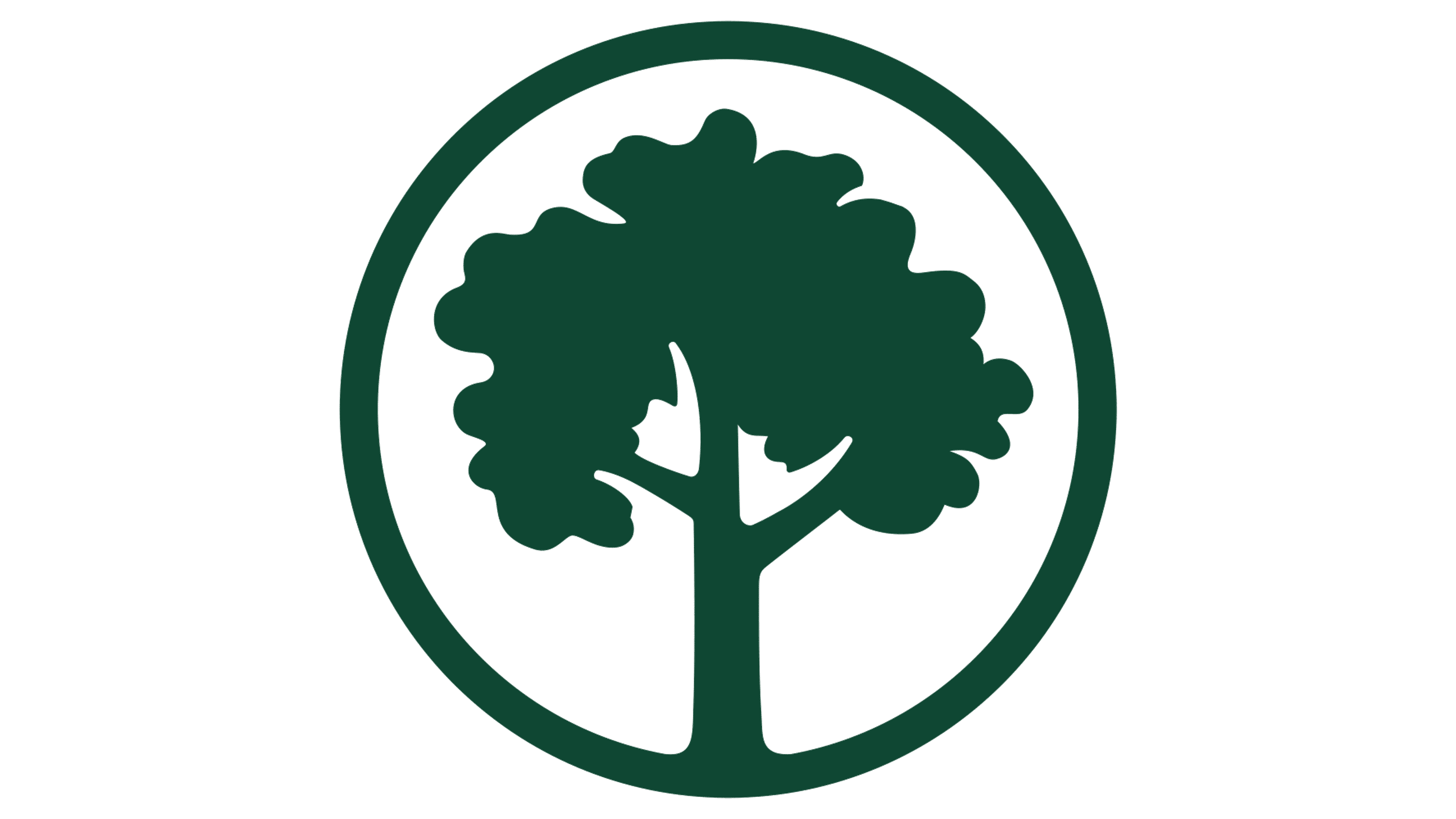
The familiar green is still there, but it’s been updated to a deeper, richer shade. The new tone adds sophistication while staying rooted in nature. It represents vitality and growth, resonating with the Foundation’s mission of planting trees and restoring the environment. The richness of the green ensures it looks strong across all platforms, from digital screens to print materials.
The new identity influences the Foundation’s visual system, including marketing materials, digital platforms, and educational content. Subtle graphic patterns inspired by nature—like leaf veins and tree rings—are woven into the designs, adding texture and depth without cluttering the look. These details reinforce the Foundation’s focus on the environment while keeping the look clean and modern.
![]()
The new design’s simplicity makes it highly versatile. Whether featured on large banners at tree-planting events, educational campaigns, or mobile apps, the logo fits seamlessly.
Another key goal of the rebrand is to create a unified identity across the Foundation’s many programs and initiatives. The updated design system visually connects these efforts, showing how they work toward the same mission. It helps build a stronger community among members, volunteers, corporate partners, and environmental advocates worldwide.
The simplified tree icon, modern typography, and richer color palette create a dynamic visual language reflecting the Foundation’s growth and continued commitment to protecting the environment.