The Arch Enemy logo speaks of anarchy, eternal struggle, and the need for defense. Sharp symbols associated with the destruction of targets create an atmosphere of power and dominance. The emblem resembles the eye of eternity, watching over humanity, a portal to other worlds.
Arch Enemy: Brand Overview
Arch Enemy, which originated in 1995 in Halmstad, Sweden, has become one of the most famous bands playing melodic death metal and has gained worldwide fame. The lineup has changed over the years, but the current ensemble—vocals by Alyssa White-Gluz, guitars by Michael Amott and Jeff Loomis, bass by Charly D’Angelo, and drums by Daniel Erlandsson—has cemented Arch Enemy’s status in the world of metal music.
Arch Enemy was somewhat of a supergroup in its early days, with a roster of notable metal musicians. Michael Amott, formerly of Carcass, enlisted his brother Christopher as drummer. At the same time, Johan Liiva’s powerful vocals and Charly D’Angelo’s resonating bass gave the band power. This impressive union of metal music legends was ready to take the world stage.
With the release of their debut album, “Black Earth,” in 1996, Arch Enemy sensationally entered the world of music. Their peculiar fusion of heavy and melodic death metal immediately won critical acclaim and helped them gather a loyal fan base.
The fourth album, “Wages of Sin,” was released in 2000, which led to radical changes. The emergence of Angela Gossow as a new vocalist with powerful vocal modulations set Arch Enemy apart from its contemporaries. Critics praised the album, which is still considered the band’s breakthrough work.
Arch Enemy further elevated themselves in the following years with albums such as “Anthems of Rebellion” and “Doomsday Machine.” Their high-octane, unforgettable live performances quickly gained a reputation, thrilling audiences worldwide.
In 2014, Alyssa White-Gluz replaced Angela Gossow as the new vocalist. This put Arch Enemy on a trajectory of extraordinary growth, and their music and activism led them to worldwide fame. Since then, the band has released several hit albums, and their commitment to animal rights and environmental conservation has garnered many loyal fans.
With their groundbreaking sound and exciting live performances, Arch Enemy has been a catalyst in transforming the melodic death metal scene. Their inspiring musical journey has shaped many other bands, and they persistently push the boundaries of the genre with each new release.
Meaning and History
What is Arch Enemy?
Arch Enemy, a melodic death metal band from Sweden, debuted on the music scene in 1995. The band was originally conceived as a supergroup from the city of Halmstad and formed by a group of well-known musicians who were looking to take their rightful place in the global metal community. From the very beginning of their existence, the band quickly gained considerable popularity thanks to their dynamic combination of melodic harmonies and hard, aggressive rhythms. Their innovative music, characterized by complex guitar solos and powerful vocals, as well as lyrics that often touched on philosophical and social issues, has carved a unique niche in the death metal genre.
1995 – today
The Arch Enemy emblem carries an enigmatic meaning. The “Doomsday Machine” comprises several elements: a small black circle, a large white circle, a black ring, and four spikes with rectangular bases. This design resembles a stylized eye or a mechanical part. The inscription nearby appears fragmented, evoking the chaos of an apocalypse. Despite this, the band’s name remains clear due to the serif font used.
The logo evokes heavy metal through its pointed shapes and intense atmosphere. The mix of circles and rectangles lends an ancient and futuristic feel. The breaks in the title add drama, suggesting the band’s music is so powerful that even the letters seem unsettled. This design reflects a blend of chaos and precision, much like their music.
The small black circle at the center anchors the design, surrounded by the large white circle and black ring. The four spikes radiate outward, creating a sense of dynamic motion and energy. This combination of shapes and elements forms a compelling visual that captures the essence of Arch Enemy’s music.
The fragmented inscription enhances the apocalyptic theme, giving the impression of decay and destruction. The clear serif font ensures the band’s name stands out, starkly contrasting the chaotic elements surrounding it. This balance between clarity and disorder creates a powerful visual impact.
Album
1996
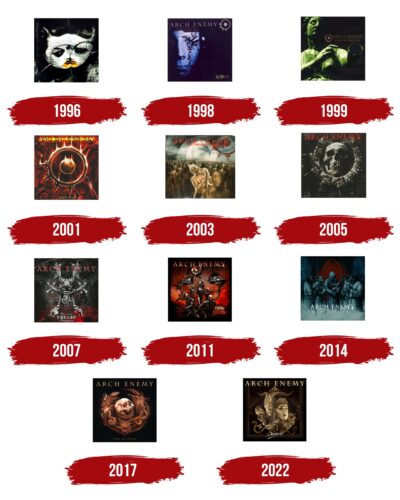
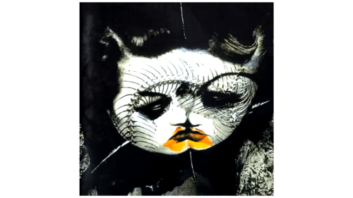
The emblem created for Arch Enemy’s debut album “Black Earth” in 1996 captures the dark atmosphere of metal. The logo uses dark, black tones, enhancing the heaviness and depth typical of this musical genre. The album’s title, “Black Earth,” is reflected in the visual design of the emblem, emphasizing its content and mood.
The logo’s central element is two faces stitched together, evoking the theme of Frankenstein. This image resonates with the idea of sinister experiments and the harmful advancement of technology. The emblem’s symbolism expresses a distorted view of humanity’s relationship with Earth, showing the destruction of life and the natural world.
1998
The emblem for Arch Enemy’s second album, “Stigmata,” continues the theme of faces from the debut album. This time, it depicts a single person with a pale face illuminated by moonlight. Numerous nails pierce the left eye and half of the sufferer’s face, starting with a large one in the eye socket and transitioning to smaller ones scattered across the cheek.
This illustration touches on Christ, His suffering, and stigmas. Human actions deeply wound the sight of God’s messenger, with tears of pain for humanity burning like molten metal. Each person, through their life, seems to drive nails into the Son of Man, adding new wounds. This image is inspired by recognizing the pain inflicted on Christ on the cross due to the world’s sinfulness.
The portrait on the emblem reflects physical suffering and deep emotional pain associated with Christ’s sacrifice. It symbolizes the experience of these sufferings, conveying a sense of profound sorrow and torment.
1999
The logo for Arch Enemy’s album “Burning Bridges” contains deep symbolism related to the theme of love and loss. The central image of the logo is Venus, which inherently suggests love. However, in the band’s interpretation, the statue of Venus is depicted with arms, differing from the classic image.
One of the statue’s hands is severed at the wrist, symbolizing separation and burned bridges. This visual choice aligns with the album’s main theme of experiencing failed relationships and understanding the reasons for the breakup. The image of Venus with a severed hand becomes a metaphor for lost love and the pain associated with the breakup.
2001
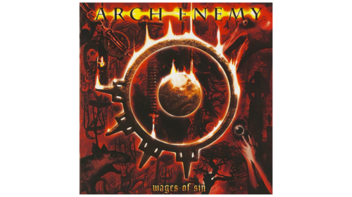
The album “Wages of Sin” marked a significant phase in Arch Enemy’s history, as it was the first with a new vocalist. It introduced the first logo without images of key members, giving the emblem a more symbolic and abstract character. The band’s logo is at the center of the emblem, resembling a bundle of keys to hell. This image enhances the album’s theme, emphasizing a connection to the otherworldly and sinful.
The picture is framed by flames, symbolizing the fire of the underworld. This element amplifies the dark and sinister atmosphere characteristic of the album’s music and lyrics. On the sides of the image are depictions of unclean spirits and suffering sinners, resonating with the theme of retribution for sin. These elements create an impressive visual metaphor, reflecting the album’s main motifs.
2003
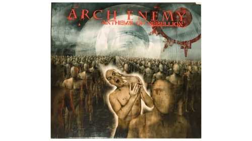
The emblem for Arch Enemy’s album Anthems of Rebellion vividly reflects the theme of rebellion and the fight against established norms and systems. This message echoes the iconic film The Matrix, where characters resist a controlling system. The logo depicts faceless columns marching in unison, symbolizing conformity and submission.
At the center of this formation is a figure breaking free from a mask, highlighting individuality and the desire for self-expression. This image represents the yearning to break free from societal constraints and liberate oneself from the bonds that restrict personal identity. The logo conveys the pain and resentment of living in a crowd where most people never leave the collective mass and obediently follow established rules.
The “Anthems of Rebellion” emblem symbolizes protest and a call for change. It visualizes the album’s main message—the necessity to fight for freedom and personal identity. The drawings reflect a drive to change the established order, step out of the shadows, and assert individuality.
2005
Arch Enemy’s sixth album, Doomsday Machine, features one of the most terrifying logos in the band’s history. The main symbol, crafted from metallic parts resembling vertebrae, curves into an arched shape. Sharp claws are positioned at the ends, giving the image a sinister appearance. The overall look resembles the remains of a fossilized worm from another galaxy, enhancing the sense of an alien threat.
Special attention is drawn to the left part of the circle, where drills protrude instead of the usual spikes. This detail makes the symbol truly resemble a doomsday machine. At the center of the circle is a human skull that appears tormented and emaciated as if subjected to painful experiments and research. This image evokes thoughts of brutal examinations, revealing a person’s motives and actions during their life.
The “Doomsday Machine” logo visualizes the idea of exposing human essence on Judgment Day. The symbol reminds us that everyone, even those long deceased, will be held accountable for their actions. Avoiding this judgment is impossible, and the emblem vividly depicts this grim future.
2007
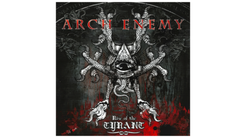
The cover of Arch Enemy’s seventh album, “Rise of the Tyrant,” features a devilish and surreal image representing an avant-garde portrayal of tyranny. The central monster has an eye in the center, positioned under a triangle, symbolizing the Trinity. This eye is surrounded by six chicken legs radiating outward, creating a sinister and frightening image.
In the background, numerous snake tails intertwine, adding more eeriness to the scene. Skeleton angels fly around the monster, giving the scene a dark and apocalyptic feel. Below, a bloody fire burns, enhancing the sense of horror and hopelessness.
The image on the cover conveys a world engulfed by tyranny, where society is deprived of freedom and forced to accept it. Fear and terror dominate the land, reflecting a grim reality where tyranny crushes any form of resistance and freedom. It symbolizes total control and suppression, with every aspect of life monitored and manipulated.
2011
The symbol for Arch Enemy’s eighth album, “Khaos Legions,” is one of the most straightforward and accessible symbols of the band. The emblem features men in armor, representing members of the chaos legion, charging forward under black banners with the group’s anarchistic symbols. These warriors emerge from a hellish portal, symbolizing their origin from the depths of the underworld.
Each warrior on the emblem represents a specific political or social theme addressed in the album. These figures embody various destructive and disruptive ideas that spread through society. The chaos legion symbolizes forces that undermine foundations and sow chaos in the modern world.
2014
The logo for the ninth album, “War Eternal,” resembles a horrifying product of genetic engineering. The image depicts people with heads of boars, pigs, and rats preparing to place a flaming crown on a baby. This baby lies in the arms of a hooded figure whose face is a skull. This artwork, created by Romanian artist Costin Chioreanu, perfectly matches the spirit of the songs featured on the album.
The album’s main theme is the eternal struggle between good and evil. The battle for the human soul, the fight between life and death, heaven and hell, runs through every song and is reflected in the cover image. The logo serves as a visual essence of the entire album, conveying its profound meaning and dark atmosphere.
2017
Like a Christmas wreath, the Will to Power emblem features a satanic wreath with an image of Beelzebub intertwined with snakes and chains, along with the heads of a wolf and a goat. In the center, as the main decoration, is a skull. Together, the composition represents attributes of power given by Satan. The symbol emphasizes that questionable motives often drive the desire to rule, and the ambition for high positions can corrupt a person.
2022
Like theatrical masks, the album “Deceivers” logo features three characters: a maiden, a mime, and a devil. These figures symbolize pretense and the changing masks behind which people hide their true nature. The maiden represents innocence, the mime embodies the art of deception and performance, and the devil signifies evil and cunning.
The emblem highlights society’s hypocrisy and deceit and points to its downfall. Each element of the logo reveals the album’s theme, exposing the hidden persona people wear in everyday life.

