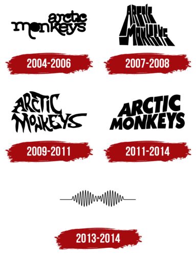
The Arctic Monkeys logo is simple and clear. The emblem shows the band members’ deep dedication to music and desire to make their work easy to perceive. The symbol conveys the lively rhythm of the compositions.
Arctic Monkeys: Brand overview
| Founded: | 2002 – present |
| Founder: | Alex Turner, Jamie Cook, Matt Helders, Nick O’Malley |
| Headquarters: | Sheffield, England |
| Website: | arcticmonkeys.com |
Meaning and History
When Alex Turner and Jamie Cook decided to form a band, it was 2002, and the guys had started playing together even earlier. However, the friends didn’t think about their logo until much later, when they decided to distribute their demo album Beneath the Boardwalk, recorded on compact discs, in 2004. From then on, the band’s logos changed with each compilation.
What is Arctic Monkeys?
A rock ensemble from the United Kingdom. From their very first album, the group hasn’t stopped winning awards. Their first, second, and fifth albums have been recognized as the best by Brit Awards, the fourth by the Mojo Award, and the sixth was nominated for the Best Alternative Music Album.
2004 – 2006
The logo was likely designed by 2fly studio, which produced the band’s debut album – Whatever People Say I Am, That’s What I’m Not. The first songs of the collection appeared in 2004, and the final layout was completed in 2006.
The chosen symbol is the band’s name, written in two levels.
A distinctive feature of the image is the black dots in the letters O and C. The circular elements remind of discs and records. The elongated and rounded glyphs M and Y hint at monkey tails. The unusual combined writing of “r” and “i” also adds uniqueness. Thanks to such features, the logo made the common words individual.
The approach pointed to the guys’ desire to stand out among hundreds of rock bands. They experimented with sound and vocals until they finally found their niche in indie rock.
The band’s name also speaks to the desire to be different. After all, ordinary monkeys live in a warm climate.
The exact origin of the phrase Arctic Monkeys, proposed by Jamie Cook as the band’s name, is unknown. However, it can be assumed that the name is connected to The Monkees, an American rock band that played in the 60s. The band was internationally known, sold 75 million records, and resumed their activity repeatedly. Therefore, music-loving Turner and Cook would certainly have known about it. And since The Monkees was founded in warm Los Angeles, the guys from cool Sheffield decided to become Arctic Monkeys.
Interestingly, the logo deformation, characteristic of all subsequent signs of the musicians, was also present in The Monkees’ logo.
The first compilation was very successful. It sold at lightning speed – 360,000 copies in a week.
2007 – 2008
The emblem of 2007 appeared on the band’s second studio album – Favourite Worst Nightmare. The sign differs by the transformed letters of the name. The band’s name seems to be a shadow of the real letters. Half of the shadow falls on the asphalt, and half continues on the house wall. Because of the curve, the symbols are unnaturally elongated and fractured in the center.
The method is related to the theme of nightmares. It hints at the fear of an unknown object when you see its approaching shadow. Depending on the distance, the shadow of even a very small object grows to gigantic sizes and stirs the imagination.
The image was chosen in unison with the album’s name and was likely developed with the assistance of Domino Recording, which was responsible for the album’s release and promotion.
2009 – 2011
The emblem of 2009 first appears on the cover of the band’s third studio album – Humbug, released on the same label (Domino Recording).
The letters of the name, arranged on two levels, are transformed as if in a distorted mirror: bent, skewed, enlarged, or reduced. The emblem is most similar to The Monkees logo from 1967.
This approach indicates:
- Shift in consciousness, strange content of many songs, the course of thoughts unclear to everyone.
- Psychedelic rock – the leading style of the album.
- The unusual sound of instruments steering the music towards surf rock, which is uncharacteristic for the band.
Sharp serrations at the ends of the letters hint at the gloominess of the songs and the cutting metal in the compositions.
2011 – 2014
The fourth album, with the rather provocative title Suck It and See, received a new logo. The appearance of the letters of the name is most similar to the standard. Only the initial symbols are slightly “fluttering,” as if the emblem is swaying on the waves. The changes immediately indicated the influence of the new label – Sound City Studios. The smoothness and ease of the inscription highlighted the transition to the “guitar pop” style and the romantic content of the album.
Interestingly, many fans considered the floating font of 2011 plagiarism from the emblem of another famous group – Black Sabbath.
2013 – 2014
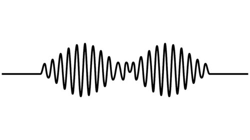
The logo of the fifth album, AM, is characterized by a sharp transition from a letter-based to a visual style. A sound wave represents the emblem without any inscriptions. The sign appeared with the assistance of the Sage & Sound Recording label.
The two waves on the track are like two letters in the collection’s name. Since the album is named after the group, its task is to reveal the band’s essence, preferences, and hobbies. The choice of a “sound” emblem communicates that the band lives by music. And melodies are understood in any language.
It resembles the logo of a glasses lens, hinting that the collection conveys the Arctic Monkeys’ view of the world.
Font and Colors
Black color – the main one in the emblems. It points to the rock style. Conveys the band’s dominance on stage, growth, and maturation of the musicians, who started playing at 18-19 and stayed in the profession for over 20 years.
The fonts of the logos are unique and do not correspond to the standard, reflecting the band’s individuality.
Arctic Monkeys color codes
| Black | Hex color: | #000000 |
|---|---|---|
| RGB: | 0 0 0 | |
| CMYK: | 0 0 0 100 | |
| Pantone: | PMS Process Black C |

