Ariana Grande’s logo is simple and, at the same time, tender and soft. The emblem conveys the singer’s calm, radiant temperament, friendliness, and kindness. The sign emphasizes the slimness and gracefulness of the figure, attractive with its symmetry and harmony.
Ariana Grande: Brand overview
| Founded: | 2008 – present |
| Founder: | Ariana Grande-Butera |
| Headquarters: | Boca Raton, Florida, U.S. |
| Website: | arianagrande.com |
Meaning and History
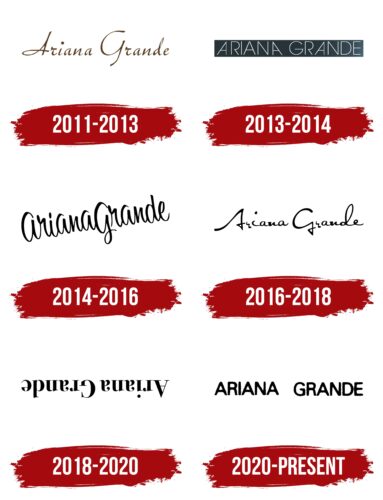
The leading format of the singer’s logos is a black inscription on a white background. However, even with such a limited form of presentation, the emblems of the performer are full of diversity. A new version of the mark was developed for each single and album. The images are united by the softness and roundness of the letters, adding femininity to the inscriptions. The girl’s career started in childhood when she began performing on the local theater stage. However, the first Ariana Grande logo was designed for the artist’s musical creations when she turned 18.
What is Ariana Grande?
A young American pop singer whose work has been awarded from the first year, initially as New Artist of the Year, then as Artist of the Year, Best International Solo Artist, and Top Female Artist. Her albums Sweetener and Thank U, Next took first place in Billboard 200, and their songs topped the charts’ first three lines. The singer’s music videos have amassed 9 billion views on the internet, which speaks of unprecedented popularity.
2011 – 2013
The 2011 logo was created for the singer’s first single, Put Your Hearts Up. A harmonious hand-drawn inscription with a slight tilt to the right indicates a feminine and self-confident girl. The label Republic Records influenced the artist’s identity, which produced her songs. The symbols convey an elegant but restrained style, which would suit an older performer better. The choice showed the girl’s early maturation; she had already performed on stage by 18 and became a star of the Broadway musical “13”.
2013 – 2014
In 2013, several variations of the logo of the same style appeared. Each was worked out depending on the design of the next compilation. The basis is the inscription invented for the single The Way, which was included in Ariana’s first album – Yours Truly.
Very thin and slender white letters convey the young and tender image of the singer. The twists of the letter A in different directions give the inscription a feminine look. The glyphs are barely visible on a dark background as if illuminated by spotlights on the right. The baseline embodies the title of the disc. The young artist is moving her way toward fame and recognition. The semi-open lines of R show some unsaid things. Hidden from the public facts, adding mystery and secrecy to the singer’s image.
2014 – 2016
The emblem was developed for the single Problem, the video for which gained over 1 billion views on YouTube. The heroine of the track walks in a circle, allowing herself to be captivated by a guy who uses her. The rounded letters of the logo’s inscription are combined into a single spiral structure, demonstrating the whirlpool of feelings described in the song.
2016 – 2018
A logo with lowercase letters, reminiscent of a more disorderly version of the 2011 mark, can be found on the singer’s third studio album – Dangerous Woman. The emblem has more individuality and firmness. The sign represents a confident woman who knows what she wants.
2018 – 2020
On her website, the upside-down text appeared in advertising the artist’s fourth compilation, Sweetener. This technique demonstrates a topsy-turvy world. A call to twist, flip, and mix, as heard in the album’s titular song. The letters with serifs talk about passionate love, from which one’s head spins.
2020 – today
The sixth studio album, Positions, received the most straightforward sign with capital letters. The rounded glyphs demonstrate lyrical feelings and describe the theme of male-female relationships, where one needs to be able to adjust and smooth out rough edges. The logo perfectly suits the accomplished singer who has reached the heights in her niche.
Font and Colors
The black color of the emblems resonates with the color of the notes and the treble clef on a white sheet, underscoring the singer’s achievements. Only 15 women in history have managed to top the charts with their debut albums. And to maintain no less popularity in the subsequent years is only achievable for a few. No wonder in 2016, Ariana was included in the list of the 100 most influential people in the world.
The font of the inscription corresponds to Generic G40 CC Slender with geometrically accurate letters made of lines rounded at the ends. The inscription reflects the harmony and smooth rhythm of the music. It points to the pleasant personality of the star.
Ariana Grande color codes
| Black | Hex color: | #000000 |
|---|---|---|
| RGB: | 0 0 0 | |
| CMYK: | 0 0 0 100 | |
| Pantone: | PMS Process Black C |


