Designers proposed the Arizona Coyotes logo in a Cubist style. It features the club’s mascot, a coyote, after which it was named. This animal is symbolic for hockey players, as it possesses relentless endurance, the ability to sudden attacks, and cohesiveness, which is extremely important for team play.
Arizona Coyotes: Brand overview
| Founded: | 1972 |
| Founder: | Alex Meruelo, Andrew Barroway |
| Headquarters: | Tempe, Arizona |
| Website: | nhl.com |
Meaning and History
The “Arizona Coyotes” is a professional hockey team. It is part of the NHL, where it competes in the Western Conference as a member of the Central Division. It was founded in 1971 as the “Winnipeg Jets”. Since 2019, it has been solely owned by billionaire Alex Meruelo.
The club was established in the early 70s of the last century and was initially part of the World Hockey Association. After the dissolution of the WHA, it became one of the four franchises that joined the NBA, receiving official membership in June 1979.
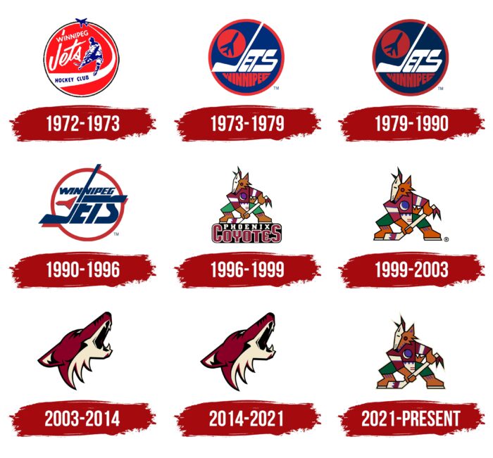
Moreover, the team has had three names. It debuted as the “Winnipeg Jets,” became the “Phoenix Coyotes” in 1996 after moving to Phoenix, and in 2014 became the “Arizona Coyotes” due to moving to Arizona. All this is reflected in the emblem, which has changed many times (presumably five). The hockey players are expected to return to the Central Division in 2021 when an expansion franchise from Seattle joins the league.
What is Arizona Coyotes?
The “Arizona Coyotes” is a hockey team formerly known as the “Phoenix Coyotes” until 2014 and known as the “Winnipeg Jets” before 1996. It was initially a WHA franchise but later had to join the NHL. One of the team’s main achievements was winning the championship title in the 2011-2012 season.
1972 – 1973
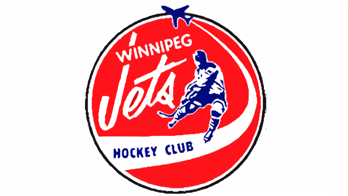
The “Arizona Coyotes” played in the WHA under a red emblem for one year. A hockey player with a stick was depicted on a raspberry field, winding up to make an accurate pass. The athlete’s figure and equipment were schematically drawn with alternating blue and white strokes. A wide strip ran under the player’s feet, narrowing and turning upwards to a blue plane. On the white strip was written HOCKEY CLUB. A few more words were placed above: “WINNIPEG” and “Jets,” where “J” was depicted as a hockey stick. All elements were located in a circle reminiscent of a puck.
1973 – 1979
Continuing their journey in the WHA, the team received a new logo. Essentially, its elements remained the same but were regrouped. The developers further emphasized the club’s resemblance to the letter “J,” combined the upper parts of the letters “E” and “T,” and enlarged and bent the “S.” The word “WINNIPEG” was placed below “Jets,” and “HOCKEY CLUB” was removed entirely. The theme of airplane flights was embodied in a red hockey puck. The background was a dark blue circle with a red border.
1979 – 1990
The original version of the logo dates back to the club’s first period of existence. It featured a dark blue airplane in a red circle, the white inscription “Jets” with a stick instead of “J,” and the burgundy word “Winnipeg” below. The background was a dark blue color with a red trim. All elements were placed in a large circle.
1990 – 1996
In 1990, the management decided to change the logo, adding clarity and light. As a result, a logo appeared with a white background, on which the club and its name are located. The words “Winnipeg” and “Jets” are inverted: the first is at the top, and the second is at the bottom. In addition, the designers added original details, using a regular cap for the letters “ets” and depicting “J” as a large club extending beyond the bordering circle. Where it intersects with the red line, there are stylized red shadows.
1996 – 1999
In 1996, a new chapter in the logo’s history opened as the club moved to the city of Phoenix and changed its status and name. It was called Phoenix Coyotes and received radically revised symbolism during this period. Moreover, this stage is significant because it was then that an image of a coyote first appeared on the logo. However, it was very artistic and done in the Cubist genre. Greg Fisher was the author of this idea.
The emblem featured a coyote in hockey gear, on skates, and with a stick. The animal was poised in a waiting pose, ready to attack the opponent and intercept the puck at any moment. The unusual stylization is related to the desire to convey the national flavor of the region where the franchise was relocated. Therefore, the gear is incredibly colorful and ornamental, in patchwork style, feathers are drawn on the stick, and the head is made in the form of a mask.
1999 – 2003
After the redesign, the logo retained the unique image of a coyote in the local colors of the Phoenix surroundings. The developers removed the massive inscription “Phoenix Coyotes” on which the animal stood. They also made the main element larger and brighter.
2003 – 2014
The sports club’s management decided to play with the image of the coyote, making it more realistic. After all, this predatory animal is just right for hockey players: it is fast, lightning-fast, sharp, and elusive. It fiercely corners the opponent – waits for the most suitable moment for an attack, and suddenly pounces. It’s no wonder that experts recognize the new logo as one of the best in the National Hockey League and is among the top ten.
2014 – 2021
Having moved to the Arizona desert, the club decided to keep the sand coyote as a native inhabitant of this area. Therefore, after moving and renaming, the athletes use the old symbolism.
2021 – today
And again, radical changes in the visual image of the team’s main logo. The 1999 emblem is so recognizable and popular among fans that the management decided to return it as the team’s main icon. The changes compared to that emblem are not noticeable, except for the outer beige contour.
Arizona Coyotes: Interesting Facts
The Arizona Coyotes are a hockey team from the Phoenix area. They’ve had an interesting journey since they started.
- From Winnipeg to Arizona: They started as the Winnipeg Jets in 1972 and joined the big leagues in 1979. In 1996, they moved to Arizona and got a new name, the Phoenix Coyotes. By 2014, they changed their name to Arizona Coyotes to show they represent the whole state.
- First Season in Arizona: They played their first season in Arizona from 1996 to 1997. This was part of a big plan to make hockey popular in places where it wasn’t the main sport.
- Moving Arenas: They first played in the America West Arena in Phoenix. In 2003, they moved to the Gila River Arena in Glendale, a better place for hockey.
- Chasing the Championship: The Coyotes have tried hard to win the big championship but haven’t yet. Their best effort was in the 2011-2012 season when they got close.
- Honoring Players: They’ve honored some of their best players, like Wayne Gretzky (everyone honors his number 99) and Shane Doan (number 19), a big deal in Coyotes history.
- Shane Doan: Speaking of Doan, he’s the most famous Coyotes player. He played with them for 21 seasons and holds records for most goals, assists, and points.
- Helping the Community: The Coyotes do a lot for the local area, like supporting youth hockey, education, and health projects. They want to make hockey popular and help out where they can.
- Mascot: Their mascot is Howler, a coyote who wears the team’s jersey and cheers up the fans at games.
- Breaking New Ground: The Coyotes are known for trying new things. In 2016, they were the first team to hire a woman full-time as a coach.
The Arizona Coyotes have made a big impact in Arizona, creating a lot of hockey fans and being an important part of the community, even though they play in a desert.
Font and Colors
The emblem features a howling coyote with a half-open mouth, showing sharp fangs as a sign of courage and aggression. The head is raised, the eyes are narrowed, and the ears are pressed and laid back. The lines in the drawing are straight and confident, and the strokes are voluminous, with shadows. The Adrenalin Design Group designed the logo.
Although the current version does not contain text, early versions do. During the club’s debut, the sign’s lettering was individual, with wide uppercase letters. When the team was based in Phoenix, it received a logo with the name, in which the word “Coyotes” was very large, with the letters “C” and “S” in uppercase. It served as a platform for the second part – “Phoenix.”
In terms of the palette, the franchise is more consistent: the same colors are present on all emblems in different combinations. Specifically, these are red, beige, brick, white, and black. For some time, dark blue and brown were also used.
Arizona Coyotes color codes
| Brick Red | Hex color: | #8c2633 |
|---|---|---|
| RGB: | 140 38 51 | |
| CMYK: | 9 100 64 48 | |
| Pantone: | PMS 202 C |
| Desert Sand | Hex color: | #e2d6b5 |
|---|---|---|
| RGB: | 226 214 181 | |
| CMYK: | 3 15 29 0 | |
| Pantone: | PMS 2309 C |
| Black | Hex color: | #111111 |
|---|---|---|
| RGB: | 17 17 17 | |
| CMYK: | 0 0 0 100 | |
| Pantone: | PMS Process Black C |
FAQ
Did the “Arizona Coyotes” change their logo?
Yes, the “Arizona Coyotes” team changed its logo. Radical changes occurred in 2003 when the cubic character disappeared from the emblem, and a howling coyote head appeared in its place. The latest changes date back to 2021: the designers returned the colorful Kachina character.
Who designed the “Arizona Coyotes” logo?
The designer of the “Kachina” logo, depicting the spirit of the Pueblo people in a Cubist style, is the Adrenalin Design Group. This version was approved in 2003 and returned in 2021.
When did the “Arizona Coyotes” change their logo?
The Arizona Coyotes hockey team last changed its logo in September 2021. It replaced the howling coyote head with the original Kachina version – a spirit doll made of many patches.
