


 Army Black Knights Logo PNG
Athletes of the United States Military Academy reflect their combative spirit in their emblem’s graphics. The Army Black Knights emblem symbolizes confidence in victory, fighting to the end, courage, Spartan resilience, and brand image protection.
The Army Black Knights’ history dates back to 1802, when the United States Military Academy was founded at West Point on the Hudson River. The athletic department was established in 1820, and sport was treated as part of officer training, with a focus on endurance, discipline, and teamwork. The Black Knights’ name and black-and-gold colors became long-standing identifiers of the program.
Football took shape in the late 19th century, with the first recorded game in 1890. In the early 1900s, the Army competed among the strongest programs in the country. The team peaked in the 1940s, winning national championships in 1944, 1945, and 1946. Key players included Felix Blanchard and Glenn Davis, known as “Mr. Inside” and “Mr. Outside.” Blanchard won the Heisman Trophy in 1945; Davis followed in 1946.
The annual Army–Navy game, first played in 1890, became one of college sports’ most recognized rivalries. Navy later dominated the series from 2002 to 2015, before Army ended the streak in 2016. A parallel rivalry exists with Air Force, forming a triangle among service academies.
From the 1950s onward, the program faced limits tied to mandatory military service, which affected recruiting compared with major universities. Despite this, the Army reached bowl games under Bob Sutton in 1996 and recorded a 10-win season under Jeff Monken in 2018.
The basketball team competes in the Patriot League alongside institutions like Navy and Air Force, with occasional NCAA appearances. Wrestling remained one of the strongest programs, producing national-level athletes and Olympians.
Meaning and History
What is Army Black Knights?
Army Black Knights is the sports division of the United States Military Academy at West Point, New York. It encompasses 25 student teams from various sports organizations, including NCAA Division I, the Patriot League, the ECAC, the Great American Rifle Conference, Atlantic Hockey, and many others. The academy’s representatives also compete for the Commander-in-Chief’s Trophy: games are held among teams from the Navy, Air Force, and Army.
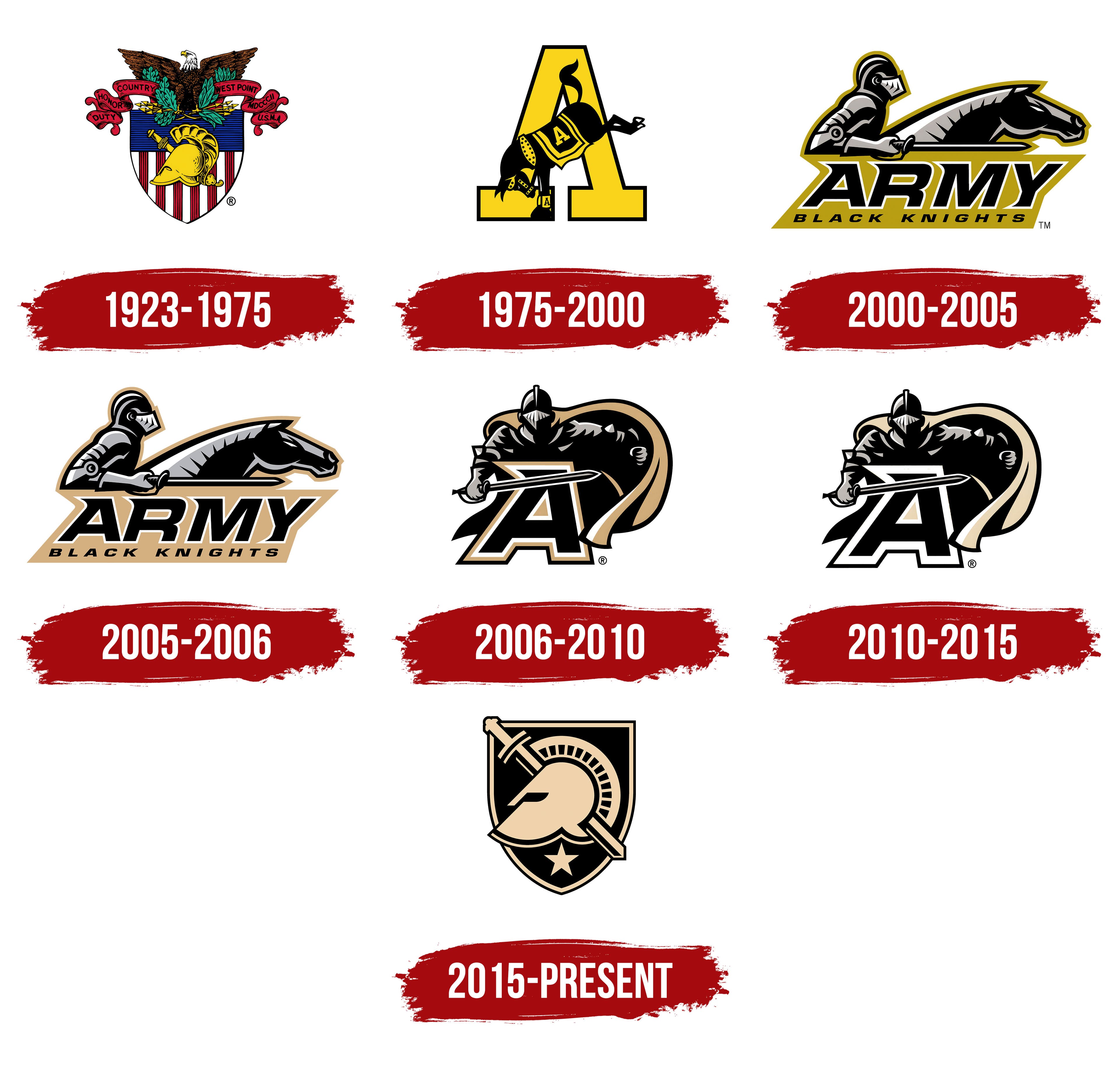
1923 – 1975
From 1923 to 1975, West Point’s athletic teams were represented by the United States Military Academy’s coat of arms. Founded in 1802 on the Hudson River, the academy used symbols of national allegiance, military training, and education in its athletic identity. Separate athletic emblems appeared later, while the academy continued to use the coat of arms.
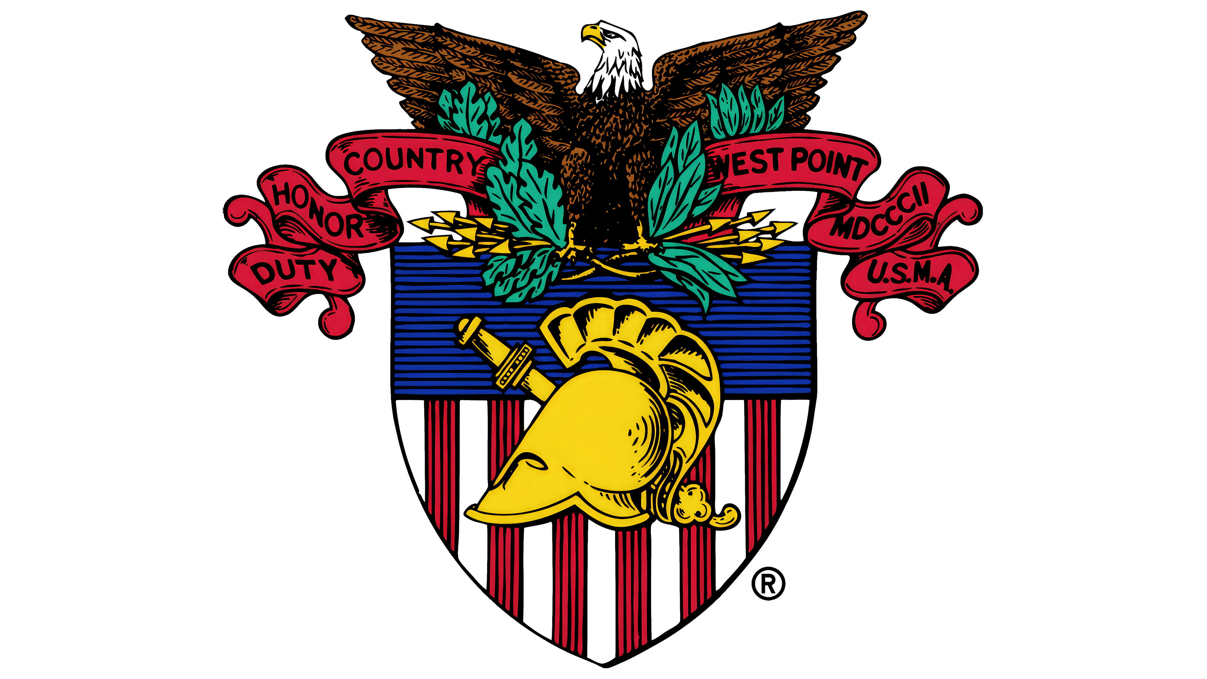
The first version was approved on October 13, 1898. A committee led by Colonel Charles Larned, a professor of drawing, developed it. Athena’s helmet, associated with wisdom and learning, represented education, while a Greek sword signified the academy’s military purpose. Both appeared in gold on a shield with vertical red-and-white stripes and a blue upper field.
A bald eagle with outstretched wings stood above the shield. Thirteen arrows in its talons represented the original states, while oak and olive branches symbolized peace. The full-color version combined brown plumage, a white head, green branches, and red ribbons. Every component was rendered in detail. The ribbons bore the motto “Duty, Honor, Country,” the name West Point, the abbreviation U.S.M.A., and MDCCCII, the year 1802 in Roman numerals. These inscriptions connected the national symbols to the academy and its founding year.
The coat of arms adopted for athletics in 1923 incorporated a heraldic correction. Captain George Chandler had drawn the academy leadership’s attention to the direction of the eagle’s head and helmet. Both, along with the sword, were turned toward dexter, the shield bearer’s right and the viewer’s left. The corrected coat of arms was approved on July 2, 1923.
The Army Black Knights name combined a military affiliation with a nickname inspired by West Point’s appearance. Army refers to the U.S. Army. Sportswriters coined “Black Knights of the Hudson,” linking the football players’ black uniforms to the academy’s architecture, which resembled a medieval fortress. The phrase was later shortened to Black Knights. The teams were also known as the Cadets. In 1999, Black Knights became the primary athletic nickname.
1975 – 2000
The mule entered West Point’s athletic tradition as an answer to Navy’s goat mascot. In 1899, a quartermaster officer in Philadelphia brought a mule to the rivalry game. Before its football appearance, the first Army mule had pulled an ice wagon. It was groomed, covered with a gray blanket, and decorated with black, gold, and gray ribbons before being introduced to the crowd. The animal had a direct connection to Army life, since mules transported artillery, ammunition, and supplies.
In 1975, the mule became West Point’s primary athletic emblem, the Kicking Mule, continuing that longstanding tradition. The name described the animal’s pose. A black mule, its head lowered and hind legs kicked upward, overlapped the center of a large gold “A.” A thick black outline bordered the letter, whose strokes ended in heavy rectangular serifs.
A smaller “A” appeared on the mule’s blanket. Gold defined the harness and blanket edges, echoing the letter behind it. A standalone mule illustration accompanied the full version.
2000 – 2005
A mounted knight became the primary image of the Army Black Knights in a logo collection unveiled on July 19, 2000, by the academy’s athletic leadership and SME Power Branding. The update accompanied the transition from the previously dominant Cadets name to Black Knights. Athletic director Rick Greenspan described the project as an effort to better reflect contemporary college athletics.
The primary emblem was called Horseman. A gold background followed the angular contours of the illustration and lettering, uniting the figures and text. Large, slanted sans-serif ARMY lettering occupied the lower portion. BLACK KNIGHTS appeared beneath it in smaller, widely spaced letters.
Above the text, a knight in full plate armor rode a horse. Both rider and horse appeared in profile, facing right. A nearly horizontal sword crossed in front of the knight’s chest and the horse’s neck. Gray and white bands broke up the black armor, defining metal plates and highlights. Other marks extended the knight theme through a caped figure, standalone helmets, and wordmarks incorporating a sword.
2005 – 2006
The 2005 Horseman emblem retained the arrangement of the rider, horse, and sword above two lines of text. The gold shade changed. A light sand color replaced the earlier rich, olive-toned gold.
The revised Horseman remained the primary emblem until 2006, when it became a secondary mark.
2006 – 2010
In 2006, Capeman, a caped knight standing before a large “A,” became the Army Black Knights’ primary emblem. The illustration had been part of the collection developed by SME Power Branding in 2000 and initially served as a secondary mark. It remained the primary emblem from 2006 to 2010. The team name was reduced to the letter “A.”
A black, slanted “A” with white and gold outlines formed the background for the forward-facing figure. With his right hand, the knight extended a sword across the letter. His left hand held the edge of a cape that curved behind his shoulders and fell along the right side of the image.
A closed helmet concealed his face. Angular white and gray shapes defined the visor and armor joints, separating the plate sections.
2010 – 2015
The 2010 Capeman emblem retained the knight in front of the “A.” The pose, sword, helmet, and letter contours remained unchanged. Only the shades and placement of the colors were revised.
A white band replaced the gold border around the “A.” Gold became lighter, approaching a cream tone, and remained on the cape and selected areas inside the emblem.
2015 – today
West Point’s historic coat of arms provided the basis for its new primary athletic emblem in 2015. The Athena Shield replaced the medieval figure and “A.” A gold helmet appeared within a black shield outlined in gold, with a sword running diagonally behind it and a five-pointed star below. The emblem connected athletics to the Army’s duty to defend the U.S. Constitution and the ideal of an educated officer.
Athena’s helmet represented wisdom, while the sword signified a warrior ready for battle. The helmet faced dexter, the position of honor in heraldry, and the 13 segments between its body and crest represented the original states. The sword took the form of an ancient Greek xiphos. Unlike the sword in the historic coat of arms, its blade was unsheathed. The star linked the design to Army identification markings and the stars on the American flag.
The new Army West Point name combined the Army affiliation with the academy’s name. Black Knights remained the athletic nickname, while Cadets continued as an approved secondary designation. The wordmark collection included Army West Point, Black Knights, The Corps, and Cadets. A custom typeface, Army Stencil, was developed for the update. Gaps in the letter strokes echoed military stencils used to apply lettering repeatedly. The traditional Classic A retained a limited role as a secondary emblem, preserving a connection to the letters on cadet varsity jackets and cardigans.
The color standards specified gold Pantone 467 C, Process Black C, and Cool Gray 5 C, with white included in the designs. Black, gray, and gold retained their traditional cadet associations with gunpowder, charcoal, saltpeter, and sulfur. Gray continued to reference cadet uniforms and the Long Gray Line, the name for West Point’s community of graduates.
The project with Nike took 18 months. Army and academy leaders, athletes, graduates, coaches, and historians participated in the discussions. Colonel Ty Seidule, head of the academy’s history department, worked with the designers. The project established shared standards for emblems, colors, lettering, and numerals across all 28 intercollegiate athletic programs. Army West Point unveiled the logo at Eisenhower Hall on April 13, 2015, with Todd Van Horne, Nike Football and Baseball’s vice president and creative director, participating in the presentation.