The ARO logo represents protection, the ability to withstand any load. Cars with strong bodies and chassis are not afraid of off-road. The emblem is concerned with passenger safety.
ARO: Brand overview
ARO is a now-defunct Romanian SUV company that went bankrupt in 2006. It was the last owner of Cross Lander. The ARO logo can be seen on 380 thousand cars produced by the company.
The history of ARO began beautifully based on a factory built during World War II. Models gradually became more complicated and exported to other countries. But since 1998, the operation of the plant has turned into a series of deceptions and crashes, in the center of which was dishonest businessman John Perez.
Meaning and History
The company logo is filled with patriotism and indicates the country of production. The white background with a blue border and the company name inside convey the spirit of the post-war period, in which car production began.
What is ARO?
It is a Romanian automaker known for producing off-road vehicles. Recognized for its rugged and durable four-wheel drive vehicles, ARO models such as the ARO 24 Series and ARO 10 were popular for their versatility and ability to tackle tough terrain. Despite early success, the company faced financial difficulties and eventually ceased production.
1957 – 2003
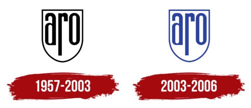
The logo of ARO, used from 1957 to 2003, was a recognizable symbol of protection and reliability. It was meticulously designed to reflect the key qualities of ARO products—safety and the guarantee of flawless performance under any conditions. The engines and parts produced by the manufacturer were intended to provide users with high confidence during operation.
The elegant lines of the ARO company emblem evoke the medieval era of knights and tournaments, symbolizing strength, protection, and nobility. These design elements were chosen intentionally, as they recall the knightly armor providing reliable battle protection.
The logo’s black color has practical and symbolic significance. It refers to the lubricant used on individual parts to ensure their durability and efficiency. This color is associated with solidity, strength, and elegance, further emphasizing the reliability of ARO products.
When the brand began producing its first vehicles, the logo was adapted to highlight their simplicity and functionality. Through the logo’s visual aspects, the company aimed to convey that its vehicles are built for efficient and reliable performance, providing drivers with maximum confidence and control while driving.
2003 – 2006
The logo’s shape resembles the historical shields of Romania’s regions of Dobruja and Banat and the coat of arms of Câmpulung Muscel, where the company was founded. Smooth, streamlined shapes indicate well-thought-out equipment and body strength.
The choice of the protective theme of the emblem is related to the following:
- An aircraft manufacturing plant was built in 1942 to produce propellers for military aircraft. After the war, the premises were used to produce ARO machines, which played a role in the defense complex.
- Cars were offered to former members of the Warsaw Pact as additional military vehicles. Unlike NATO, the Pact united the countries into an organization protecting each other’s borders.
- The ability of cars to move off-road and increased wear resistance.
Inside the shield are three lowercase letters, “aro,” the same size as the background. At the same time, R received the most elongated leg, and A and O increased in size. Oblong letters indicated the body of a convertible-type machine. Later models received an elongated chassis.
The company’s name honors the country of production. It stands for Auto Romania (the first letter from “auto” and two from “Romania”) and, since 1972, Automobil Romanest.
Font and Colors
The main color is calm blue. It is associated with the sky, water, and freshness, so it has a calming effect. The color represents the transition from military purposes to peaceful transport. It conveys the owners’ desire to protect their country and city from threats and live measured lives. He talks about travels in which off-road vehicles were involved.
The lettering font is similar to Aodaliya Bold. The letters “a” and “r” caps are rounded and resemble a convertible top on the company’s first cars.


