


![]() Artistry Logo PNG
Artistry Logo PNG
The spiky font and golden color make the Artistry logo look very sublime. The reference to the oriental style is not accidental because the cosmetics manufacturer uses natural beauty recipes worldwide. Harmony, brevity, sophistication, and moderation are all embodied in one short inscription.
The origins of Artistry trace back to 1934, when Carl Rehnborg founded Nutrilite Products in California, producing one of the first multivitamins in the US. His work in China helped establish the idea that nutrition affects health, laying the foundation for later developments.
In 1958, Edith Rehnborg launched Edith Rehnborg Cosmetics within Nutrilite, using plant extracts grown on company farms. The focus on botanical ingredients contrasted with synthetic-heavy products common at the time.
On November 9, 1959, Richard DeVos and Jay Van Andel established Amway in Michigan, building on Nutrilite’s direct sales model. In 1968, Amway introduced Artistry Color Cosmetics, with 11 products and 37 shades, and merged it with Edith Rehnborg’s skincare line under the Artistry name.
In 1972, Amway acquired Nutrilite, gaining control over both the brand and its agricultural base in Washington, Mexico, and Brazil. This structure differed from competitors such as Clinique and Estée Lauder, which relied on in-house laboratory development.
During the 1970s, Artistry expanded into markets including Australia, France, and the UK. Production scaled with facilities in Michigan and California, and later in China, by 1995. By the late 1990s, Euromonitor placed Artistry among the leading prestige brands alongside Lancôme and Chanel.
By 2000, the range exceeded 400 products, covering skincare, makeup, body care, and fragrances. The brand’s stylized “A” logo reflected its global positioning and links to Eastern beauty traditions.
Meaning and History

The brand uses the stylized letter “A” as a personal symbol. It has a complex structure and consists of several strokes that outwardly resemble a hieroglyph. This concept was pushed not only by designers but also by the administration to demonstrate a connection with the fashion industry’s eastern direction. Graceful curves, flowing lines, and a sandy palette reflect confidence and femininity.
What is Artistry?
Artistry is an American brand specializing in skincare and decorative cosmetics. Its product list includes over 400 items, which it sells in over 50 countries. The trademark is owned by Amway, headquartered in Ada, Michigan.
Font and Colors
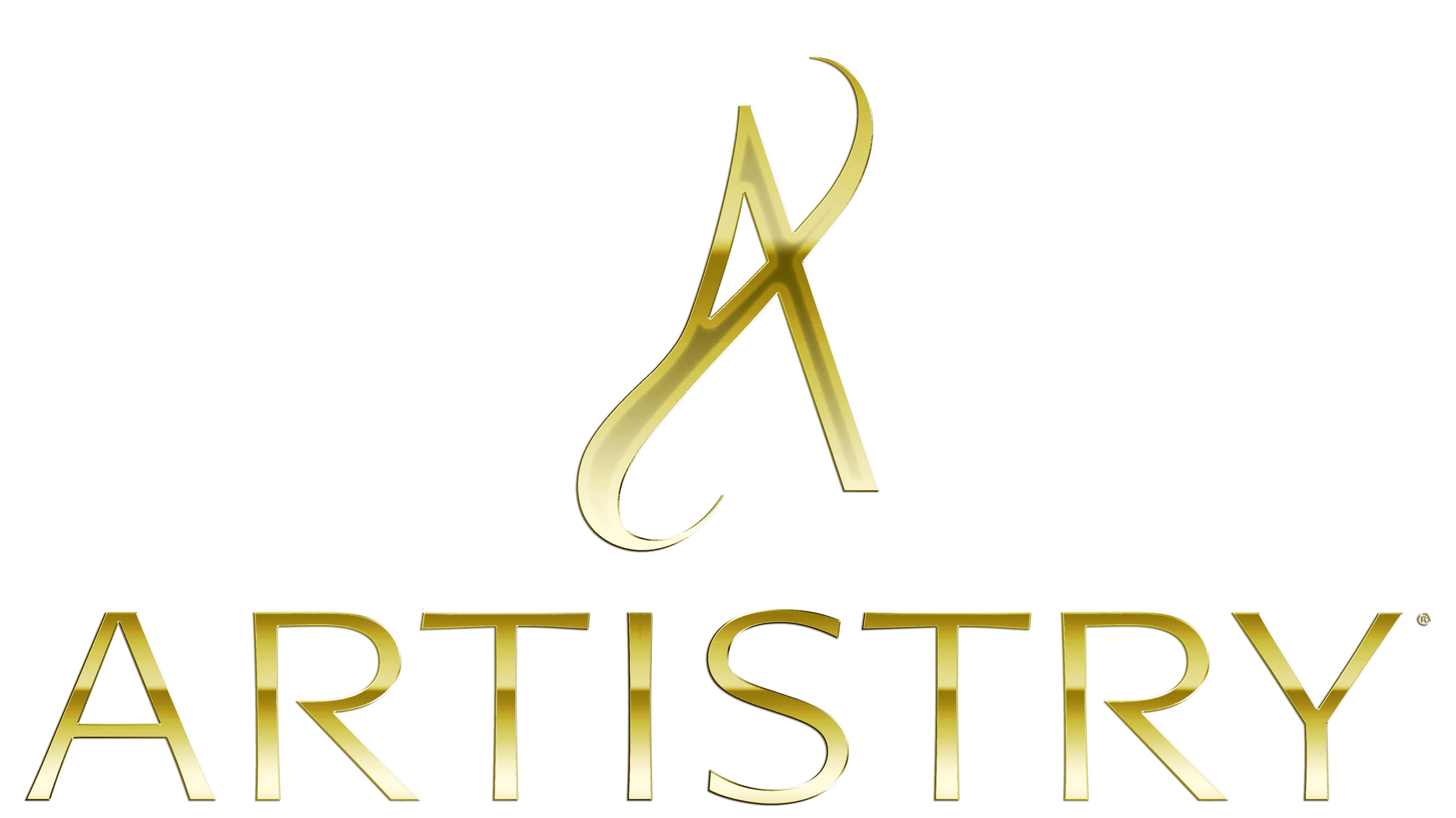
The logo consists of a capital “A” with the center bar and the bottom of the left leg. The silhouette strip has pointed ends twisted into a semi-curl. The rest of the letter is standard, typical of the printed sign: straight lines, sharp corners, clear geometry.
Some versions have text in the form of a trademark name. The inscription is set in a chopped grotesque typeface. The palette of the emblem is restrained, sandy-golden.