![]()
The Aruba Conservation Foundation (ACF), a nonprofit organization dedicated to preserving Aruba’s natural ecosystems, has introduced a new logo and brand identity designed by How&How. This rebranding reflects ACF’s shift from park management to a focus on environmental sustainability.
Founded in 2003 as Fundacion Parke Nacional Arikok, the organization expanded in 2018 to include marine protected areas, becoming Parke Marino Aruba. ACF now manages nearly 25% of Aruba’s land and 0.2% of its waters, promoting sustainable practices that balance environmental, social, cultural, and economic goals.
![]()
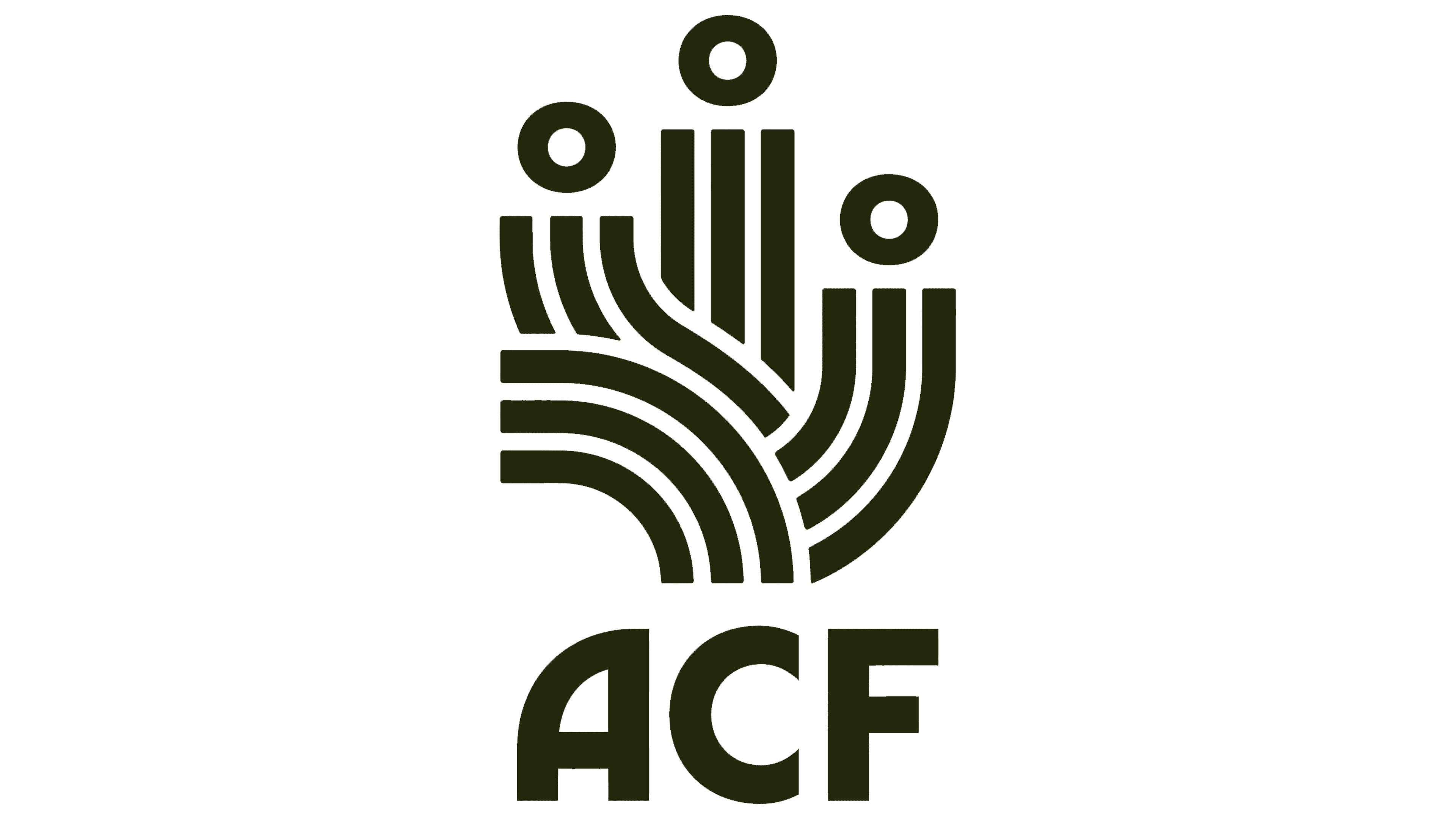
With its festive typography and graphics, the old logo suited a national park but didn’t represent the foundation’s new mission. The new logo is more conservative and visually appealing, featuring an icon with concentric lines and textures that evoke a lush landscape. The design subtly incorporates an implied cactus, reflecting Aruba’s arid environment. A wave element within the icon highlights Aruba’s island geography, while the collective representation of human heads underscores the foundation’s community-focused approach.
The wordmark uses a simple, bold sans serif typeface. The “A” and “v” mirror the curves in the icon, creating a cohesive visual identity. This design choice reinforces the connection between the text and the icon, enhancing brand recognition.
![]()
The identity extends beyond the logo to include illustrations inspired by ancient cave paintings and rock art. These illustrations have a unique and distinctive appearance. Some are modular, allowing for flexibility in design. For instance, the snake’s body can be extended with more curves, the tree’s trunk can grow, and the waves can repeat, adapting to different layout requirements.
The serif typeface Timezone is used throughout the identity, with keywords italicized and colored to stand out. This typographic choice adds elegance and sophistication. The motion behavior for the shift to italics is fluid and smooth, adding a dynamic element to the design.
The color palette features warm, nature-inspired colors reflecting the various geographical areas of the National Park, such as dunes, marshes, the ocean, and scrubland. This diverse palette enhances the visual appeal and conveys a connection to the natural environment.
The rebranding aimed to rally local pride and support for preserving nature rather than increasing foot traffic or boosting tourism. This shift required reframing the brand from park management to a true conservation authority. The new identity positions ACF as “Aruba’s Voice of Nature,” emphasizing the organization’s role in advocating for local ecosystems and reminding the community of their intrinsic ties to the land.
The visual identity showcases humanity’s spiritual connection to nature, with the logo combining land, sea, and collective action themes. The strong and bold marque symbolizes ACF’s commitment to conservation and stewardship of Aruba’s natural heritage.