![]() Asahi Logo PNG
Asahi Logo PNG
The Asahi logo reflects the character of the Japanese beverage: pure, refreshing, and Eastern in flavor. The image of the morning sun conveys Japan’s national color and atmosphere, where attention to detail is evident even in beer.
Asahi traces its origins to 1889, when Komakichi Torii founded the Osaka Beer Brewing Company in Osaka during Japan’s Meiji era. A year earlier, technician Hiizu Ikuta had been sent to Germany to study brewing at Weihenstephan. He returned in 1889 to lead production in Suita. In 1892, the company introduced Asahi beer, named after the rising sun. In 1900, it won a gold medal at the Paris Exposition.
In 1906, Osaka Breweries merged with Sapporo Brewery and Nippon Brewing Company to form Dai Nippon Brewery. Asahi became a division within this structure and expanded into soft drinks. After World War II, US occupation authorities forced the decentralization of industry. In 1949, Dai Nippon Beer split into Kirin Brewery and Asahi Breweries, marking the start of Asahi as an independent company.
Through the 1950s and 1960s, Kirin and Sapporo dominated the market. By the early 1980s, Asahi’s share had dropped to around 9–10%. A consumer survey revealed that 98% of respondents wanted a different taste profile. President Tsutomu Murai pushed for reform despite technical doubts.
In March 1987, Asahi launched Asahi Super Dry, introducing a “dry” beer style with higher alcohol content and lower sugar content. Within a year, market share rose from 10% to 17%. By 1994, it became Japan’s top-selling beer. In 2001, Asahi surpassed Kirin with a 38.7% share.
Global expansion followed. In 2016, Asahi acquired Grolsch, Peroni, and Meantime from Anheuser-Busch InBev, and later purchased brands from the former SABMiller portfolio, including Tyskie, Lech, and Pilsner Urquell. In 2019, it added Fuller’s brewing business, and in 2020, completed the acquisition of Carlton & United Breweries in Australia.
Meaning and History
![]()
Asahi’s bottle labels feature a recognizable design, thanks to the brand name prominently displayed on the logo. The name comes from Japanese and means “morning sun.” The meaning embedded in the brand name aligns with the concept of refreshing, crystal-clear beverages.
What is Asahi?
It is a Japanese manufacturer of alcoholic and non-alcoholic beverages, whose name translates as “rising sun.” The company’s range primarily includes ales, stouts, porters, pilsners, and lagers. Other products include bottled water, tea, and cider. The company’s history dates back to 1889.
1889 – 1957
![]()
The first Asahi Breweries logo captured the essence of Japanese graphic art. Within a circular symbol featuring a bright red sun radiating rays and stylized waves, motifs come together to evoke associations with Edo-period and early Meiji-era Japanese culture.
The logo is centered on a red disc. From it, red rays of equal width extend outward in a strict pattern, alternating with a white background and recalling the Japanese military flag of the early twentieth century.
The lower part of the mark unfolds a true visual narrative. A wave appears there, rendered in a style close to Hokusai’s famous work The Great Wave off Kanagawa. The wave structure conveys a turbulent water surface, with curls and dots that emphasize the image’s liveliness and texture.
The black-and-white palette of the waves contrasts with the rising sun’s brightness. The complex wave curves visually intersect with the straight lines of the rays, creating a sense of volume and depth. The bright sun appears to sit behind the waves, reinforcing a compositional effect characteristic of Edo-period Japanese decorative prints.
The visual style is embedded in the cultural context of the time, combining graphic expression with restrained design and reflecting Japanese artistic heritage. The logo was not merely a commercial mark but a cultural image, linking the brand’s history to the country’s culture.
1957 – 1985
![]()
The new Asahi Breweries image reinterprets Japanese symbols, weaving them into a modern brand style. At the center of the logo remains a large red sun. From the disc, red rays of uniform thickness radiate in all directions, evenly alternating with white segments.
The lower half of the circle is devoted to waves, now rendered more simply and abstractly than before. The waves are depicted with broad black lines separated by white gaps. The lines curve smoothly and round into spiral-like curls that echo Japanese aesthetics. Several waves feature splashes that appear as small black circles outlined in white.
The red, white, and black colors create a rich and cohesive image that unites sun and water. The logo remains restrained, preserving a balance between decorative detail and simplicity while gaining a new interpretation.
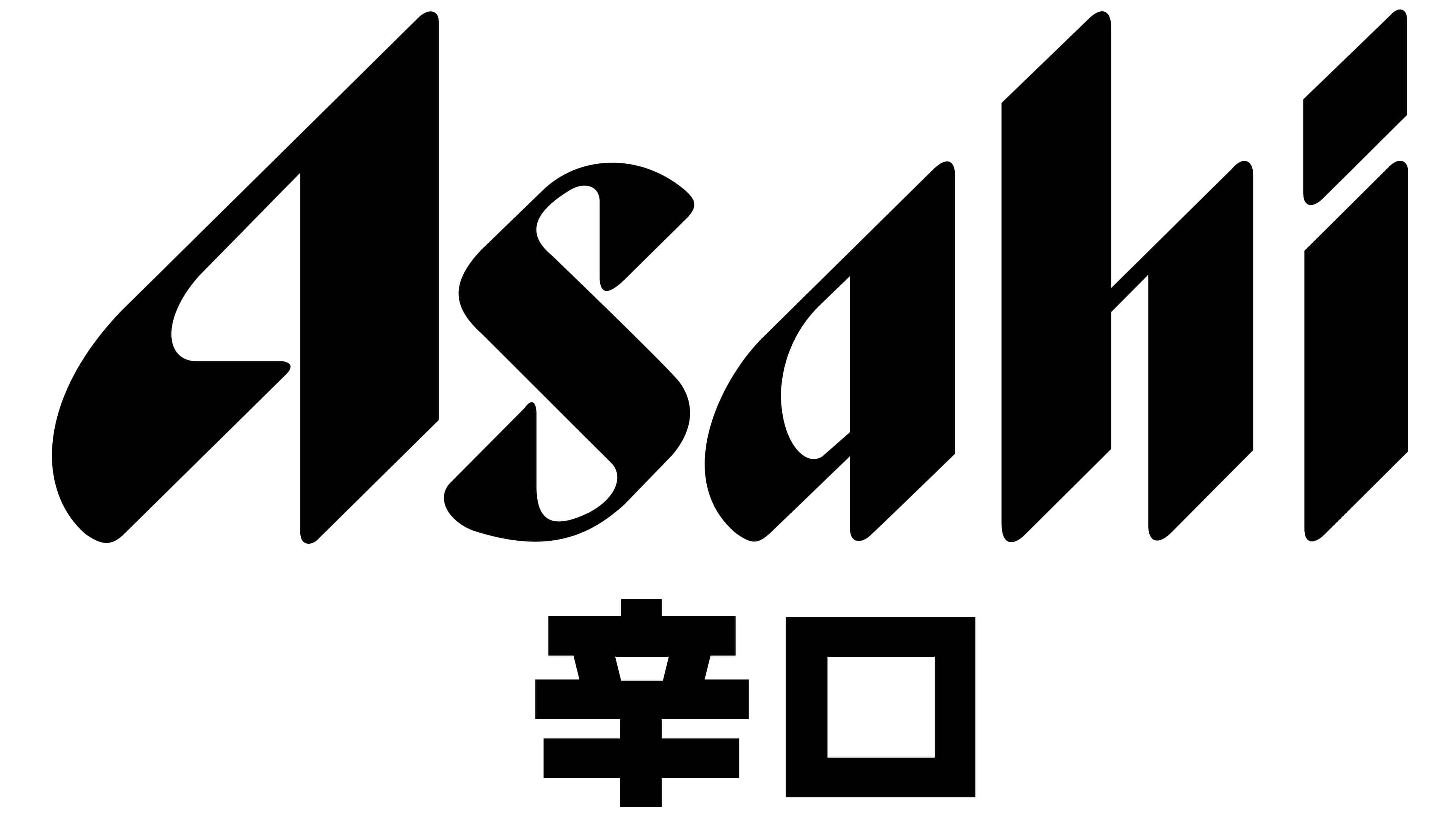
1985 – today
![]()
The new and current Asahi Breweries logo, introduced in 1985 for the Japanese brewery, was created by Kazumasa Nagai, Masashi Uehara, Kahei Kiyono, and Yutaka Sasaki, who developed a stylized rendering of the company name. It features the energetic word Asahi in rich blue, symbolizing the brand’s freshness and relevance in a new era.
The letters are individually crafted on a Latin sans-serif foundation, though the design was fully reworked. The characters are elongated and slanted to the right. Their uniqueness is expressed in how the strokes transition from a wider center to sharp ends. Diagonal cuts emphasize the wordmark’s overall character. The stroke thickness varies throughout, giving the word a lively appearance and conveying a contemporary brand image.
Font and Colors
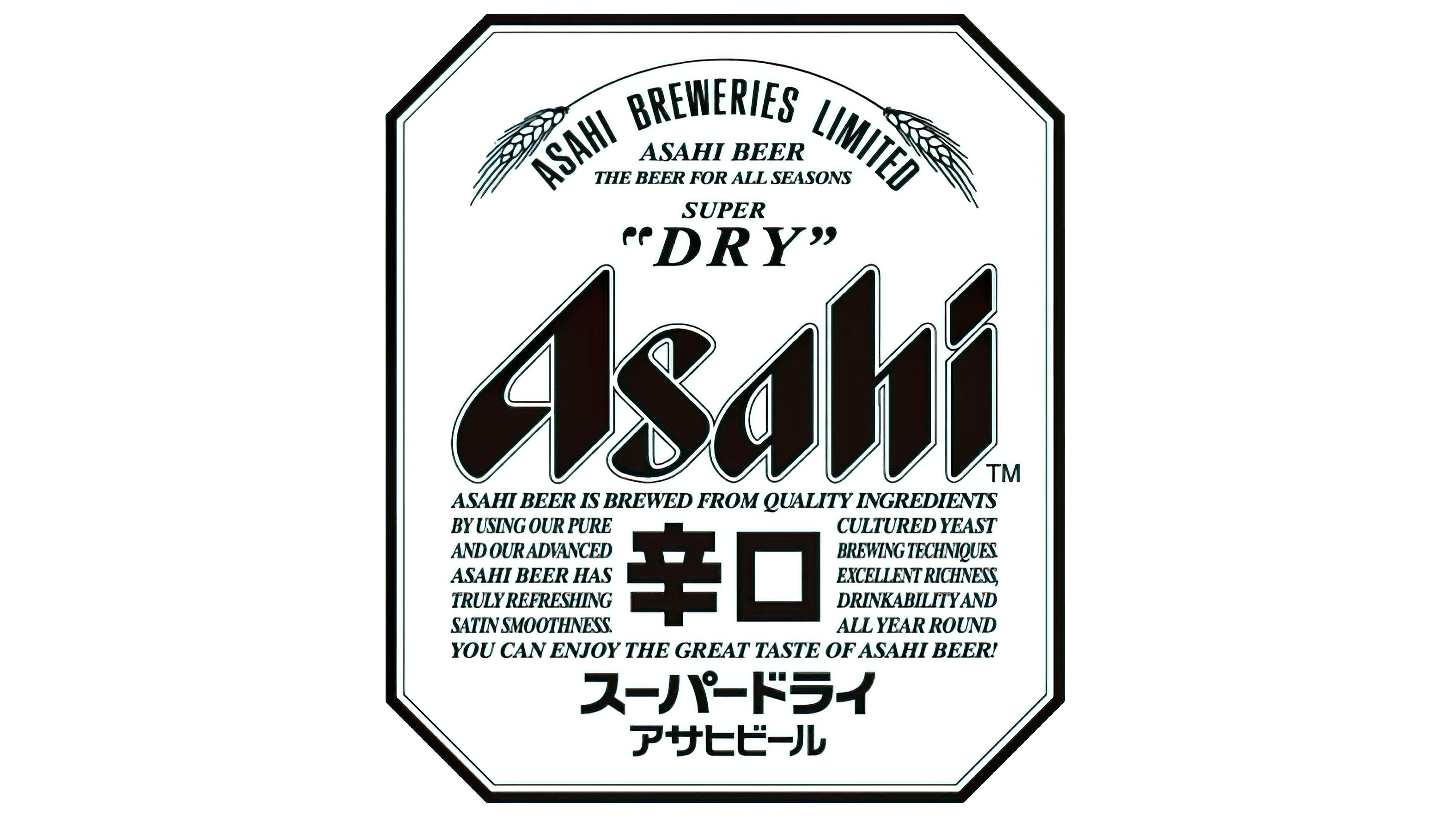
The font conveys a unique Eastern flair. The letters are horizontally aligned, but they contain many diagonal lines. As a result, the letters appear to be positioned at a 45-degree angle.
The logo’s palette often varies by drink type. The labels feature black, white, yellow, blue, and green “Asahi” inscriptions. They feature an original design and are outlined twice. The inner contour is always light, and the outer one is the same color as the brand name. In the classic version, the background is white or silver. But the bottles can have any background.
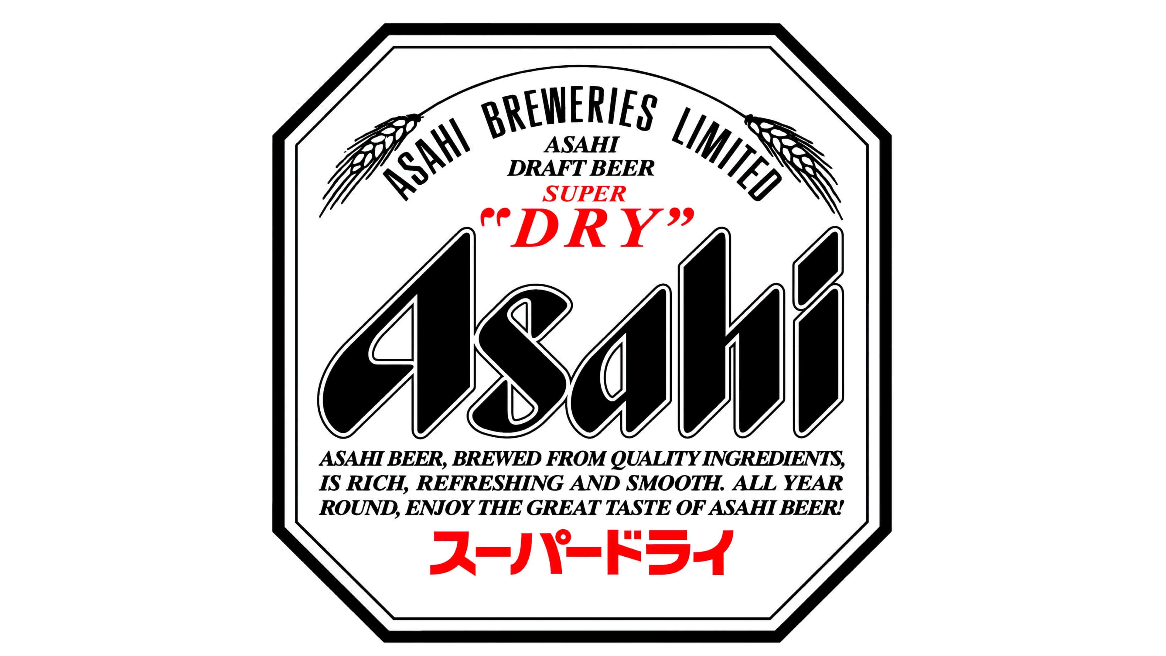
A trademark sign in the form of curved wheat ears complements the emblem. At the bottom is the full name of the company (“Asahi Breweries Limited”) and the advertising slogan (“The Beer For All Seasons”).
In addition to the brand name, the label contains the kanji 辛口. This means “dry” (“karakuchi” in Japanese), which is also written at the top of the label, but in English.