The Asia Motors logo represents a premium manufacturer in the region. The emblem seemingly elevates and shows that the brand’s cars are the best in Asia. The symbol displays harmony and perfection.
Asia Motors: Brand overview
Asia Motors was a commercial vehicle manufacturer established in 1965 in Gwangju, South Korea. During its formative years, the company dedicated itself to constructing light trucks, buses, and passenger cars under licenses granted by European automakers, including the Italian giant Fiat.
Asia Motors found itself under new ownership in 1976 when it was bought by Kia Motors, which was then broadening its manufacturing base in South Korea. Despite the acquisition, Asia Motors maintained its production of licensed models from Fiat and Hillman, even as it began to produce vehicles branded as Kia.
As time passed, the 1980s and 1990s saw an increasing overlap between the models produced by Asia Motors and those from Kia. Eventually, in 1999, Kia chose to consolidate its production under its singular brand, leading to the winding down of the Asia Motors marque.
At the height of its operations, Asia Motors produced over 150,000 vehicles annually across its three manufacturing facilities before eventually being assimilated into Kia, its parent company. After 34 years of production as an independent entity and under Kia’s ownership, the Asia Motors nameplate was finally retired in 1999.
Meaning and History
What is Asia Motors?
It is a South Korean automaker known for producing a range of vehicles, including SUVs, trucks, and buses. The company specializes in producing vehicles suitable for various commercial and personal purposes. It eventually became part of Kia Motors Corporation, which led to integrating its operations and models into the larger Kia brand.
1986 – 1994
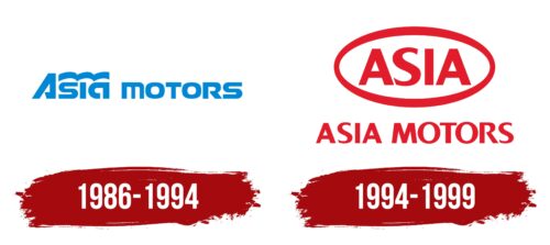
The logo of Asia Motors, used from 1986 to 1994, was designed to highlight the company’s geographic location in Asia. The main design element is the word “Asia,” which is prominently featured to indicate that the company is based and operates in this region. This is crucial for the brand, aiming to strengthen its position in the Asian market.
Above the name, blue waves are depicted, capturing the eye with their bright color palette and carrying deep meaning. These waves remind us of South Korea’s geographic feature of being surrounded by seas on three sides. This design element reinforces the brand’s connection to its roots and emphasizes its commitment to local traditions and culture.
The logo incorporates an image of a ribbon that symbolizes success and growth. Like a victory symbol, this ribbon streams above the car, following it as it moves, evoking associations with space and freedom. This element highlights that Asia Motors continuously strives for new achievements and goals.
The logo’s color palette is deliberately chosen. The combination of calm tones visually embodies confidence and stability, which is important for reassuring customers. Asia Motors aims to show that its cars represent technology, quality, reliability, and safety, making them an ideal choice for buyers who value these attributes.
1994 – 1999
When the logo of the South Korean company was still in operation, it repeated the logo of its parent company, Kia Motors. It was the same horizontal oval with a red border and lettering on a white background. The ellipse was topped and bottomed by a broad line tapering to the sides, giving the symbol a dynamic look. The word “Asia,” located inside, was written in bold type. The letters were capitalized, solid, and large. The letter “S” stood out with its refined tips. Below the oval was the full name of the car manufacturer, stylized to match the text above.
The oval design gives the impression that it is in motion like a wheel rushing down the road. The red border also gives it energy. The word “Asia” in bold lettering seems to say, “Hey, look at us, we are confident!”—the letter “S” with little fancy tips, as if twisted abruptly in the middle. The top and bottom text are in the same style, which unifies them very well. It all shows balance but still looks very cool and casual.


