


![]()
The Asian Football Confederation (AFC), which oversees football across Asia, has introduced a new logo and brand identity, marking the start of a new chapter in its history. This is the second major redesign since AFC was founded in 1954 and the first significant update since 2021. The new look reflects the organization’s desire to modernize, engage with future generations of fans and players, and highlight its growing influence in global football.
The updated logo moves away from the old design, which featured bold lettering alongside a golden football shaped to resemble the Asian continent, with a radiant star symbolizing growth and unity. That logo served as a familiar symbol for more than two decades. The new design, however, embraces a minimalist, contemporary style that aligns with how the confederation wants to present itself going forward.
![]()
At the center of the new logo is a sleek typographic design. The letters are written in smooth, ribbon-like white shapes against a deep navy blue background. The typography is sharp and geometric, with clean lines that suggest movement and energy. A small golden detail within the curve of the letter “A” adds a refined touch, linking the new look to the color palette of the previous emblem.
The old graphic elements, like the stylized map of Asia and the star, are gone. This streamlined approach shows the organization’s confidence in its name and the strength of its identity without needing extra symbols. It reflects a broader perspective, positioning the governing body as an entity with global ambitions while still deeply rooted in its role across Asia.
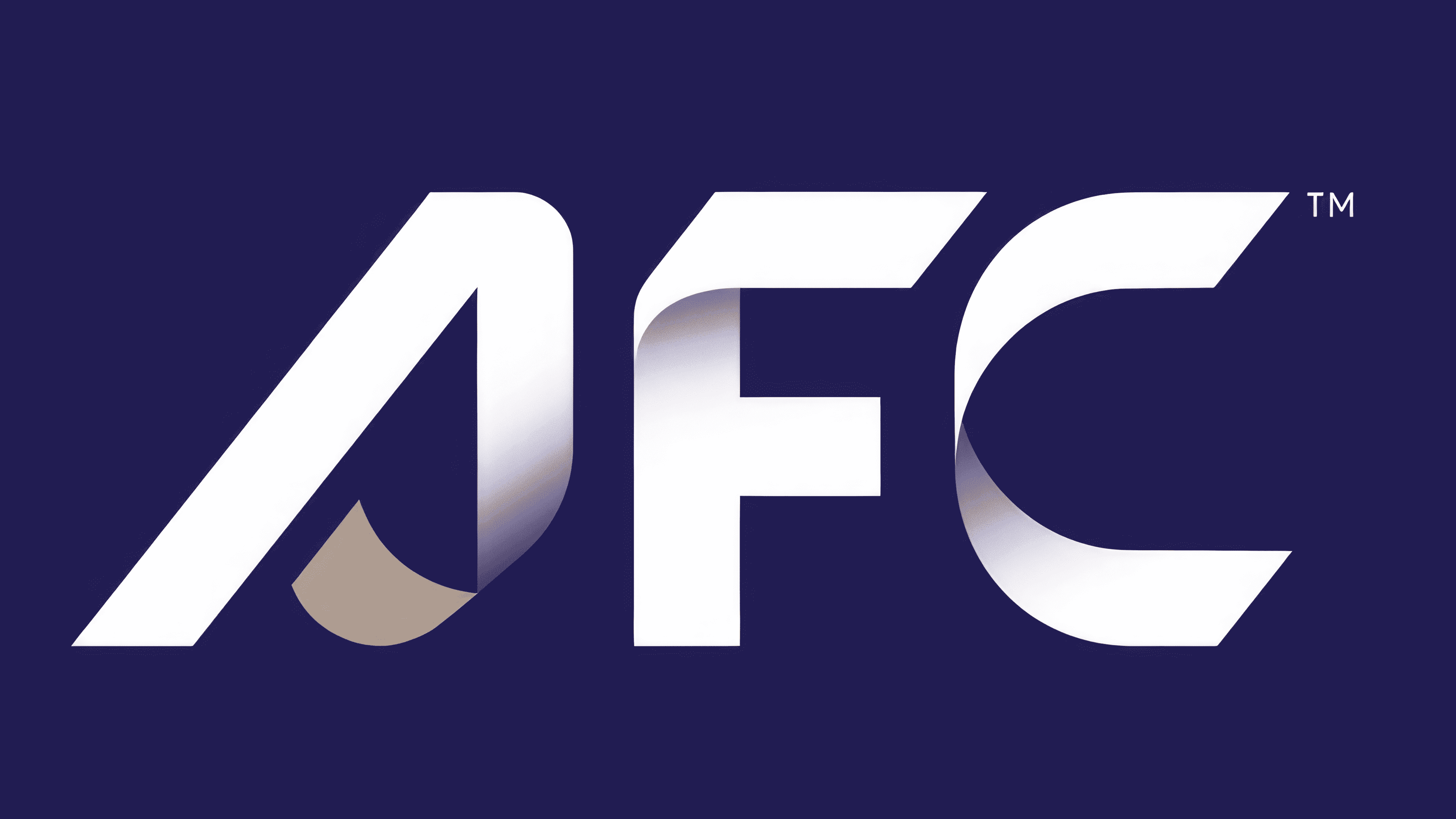
Color plays an important role in the new look. The deep navy blue background remains, symbolizing trust, professionalism, and stability. A subtle gradient effect adds depth and a sense of motion, suggesting the dynamic nature of football. The golden accents are now more understated, representing excellence, prestige, and the competitive spirit of the game. This combination of solid tones with gradients gives the logo a polished, modern feel that connects with long-time fans and younger audiences.
The new design is about connection, as highlighted in the updated tagline, “Connecting Asia Through the Power of Football.” The flowing, ribbon-like lettering mirrors the fluid movements of the game—quick passes, agile runs, and seamless transitions on the field.
The new logo stands out for its careful balance of sharp technical details and visual harmony. The letters are designed precisely, blending crisp angles with smooth curves to create a balanced look. The golden accent in the “A” isn’t just decorative—it draws the eye and serves as a focal point, reinforcing the identity of the football confederation.
![]()
Unlike the older logo, which relied heavily on symbolic imagery, this new design focuses on clarity and elegance. By removing the map of Asia and the star, the organization signals a shift toward a more modern, streamlined identity that reflects its expanding role beyond the continent. This is a bold step for an entity that looks ahead while still honoring its history.
The timing of this rebrand aligns with bigger changes within the AFC, including updates to club and national team competitions and organizational reforms aimed at improving football across Asia.