


![]()
IDW Publishing, known for popular comic series like Transformers, Teenage Mutant Ninja Turtles, and Star Trek, has introduced a new logo and visual identity to celebrate its 25th anniversary. This update reflects a key moment in the company’s history, highlighting its growth and vision for the future while staying connected to its comic book roots.
The previous logo featured simple, dark blue typography. Its clean, minimal style conveyed a sense of professionalism and reliability, fitting for a traditional publisher. However, as the entertainment landscape evolved, the old design started to feel static, lacking the energy in the vibrant stories IDW publishes.
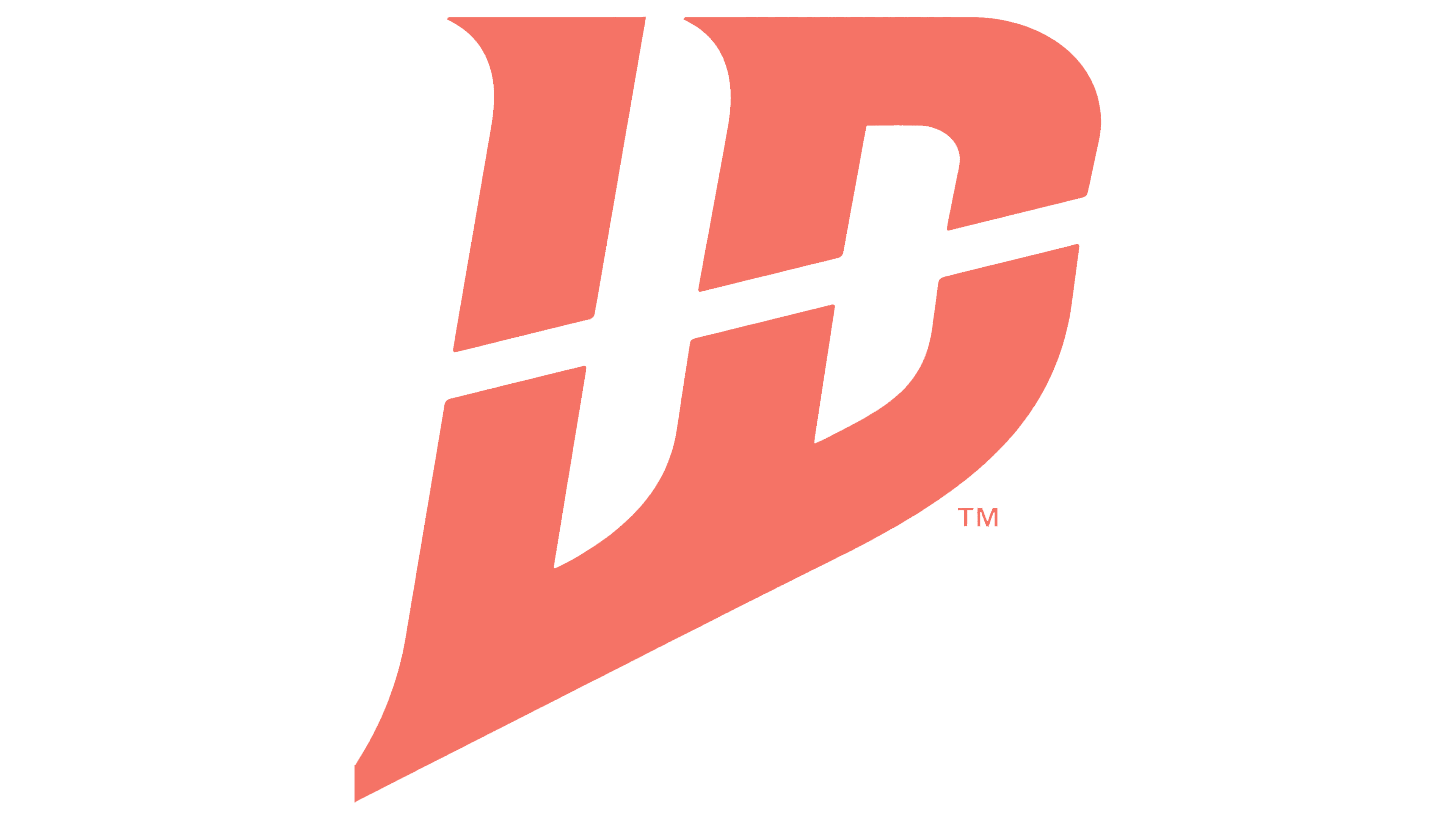
The new logo has a bold, modern look that mirrors the dynamic nature of its content. The typography has been completely reworked, with sleek letters angled slightly forward to suggest motion and progress. This subtle tilt gives the logo a fresh, energetic feel, reflecting the company’s focus on innovation and boundary-pushing storytelling.
![]()
Sharp, geometric shapes define the new design, creating a sense of strength and confidence. Bold lines are balanced with smooth curves, giving the logo a modern edge without feeling harsh. This mix of angular and rounded elements captures the publisher’s catalog’s spirit, including action-packed adventures and deeply character-driven stories.
The color palette has also been refreshed. The old dark blue has been replaced with a vibrant coral-red hue, adding energy and warmth. This bold hue stands out across print and digital formats, making the logo more noticeable and memorable. It also reflects the passionate creativity behind the company’s work, giving the brand a lively, modern feel.
Another standout feature of the new logo is its resemblance to superhero emblems. The angular typography and strong silhouette subtly reference classic comic book iconography, connecting the publisher to the genre’s visual history. This design choice reinforces its role in shaping the comic book industry, while the fresh aesthetic signals readiness to explore new creative directions.
Beyond the typography, the new logo embraces a broader visual identity. The abstract shapes and bold letter arrangement form a distinctive, recognizable mark. This versatile design adapts well across different platforms, from comic covers and merchandise to websites and promotional materials.
While the new logo marks a new chapter, it still reflects the company’s past. Subtle design details echo the original logo, maintaining a sense of continuity. This blend of old and new reflects the company’s dual role as a steward of beloved franchises and a creator of original stories.
The rebrand is part of a larger vision for IDW’s future, aligning with new projects and strategic plans. Starting in 2025, the updated logo will appear on all of the company’s materials, symbolizing a renewed focus on creativity and growth.
![]()
At New York Comic Con, IDW will showcase its new look under the theme “IDW Publishing: The Next 25 Years.” The event will offer fans a glimpse of upcoming titles and collaborations, emphasizing the company’s dedication to storytelling and its evolving role in the comic book industry.
IDW’s new logo represents where the company has been and is headed. With bold design choices, dynamic typography, and a vibrant color scheme, the refreshed identity captures the spirit of a publisher that honors its legacy while embracing the future of comics and graphic novels.